
Have you ever walked into a room and felt an instant sense of peace, a grounding warmth that just settles your soul? Chances are, it was bathed in earthy tones. I know that feeling well! But how do we bottle that magic, that serene beauty, and weave it into our own designs? I used to wonder if there was some secret handshake to creating these perfect palettes. Good news: I've discovered it, and it's simpler, and more beautiful, than you might imagine.
To create the perfect earthy color palette, start by selecting a core inspiration from nature, like a forest or a desert scene. Choose a dominant base color (such as deep soil brown), add two complementary accent colors (like terracotta and sage green), and finish with a soft neutral (like beige or stone gray) for balance.
But trust me, there's so much more to it than just grabbing a few pretty shades. I've spent time digging into the techniques and tools that truly elevate an earthy palette from 'nice' to 'absolutely breathtaking.' I'm talking about insights that feel like whispers from Mother Nature herself, and I can't wait to share them with you.
Earthy palettes are defined by muted, natural hues like brown, sage, and terracotta, not bright, artificial colors which clash with the nature-inspired aesthetic.
Think beyond simple brown and green. A truly authentic earthy palette draws from a rich spectrum of natural hues, each playing a vital role in creating a grounded and harmonious atmosphere.
The core colors in an earthy palette include deep browns (like soil and wood), various greens (from sage to forest), warm neutrals (such as beige, cream, and stone gray), and muted accent colors inspired by natural elements like terracotta, rust, and mustard yellow.
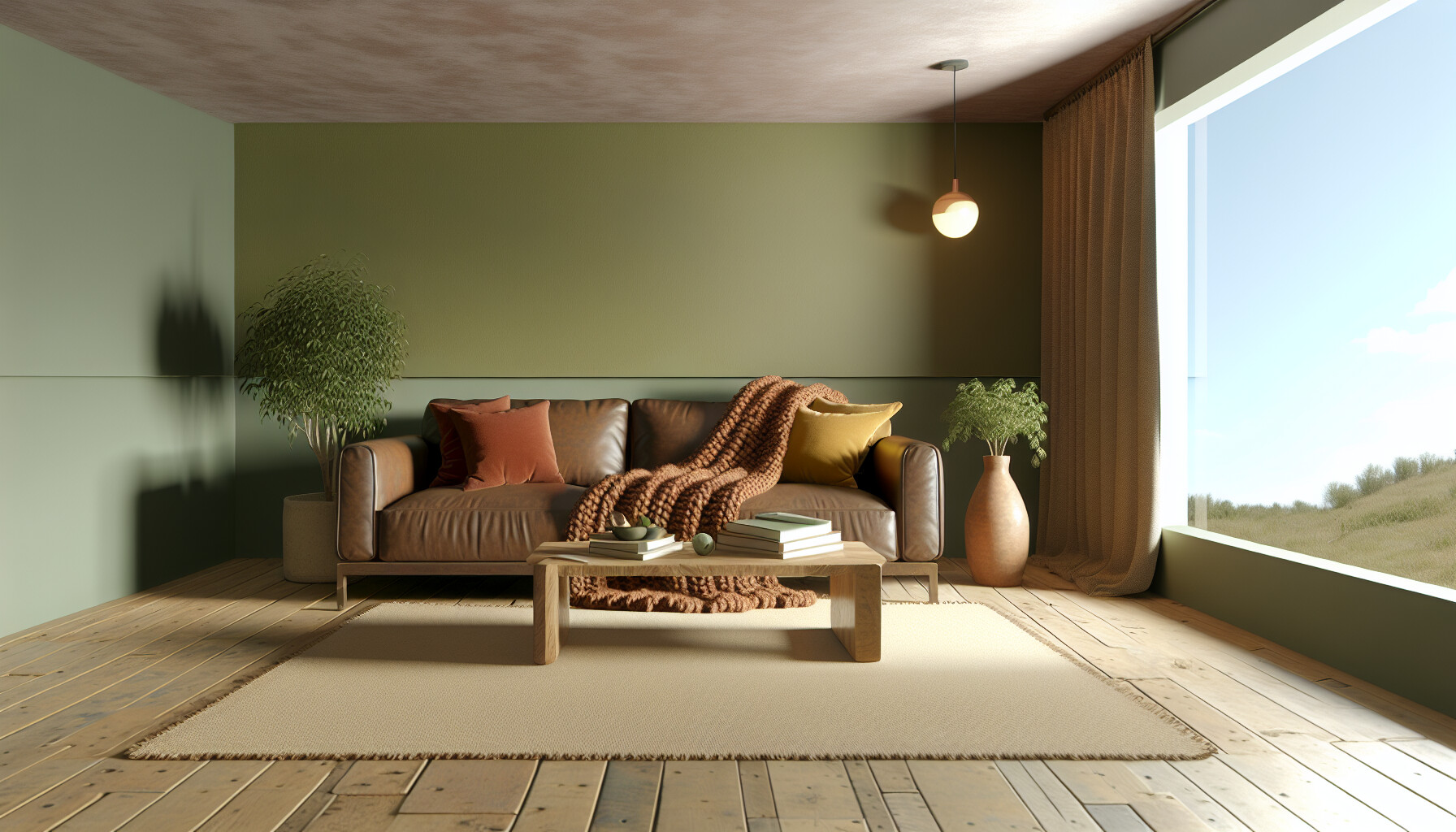
An earthy palette is a collection of colors inspired directly by the natural world. It's about capturing the essence of landscapes, from dense forests to sun-baked deserts. To build a cohesive palette, it's helpful to think in terms of color categories, each serving a specific purpose.
Browns are the anchor of any earthy palette, representing soil, wood, and rock. These grounding colors provide a sense of stability and warmth. They range from deep, rich chocolates and umbers to lighter tans and taupes. Think of the solidness of a tree trunk or the richness of fertile earth—that's the role brown plays.
Green signifies life, growth, and tranquility. In an earthy palette, these are not bright, artificial greens but rather the muted and complex shades found in foliage. Sage green, olive, moss, and deep forest green add a layer of freshness and connect the palette directly to the botanical world.
To prevent the palette from becoming too dark, warm neutrals are essential. Colors like beige, cream, and stone gray act as balancing elements, providing breathing room and light. They evoke sand, pebbles, and cloudy skies. Alongside these, muted accent colors add personality without overwhelming the scheme. These are often derived from natural minerals and phenomena, and understanding color theory principles1 can help you combine them effectively.
Here's a quick reference table for core earthy colors:
| Color Category | Common Examples | Natural Inspiration |
|---|---|---|
| Browns | Chocolate, Taupe, Sepia, Umber | Soil, Wood, Clay |
| Greens | Sage, Olive, Moss, Forest | Foliage, Plants, Moss |
| Neutrals | Beige, Cream, Stone Gray, Off-white | Sand, Rocks, Clouds |
| Accents | Terracotta, Rust, Ochre, Slate Blue | Clay Pots, Minerals, Sunsets |
Earthy palettes feature muted, natural greens like sage and olive, not bright, artificial shades, to create a calm, organic feel.
Representing soil and wood, browns provide a sense of stability and warmth, forming the foundation of any earthy palette.
Nature is the ultimate artist. A single photograph of a landscape—a misty forest, a sun-drenched beach, or a rocky canyon—holds a perfectly balanced, professional-grade color scheme just waiting to be discovered. Let's explore how to unlock it.
To use a photograph to build a color scheme, first select an image with a clear mood and balanced tones. Use a color picker tool or an online palette generator to extract 4-5 key colors. Identify a dominant hue, two secondary colors, and one or two accent shades to create your final palette.
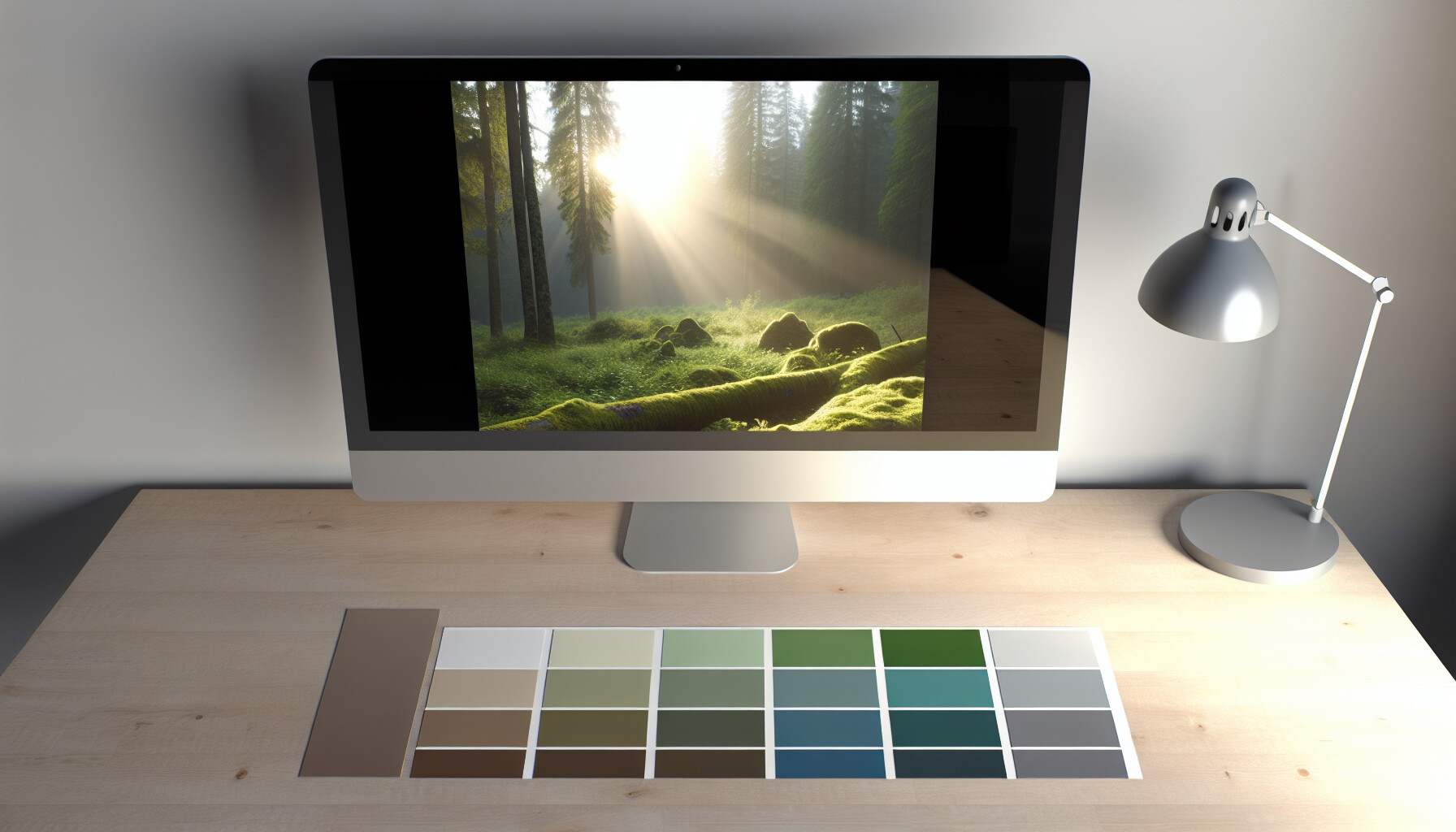
A photograph is a snapshot of a naturally harmonious color story. By learning to deconstruct it, you can borrow nature's genius for your own projects. This technique is used by designers across industries to create palettes that are both beautiful and emotionally resonant.
The first step is choosing an image that aligns with the mood you want to create. For an earthy palette, look for photos of forests, deserts, mountainsides, or coastlines. A good source image should have:
Once you have your image, it's time to pull out the colors. You don't need to sample every single pixel. Instead, aim to identify the most significant hues that define the image's character. You can do this manually with an eyedropper tool in software like Photoshop or use one of the many online color palette generators2 that automate the process. Aim to extract:
Extracting colors is just the start. The final step is to refine them into a usable scheme. Check the contrast between your selected colors to ensure readability if you're using them for text and backgrounds. You might need to slightly adjust the saturation or brightness of a color to make it work better with the others. Consider the standard RGB values to make precise digital adjustments. A great way to apply your new palette is using the 60-30-10 rule, where the dominant color is used for 60% of your design, a secondary color for 30%, and an accent color for the final 10%.
The text explicitly mentions using the 60-30-10 rule to apply the dominant, secondary, and accent colors from your extracted palette.
The guide advises extracting only 4-5 key colors to create a balanced scheme, not sampling every single pixel from the image.
Gone are the days of relying solely on physical paint swatches. Technology offers a powerful suite of digital tools designed to streamline and inspire your color selection process, making palette creation easier and more precise than ever before.
Several digital tools can help you create a color palette. Key options include online palette generators like Coolors and Canva, which can extract colors from images, and browser extensions like Duckcolor for picking colors directly from websites. Professional software like Adobe Color also offers advanced features for creating and managing color schemes.

Leveraging digital tools can transform your approach to building an earthy color palette, providing both inspiration and precision. These resources are generally accessible and can significantly speed up your workflow.
Web-based palette generators are excellent for brainstorming and quick creation. They often come with features that allow you to generate, refine, and export color schemes with ease.
Exploring the features of different online color palette tools3 can help you find the one that best suits your creative process.
Inspiration can strike anywhere, especially while browsing the web. Color picker extensions allow you to capture that inspiration instantly.
For designers working within a specific ecosystem, integrated tools provide a seamless workflow.
The text identifies Duckcolor as a browser extension for picking colors from websites, not a professional design software like Adobe Color.
The context states that Coolors and Canva's Color Palette Generator can both create a palette based on the colors in an uploaded image.
Pairing the cozy feel of warm tones with the calming effect of cool tones can be tricky. Yet, this balance is the secret to creating a dynamic, sophisticated earth-toned space. Let's explore how to achieve this harmonious blend without creating a visual clash.
To balance warm and cool earth tones, use the 60-30-10 rule: select one temperature as your dominant (60%) color, use the opposite for a secondary (30%) color, and add a neutral (10%) to bridge them. For instance, combine warm terracotta walls with cool slate gray furniture and cream accents.
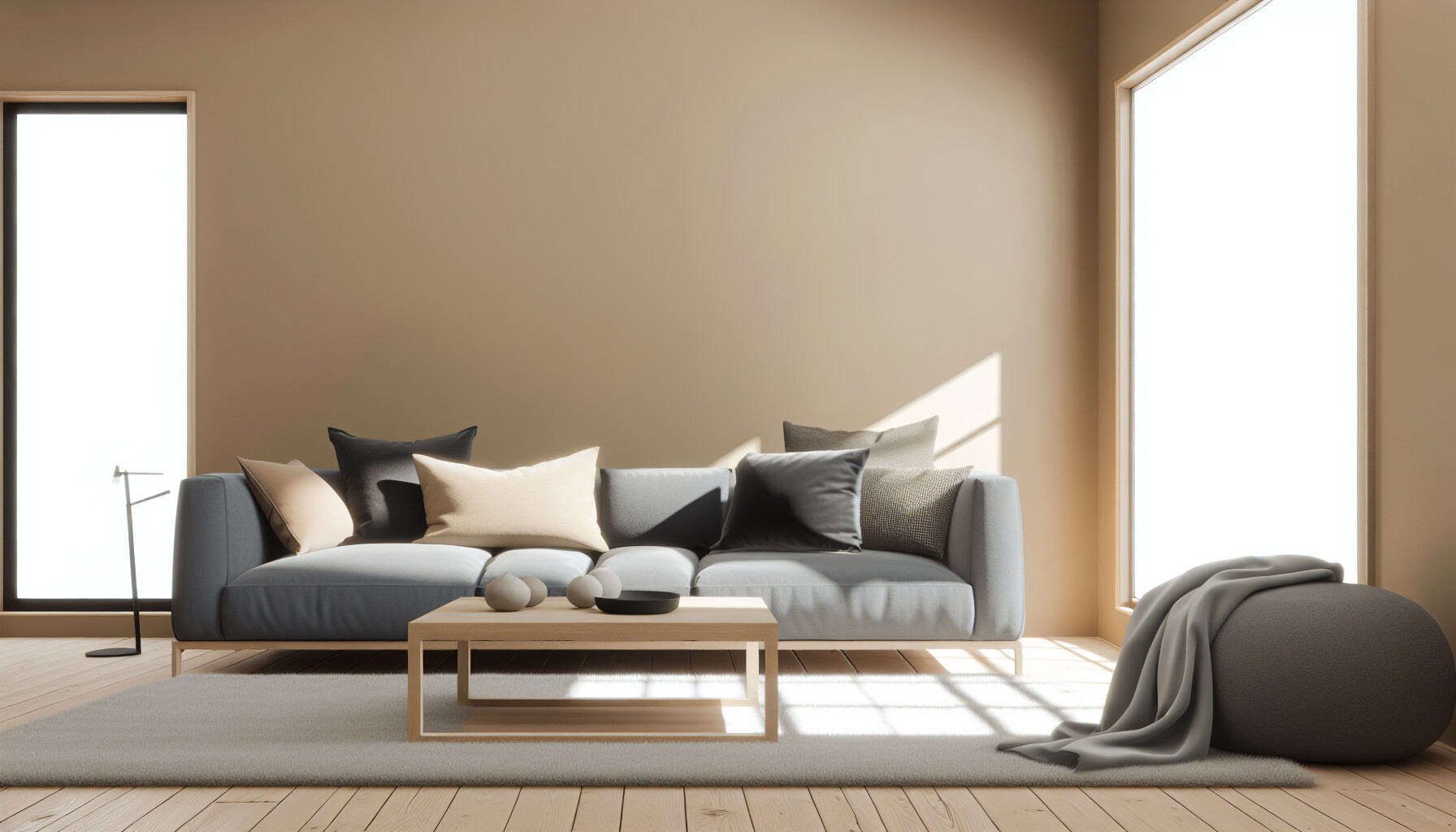
Achieving a beautiful balance between warm and cool earth tones is all about understanding their relationship and applying a few key design principles. It prevents your space from feeling either too stuffy or too sterile.
First, you need to be able to distinguish between warm and cool tones. Warm colors have red, orange, or yellow undertones, evoking feelings of coziness and energy. Cool colors have blue, green, or purple undertones, creating a sense of calm and spaciousness.
Here’s a quick guide:
| Warm Earth Tones | Cool Earth Tones |
|---|---|
| Terracotta, Rust, Ochre | Slate Gray, Sage Green, Taupe |
| Mustard Yellow, Burnt Sienna | Mushroom, Stone, Moss Green |
| Beige, Sandy Brown, Cream | Cool Grays, Washed Blues |
A foolproof method for creating balance is the 60-30-10 rule, a classic guideline in design. This principle helps distribute colors proportionally to create a cohesive look.
For example, you could use a warm, sandy beige (60%) for the walls, a cool sage green (30%) for a sofa and chairs, and accents of charcoal gray (10%). Mastering these interior design color principles5 is key to creating a professional-looking space.
Neutral earth tones like cream, stone gray, and mushroom are your best friends when balancing temperatures. They act as a buffer, preventing warm and cool colors from clashing. You can use a neutral for your dominant color to easily incorporate both warm and cool accents, or use them in your accent pieces to tie everything together seamlessly.
This rule advises using an opposite temperature for the secondary color to create a balanced, dynamic look, preventing a monotonous feel in your space.
Neutrals act as a buffer, preventing warm and cool tones from clashing and helping to tie the entire color scheme together seamlessly for a harmonious space.
So, there you have it! I truly believe that by letting nature be our guide, we can all craft breathtakingly beautiful earthy palettes. Don't be shy; dive in, experiment, and let that natural harmony flow into your next creative adventure. I can't wait to see what you create!
Master the art of color combination for a perfectly balanced and natural aesthetic: Learn the color theory concepts behind the 2026 interior color trends of warm neutrals and earth tone colors. ↩
Discover tools that automatically create stunning color schemes from your favorite photos: With DuckColor's color palette generator, you can create color combinations in seconds. Simply upload a photo, and we'll use the hues in the photo to create your ... ↩
Discover a comprehensive review of the best tools to find your perfect match: Compare the best color palette generators and tools in 2025. In-depth review of ColorKit, Coolors, Adobe Color, and more to help you choose ... ↩
Learn how to capture color inspiration directly from your web browser with ease: Duckcolor is the most user friendly, full-featured, secure and reliable color picker and color related suite of tools. ↩
Master a timeless design principle for creating perfectly balanced color schemes at home: 60 percent of a room should be in your primary color, 30 percent in your secondary hue, and 10 percent in an accent shade. These proportions ... ↩
Recommended reading: the latest three posts in this language.

Ever find yourself scrolling, searching for that perfect little mental escape? I know I do! When it comes to online tile puzzles, the options can feel endless. But don't worry, I've sifted through the colorful chaos to find the absolute best, including the beloved original Google game and some fantastic alternatives, just for you.

Remember that feeling when your social media posts just... vanished into the feed? I certainly do! For ages, I struggled to make my words pop. Then, I stumbled upon fancy font generators, and honestly, they've been a game-changer. They're my little secret for crafting text that truly stands out, making my content memorable without needing any fancy design degrees.

Have you ever just stopped to stare at the vast, endless blue of the sky or the deep, mysterious ocean? It feels like blue is everywhere, right? But then I started noticing something peculiar: when it comes to living things—plants, animals, us—true blue is incredibly hard to find. It got me wondering: why is such a common color in our world so shockingly rare in the vibrant tapestry of life? Let's explore this beautiful mystery together.
