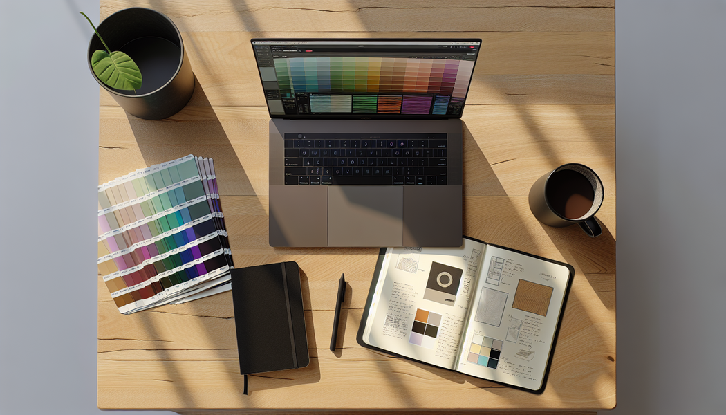
Oh, the power of color! It's like a secret language, whispering emotions and stories without a single word. I remember staring at a blank canvas, feeling overwhelmed by the endless possibilities. How do you go from a chaotic rainbow to a perfectly harmonious palette that truly sings?
The best way to create a custom color palette is by combining fundamental color theory with a structured approach, like the 60-30-10 rule, and leveraging powerful online color palette generators. This hybrid method ensures your choices are both aesthetically pleasing and strategically sound.
That little snippet is a fantastic starting point, right? But trust me, there's so much more to uncover. I've spent countless hours diving deep, exploring the exact techniques and brilliant tools that transform a good palette into an unforgettable one. Come along, and let me show you how to truly elevate your color game!
This rule originated in interior design but is universally applied to web design, fashion, and more to create balanced, harmonious color schemes.
Colors aren't just for decoration; they communicate. By understanding the psychology behind different hues, you can choose a palette that speaks directly to your audience's emotions, making your design more impactful and memorable.
Understanding color psychology improves your palette choices by enabling you to select colors that evoke specific emotions and convey a desired message. This strategic approach ensures your palette aligns with your brand's personality, resonates with your target audience, and drives specific actions.
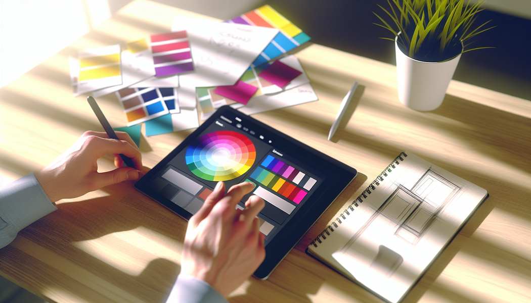
Color psychology is the study of how colors affect human behavior and emotions. It's a critical tool for designers because it transforms color selection from a subjective guess into a strategic decision. By choosing colors based on their psychological impact, you can create a palette that not only looks good but also works hard to achieve your goals.
Different colors trigger different emotional and psychological responses. While these can be influenced by personal experience, some associations are widely recognized, especially in Western cultures.
| Color | Common Positive Associations | Common Negative Associations | Typical Use Cases |
|---|---|---|---|
| Red | Passion, love, energy, excitement | Anger, danger, warning | Call-to-action buttons, sales, food brands |
| Blue | Trust, calm, stability, professionalism | Coldness, sadness | Corporate branding, finance, tech, healthcare |
| Green | Nature, growth, health, wealth | Envy, boredom | Environmental brands, finance, wellness |
| Yellow | Optimism, happiness, creativity | Warning, anxiety, cowardice | Attention-grabbing elements, youth brands |
| Orange | Enthusiasm, friendliness, confidence | Immaturity, frustration | Creative brands, call-to-actions, youth |
| Purple | Royalty, luxury, wisdom, spirituality | Arrogance, extravagance | High-end products, beauty, creative fields |
| Black | Sophistication, power, elegance | Mourning, evil, oppression | Luxury brands, fashion, tech |
| White | Purity, cleanliness, simplicity, minimalism | Emptiness, isolation | Minimalist design, healthcare, tech |
Harnessing these associations allows you to build a palette that reinforces your brand’s core message. For example, a financial tech company might use blue to build trust, while a fast-food chain might use red to stimulate appetite. Understanding the emotional impact of color in marketing1 is key to influencing consumer perception.
It's crucial to remember that color meanings are not universal. The same color can have vastly different interpretations depending on cultural background. For instance, in many Western countries, white symbolizes purity and is used for weddings. In contrast, in some Eastern cultures, it's the color of mourning.
Therefore, knowing your target audience is paramount. Before finalizing a palette for a global brand, research into cross-cultural color symbolism2 is essential to avoid sending an unintended message. This is especially important in UI/UX design, where clarity and intuitive communication are vital.
Color symbolism is not universal. For example, white represents purity in the West but is a color of mourning in some Eastern cultures.
The color blue is associated with trust, calm, and stability, making it a strategic choice for finance, tech, and healthcare brands.
Drowning in a sea of online tools? Finding the right free color palette generator can be overwhelming. We've sifted through the options to bring you the top contenders that will streamline your design process and spark your creativity without costing a dime.
The best free online color palette generators include Adobe Color for its powerful integration with Creative Cloud, Coolors for its speed and versatility, and Color Hunt for its curated, ready-to-use palettes. These tools offer robust features for both beginners and professional designers seeking inspiration and efficiency.
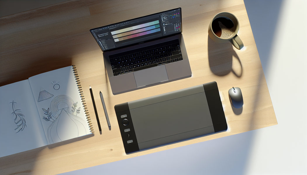
While many tools exist, a few stand out for their features, ease of use, and quality of results. They cater to different needs, from generating a palette from scratch to finding pre-made, trendy combinations.
Formerly known as Kuler, Adobe Color is an industry-standard tool that leverages a powerful color wheel. It allows you to create palettes based on color harmony rules like analogous, triadic, and complementary. Its standout features include the ability to extract color themes and gradients from uploaded images and robust accessibility tools that check for color blindness. As part of Adobe's powerful suite3, it integrates seamlessly with Photoshop and Illustrator.
If speed is what you need, Coolors is your best bet. This tool is famous for its simple interface where you can generate endless palettes just by pressing the spacebar. You can lock colors you like and continue generating others, adjust shades and hues, and view your palette on various mockups. It also allows you to generate a palette from a photo, create a collage, and check for various types of color blindness. It's a versatile and super-fast generator4 perfect for quick brainstorming.
Unlike generators, Color Hunt is a curated collection of palettes. It's an excellent resource for pure inspiration, showcasing thousands of beautiful color palettes5 created by a community of designers. You can browse palettes by tags like 'new,' 'trendy,' 'popular,' or 'random.' While it doesn't generate custom schemes, it's invaluable for discovering proven and effective color combinations that are currently in vogue.
Generate palettes with the AI Palette Generator—enter keywords or a short prompt to preview 3–8 colors and copy HEX in one click. This AI-powered color tool6 is fantastic for designers who want to discover unique combinations that align with their personal style.
| Feature | Adobe Color | Coolors | Color Hunt | DuckColor |
|---|---|---|---|---|
| Generate from Image | Yes | Yes | No | Yes |
| Color Wheel | Yes | No | No | Yes |
| Curated Palettes | Yes (Explore) | Yes (Explore) | Yes | Yes |
| AI-Powered | No | No | No | Yes |
| Export Options | ASE, SVG, CSS | PNG, PDF, SVG, CSS | PNG | SVG, CSS |
The comparison table shows that Color Hunt and Khroma do not have this feature, while Adobe Color and Coolors do.
Khroma uses AI by training a neural network on 50 colors you like to generate palettes tailored to your specific taste.
Heard of the 60-30-10 rule but not sure how to use it? This classic design principle is a simple yet powerful framework for creating balanced and harmonious color schemes in any space or design project, from interior decor to website layouts.
To apply the 60-30-10 rule in practice, you allocate 60% of your design to a dominant primary color, 30% to a secondary color for contrast, and 10% to an accent color for emphasis. This ratio creates a visually balanced and engaging composition.
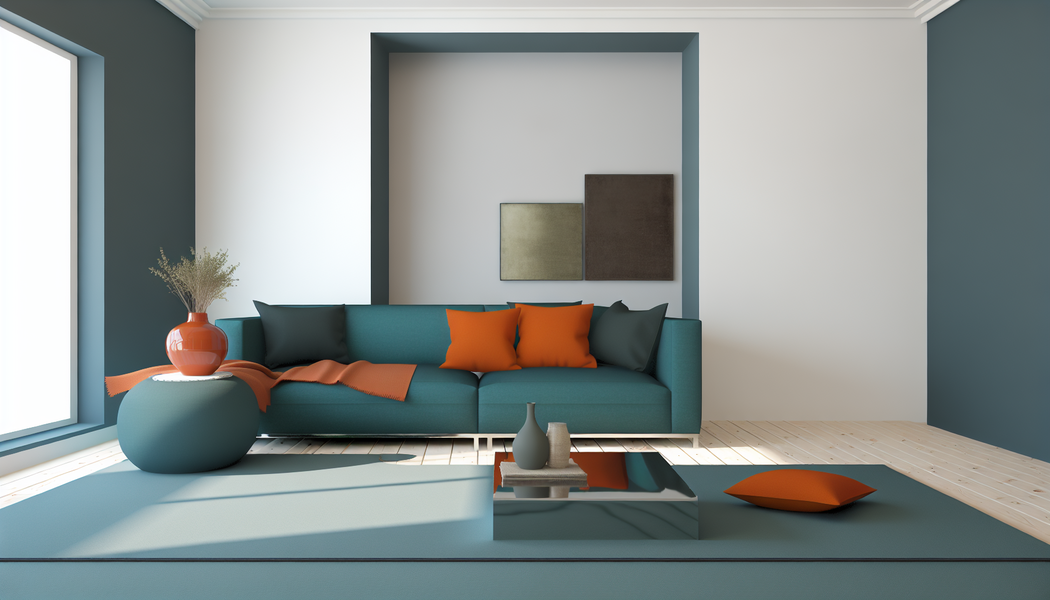
The 60-30-10 rule is a timeless decorating concept that helps you balance colors in a pleasing way. It's all about creating a clear visual hierarchy in design7 that guides the eye naturally. While it originated in interior design, its principles are universally applicable to web design, fashion, and more.
60% Primary Color: This is your dominant hue and the foundation of your palette. It should cover the largest area. Think of it as the main canvas. In a room, this would be the wall color; on a website, it would be the background color.
30% Secondary Color: This color supports the primary hue and is used for roughly half the area of the main color. It's there to create interest and depth. Examples include furniture, curtains, or header and footer sections on a webpage.
10% Accent Color: This is the 'pop' of color. It's used sparingly to draw attention to key elements and add personality. This could be decorative pillows, artwork, or call-to-action buttons in UI design.
Applying the rule to a physical space makes it easy to visualize. Imagine you're decorating a living room:
| Percentage | Color Role | Example Elements |
|---|---|---|
| 60% | Primary | Light Gray (Walls, Ceiling) |
| 30% | Secondary | Deep Teal (Sofa, Curtains, Area Rug) |
| 10% | Accent | Burnt Orange (Throw Pillows, Vase, Artwork) |
This distribution ensures the room feels cohesive and balanced, not chaotic or bland.
The same logic works perfectly for digital interfaces. Let's map it onto a website's homepage design:
This method prevents your design from becoming visually overwhelming and strategically directs the user's focus. For more inspiration, you can explore numerous real-world design examples8 online.
This design principle originated in interior decorating and was later adapted for web design and other fields to create balanced and harmonious color schemes.
The 10% accent color serves as a 'pop' to highlight important features like call-to-action buttons or decorative details, guiding the user's eye.
A single photograph can be a treasure trove of color inspiration. Whether it's a breathtaking landscape or a vibrant street scene, an image holds the secret to a naturally harmonious and evocative color palette, just waiting to be unlocked for your design.
To create a cohesive palette from an inspiration image, use a digital color picker tool or an online palette generator to extract the most dominant and compelling hues. Then, refine this selection by identifying a primary, secondary, and accent color to ensure a balanced and functional scheme.
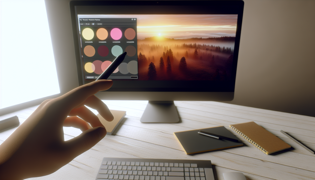
Using an image as your foundation is a fantastic way to ensure your colors work together naturally. The visual harmony in a photograph, whether it's a serene landscape or a bustling city, has already been validated by reality. Your job is to simply borrow that magic.
The success of your palette depends heavily on your source image. Look for a photo that not only contains colors you like but also evokes the specific mood you want to convey. A photo of a misty forest will yield a much different palette than one of a tropical beach. Ensure the image has clear, distinct colors and isn't too visually cluttered.
Once you have your image, it's time to pull the colors. You can do this in two main ways:
An automatically generated palette is rarely perfect out of the box. Now, you must curate it. From the 5-7 colors you've extracted, select your final group. Think about the 60-30-10 rule and identify:
Applying color palette refinement techniques10 is crucial for turning a raw selection of colors into a strategic, polished, and effective design tool.
The text states that automatically generated palettes are a starting point but require manual refinement and curation to become polished and effective for design.
The context recommends using the 60-30-10 rule to assign roles like primary, secondary, and accent to your chosen colors, ensuring a balanced design scheme.
So there you have it! With a sprinkle of color theory, a dash of proven methods, and a few trusty tools, you're now equipped to weave your own unique color magic. Go ahead, experiment, play, and tell your next story in the most vibrant way possible. I can't wait to see what you create!
Learn how to use color to influence purchasing decisions and build brand loyalty. The psychology of color suggests general guidelines for the ways that various hues and shades influence consumer behavior. ↩
Avoid cultural missteps by understanding global color meanings and associations. Colors have different meanings in different cultures. Here's a chart that details color meanings around the world. ↩
Explore in-depth tutorials and features of Adobe's industry-standard color tool. In this Quick Tip, you'll explore color.adobe.com, a powerful online tool for creating color palettes and ensuring accessible, consistent design ↩
Learn tips and tricks to master this popular and fast palette generator. I'm going to show you how to use coolers.co to create color schemes super fast so you can spend less time playing with colors. ↩
Get inspired by thousands of trendy, hand-picked color schemes for your next project. Discover the newest hand-picked color palettes of Color Hunt. Get color inspiration for your design and art projects. ↩
Discover how this unique AI tool can learn your style and generate personalized palettes. DuckColor is an AI powered color tool that helps designers coders and creatives discover and save appealing color combinations. ↩
Understand the core principles of using color to guide user attention effectively. Visual hierarchy is the order in which a visitor processes the elements on a website. So, for example, whether a visitor notices your call to action (CTA) ... ↩
See stunning real-world examples of this color rule in digital design. 60% is your dominant hue, 30% is secondary color and 10% is for accent color. This rule helps you create a proper and well-balanced color application for your ... ↩
Explore powerful tools that automatically create color schemes from your photos. With Canva's color palette generator, you can create color combinations in seconds. Simply upload a photo, and we'll use the hues in the photo to create your ... ↩
Learn professional methods for turning an extracted palette into a functional UI. Tailwind Colors. Create and preview your tailwind palettes on real UI designs. Color BotNEW. Chat with our AI-powered bot and get color suggestions. Discover ... ↩
Recommended reading: the latest three posts in this language.
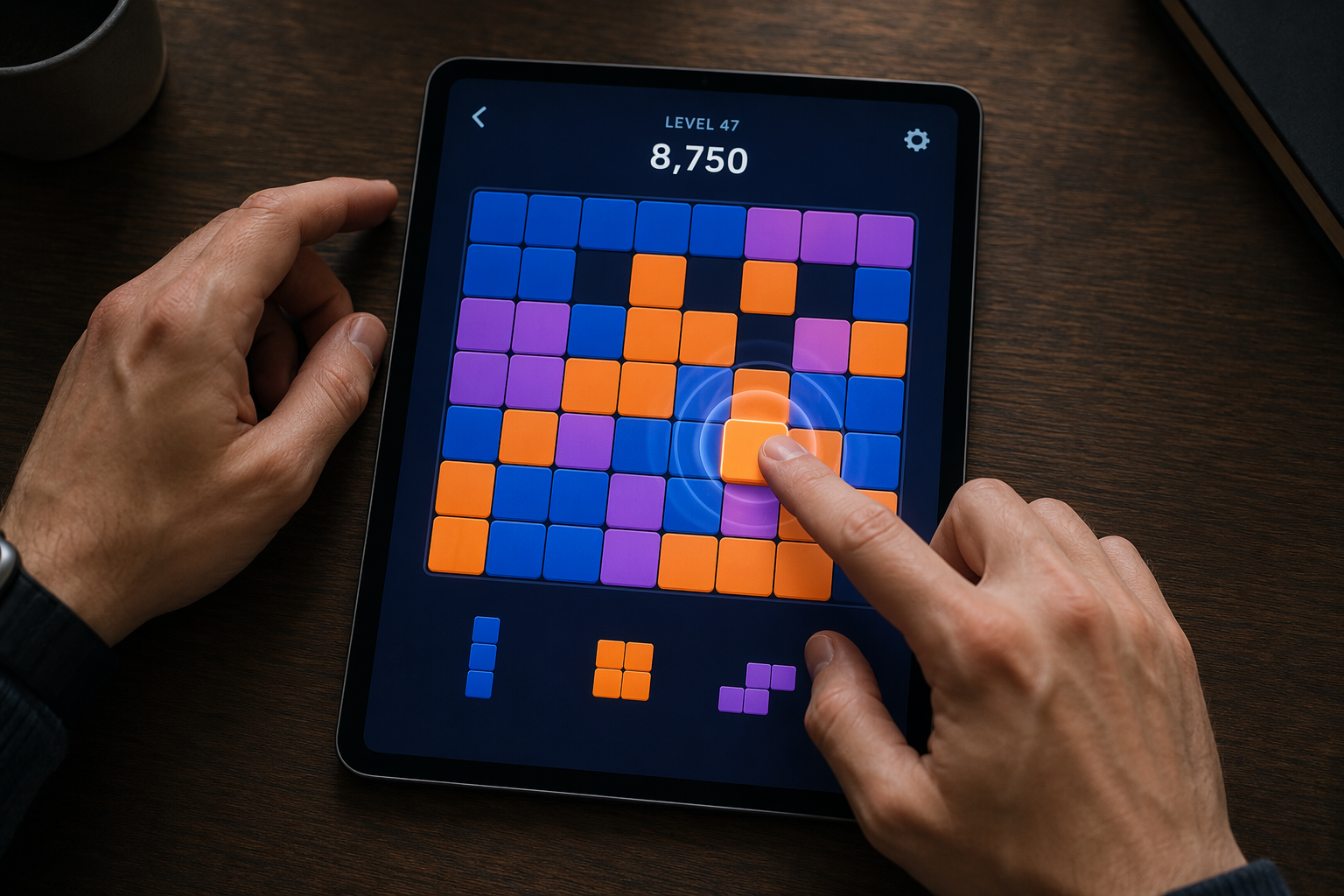
Ever find yourself scrolling, searching for that perfect little mental escape? I know I do! When it comes to online tile puzzles, the options can feel endless. But don't worry, I've sifted through the colorful chaos to find the absolute best, including the beloved original Google game and some fantastic alternatives, just for you.
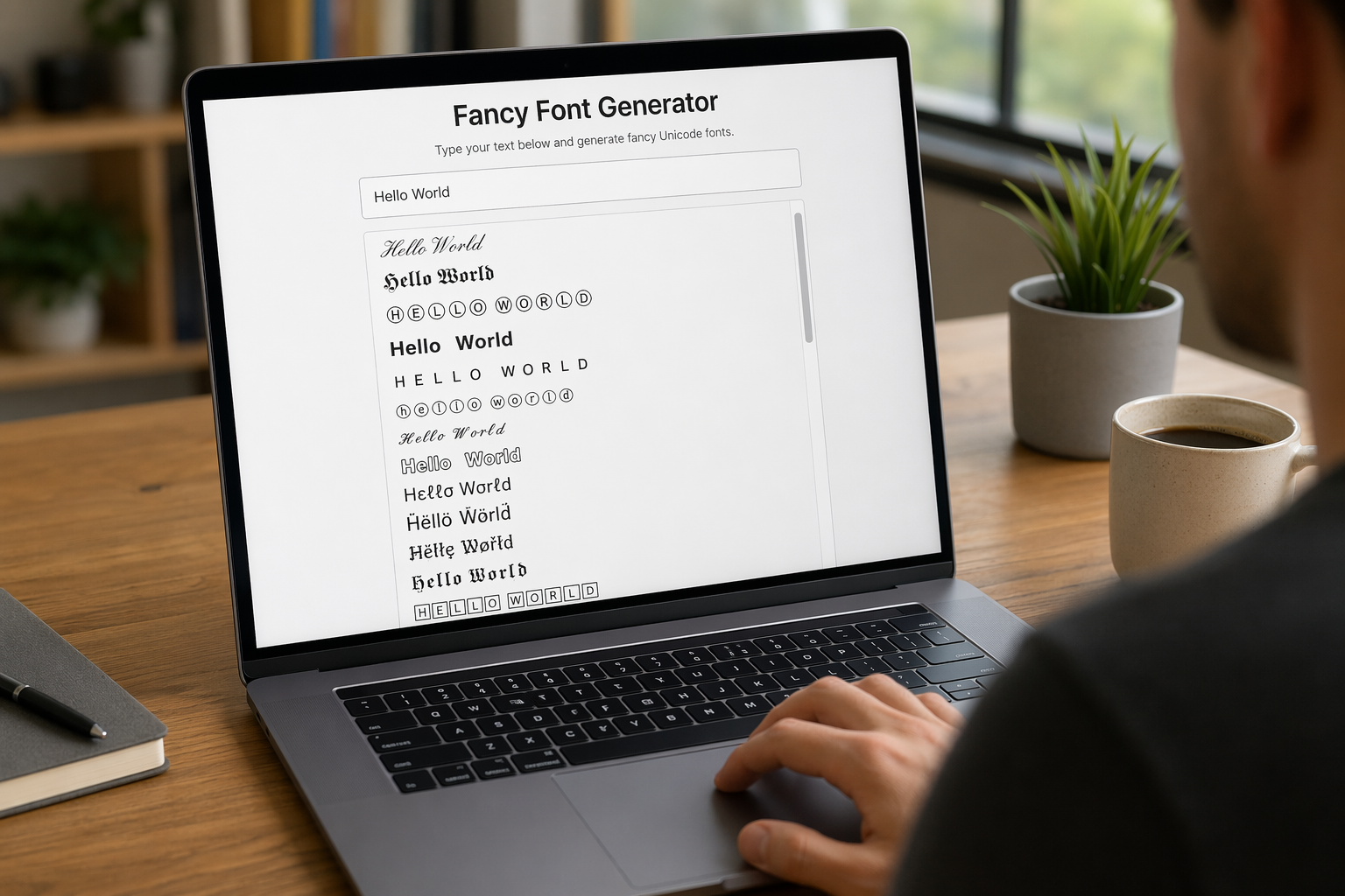
Remember that feeling when your social media posts just... vanished into the feed? I certainly do! For ages, I struggled to make my words pop. Then, I stumbled upon fancy font generators, and honestly, they've been a game-changer. They're my little secret for crafting text that truly stands out, making my content memorable without needing any fancy design degrees.

Have you ever just stopped to stare at the vast, endless blue of the sky or the deep, mysterious ocean? It feels like blue is everywhere, right? But then I started noticing something peculiar: when it comes to living things—plants, animals, us—true blue is incredibly hard to find. It got me wondering: why is such a common color in our world so shockingly rare in the vibrant tapestry of life? Let's explore this beautiful mystery together.
