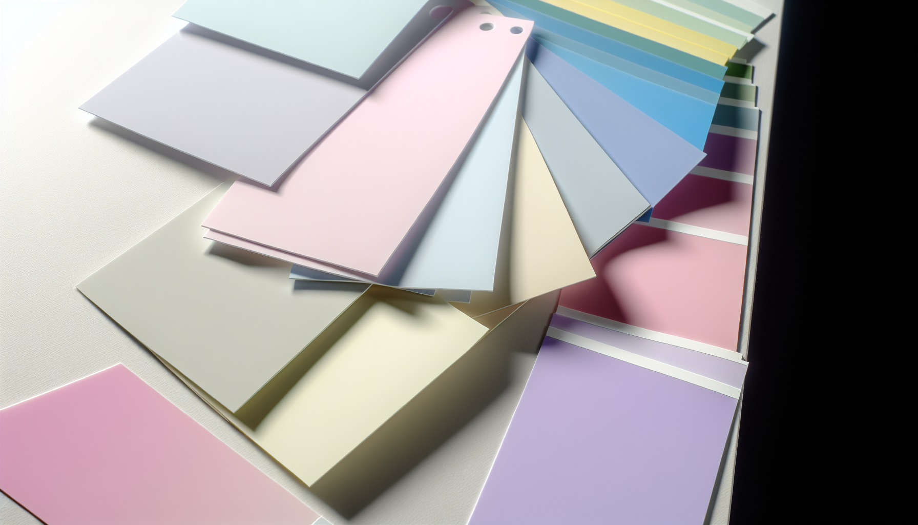
Have you ever just felt a color? I know I have! There's something undeniably soothing about pastels, isn't there? That gentle whisper of color that brings a sense of calm. But what actually makes a soft blush pink a 'pastel' and not just... well, pink? It’s not just magic; there’s a fascinating bit of color science behind it, and I’m excited to share it with you.
A color is defined as a pastel when it has low saturation and high lightness (or brightness). Pastels are created by taking a pure, saturated hue and mixing it with a significant amount of white. This process desaturates the original color, resulting in a softer, paler, and more muted version.
So, now we know the 'what,' but the real fun begins with the 'how.' Trust me, once you grasp the simple science, you'll see pastels everywhere, and you'll be ready to wield their subtle power. I've poured through so much to bring you insights and practical tips that go way beyond just picking pretty shades, showing you how to truly make these gentle hues sing in your own projects.
Pastels are created by adding white to a pure hue, which results in low saturation and high lightness, giving them their soft, muted appearance.
Ever walked into a room and felt an instant sense of peace? The colors on the walls might be the reason. Pastels have a subtle yet powerful ability to influence our emotions, creating environments that feel calm, open, and inviting.
Pastel colors primarily affect mood by creating a sense of calm, tranquility, and optimism. Due to their low saturation and high lightness, they are less stimulating to the eye than vibrant hues. This reduced visual intensity can help lower stress levels and foster a peaceful, soothing psychological state.
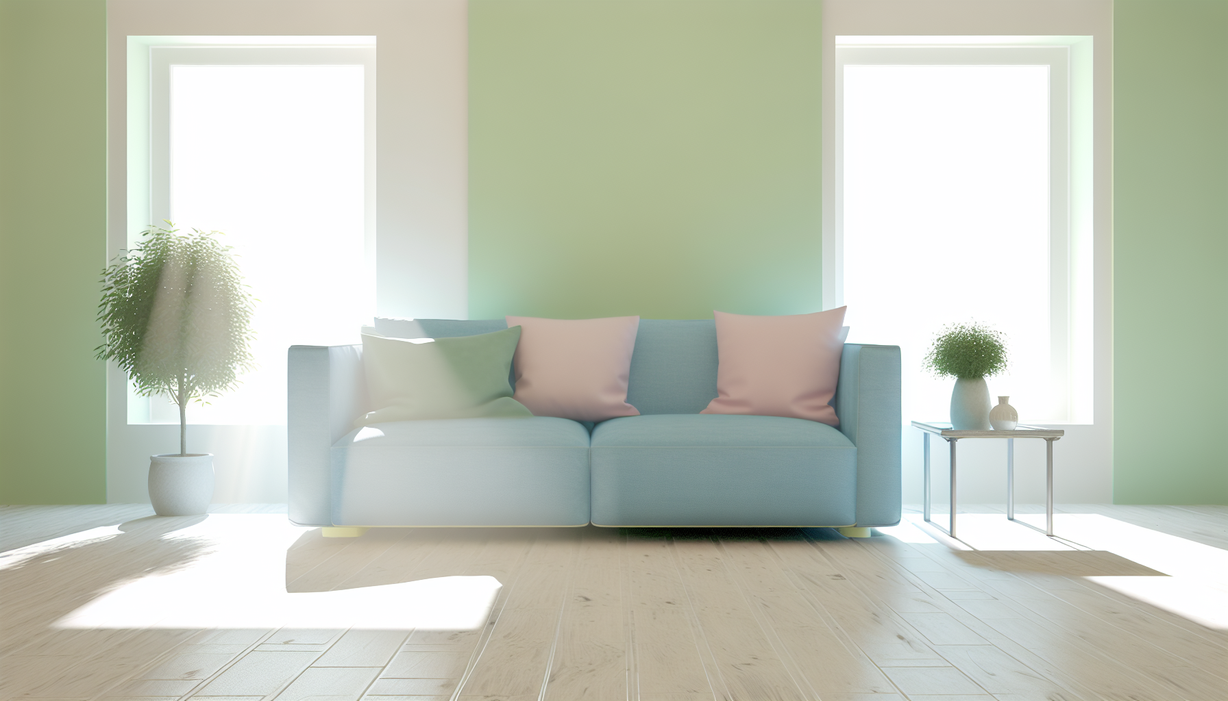
The gentle nature of pastels isn't just an aesthetic choice; it's rooted in how our brains process visual information. Their softness has a direct line to our emotional responses, making them a powerful tool in design and personal expression.
The key to the psychological impact of pastels lies in their low saturation. Bright, highly saturated colors demand more attention from our eyes and brain, which can sometimes feel overwhelming or energetic. Pastels, being mixed with a large amount of white, are visually less demanding. This lack of intensity translates into a psychological feeling of ease and serenity, making them ideal for spaces intended for relaxation and focus. The field of color psychology1 delves deep into these connections.
While pastels as a group are calming, individual shades carry their own unique emotional connotations, often tied to their parent hue.
| Pastel Color | Common Psychological Associations |
|---|---|
| Pastel Pink | Nurturing, gentleness, innocence, romance, and sweetness. |
| Baby Blue | Calmness, serenity, tranquility, and spiritual awareness. |
| Mint Green | Freshness, new beginnings, luck, and quiet energy. |
| Lavender | Peacefulness, elegance, spiritual contemplation, and creativity. |
| Pale Yellow | Happiness, optimism, gentleness, and cheerful energy. |
| Peach | Warmth, comfort, friendliness, and approachability. |
It's important to remember that color perception is subjective. While baby blue is often seen as calming, someone with a negative personal memory associated with that color might not feel the same way. Cultural backgrounds also play a significant role in color meaning. Therefore, while these general associations are a great starting point, the ultimate impact of a pastel color scheme can be deeply personal. Their application in different settings, from nurseries to wellness centers, often leverages these positive feelings, and some designers even explore the therapeutic use of colors2 to enhance a space's function.
Pastels are calming due to their low saturation. This reduced visual intensity is less demanding on the brain, fostering a peaceful and soothing psychological state.
Color perception is subjective. Personal memories and cultural backgrounds play a significant role in how an individual emotionally responds to a specific color.
Creating a pastel palette is an art of balance. While these soft hues are inherently harmonious, a thoughtful approach is needed to craft a combination that feels sophisticated and impactful, rather than overly sweet or monotonous. Let's explore the professional techniques for building stunning pastel schemes.
The best practice for combining pastel colors is to apply traditional color theory, such as analogous, complementary, or triadic schemes. Additionally, it is crucial to vary the lightness and saturation levels to create depth, incorporate a neutral color like white or gray to provide balance, and consider adding a single darker or more saturated accent color for contrast and visual interest.

Building a successful pastel color palette requires a blend of artistic intuition and an understanding of color relationships. Simply picking a few light colors isn't enough; the key is to create a scheme that is both cohesive and visually engaging.
Even with muted tones, the fundamental rules of color harmony apply. Using these structures as a starting point provides a solid foundation for your palette.
One common mistake is using pastels that all share the exact same level of lightness. This can make the design feel flat and one-dimensional. To avoid this, ensure your chosen pastels have slight variations in their value (lightness/darkness). For example, pair a very light powder blue with a slightly deeper dusty rose to create a subtle hierarchy and guide the viewer's eye.
Pastel palettes can sometimes feel overwhelmingly sweet. Introducing a neutral color is an effective way to ground the palette and enhance the soft hues. Shades of white, cream, light gray, or beige act as a resting place for the eye, making the pastels appear more vibrant and intentional. These neutrals can be used for backgrounds or as a significant component of the color scheme.
For a more dynamic and sophisticated look, consider adding a single accent color that breaks from the pastel theme. This could be a much darker shade (like navy or charcoal) or a small touch of a highly saturated, vibrant color. This focal point creates visual tension and prevents the palette from becoming monotonous. To learn more, you can explore resources on advanced color theory for designers3.
Here is a table showing some example combinations:
| Scheme Type | Example Palette |
|---|---|
| Analogous | Peach, Pastel Pink, Lavender |
| Complementary | Butter Yellow, Periwinkle |
| Triadic | Mint Green, Soft Coral, Powder Blue |
| With Neutral | Sage Green, Blush Pink, Cream |
| With Accent | Baby Blue, Light Gray, Navy Accent |
Using a pastel color palette generator4 can also be an excellent way to experiment with these principles and find inspiration for your projects.
The text confirms that traditional color theory, such as analogous or complementary schemes, provides a solid foundation for building harmonious pastel palettes.
The context explains that a darker or more saturated accent color creates contrast and visual interest, preventing the palette from becoming monotonous.
From beauty brands to serene wellness spaces, pastel colors are a surprisingly versatile tool. Their soft, approachable nature allows various industries to connect with audiences on an emotional level, crafting specific and memorable brand identities beyond the expected.
Industries that most effectively utilize pastel color schemes include beauty and cosmetics, wellness, food and beverage, and interior design. These sectors leverage pastels to evoke feelings of softness, calm, sweetness, and sophistication, which align perfectly with their product offerings and brand messaging.

The gentle and inviting nature of pastels makes them a strategic choice for brands aiming to build specific emotional connections. Different industries have mastered their use to reflect their core values and appeal to target demographics.
Pastels are a staple in the beauty world. They communicate gentleness, natural ingredients, and a light, airy aesthetic. Brands use these shades in packaging and marketing to suggest that their products are soft on the skin and create a flawless, natural look. Think of the soft pinks of a blush palette or the minty green of a soothing face mask. This approach helps build a brand identity that feels both luxurious and approachable. You can find many successful pastel branding examples5 across the industry.
The wellness industry thrives on creating a sense of calm and tranquility, making pastels a perfect fit. Spas, yoga studios, and therapy apps often use soft blues, gentle lavenders, and warm peaches to create a serene digital or physical environment. This color choice helps reduce anxiety and promotes relaxation. The psychology of color in healthcare6 is a fascinating field that supports using pastels to make clinical settings feel more welcoming.
When you think of sweets, what colors come to mind? Pastels are dominant in the branding of bakeries, candy shops, and ice cream parlors. These colors suggest sweetness, light flavors, and indulgence. A pale yellow can evoke a lemon tart, while a soft pink might remind you of strawberry frosting. This association is a powerful tool in food and beverage packaging7, instantly communicating the taste profile and creating a mouth-watering appeal.
In interior design, pastels are masters of atmosphere. They can make small rooms feel larger, darker spaces feel brighter, and create an overall feeling of peace and elegance. From a single accent wall to a full pastel-themed room, these colors are incredibly versatile. They are central to styles like Shabby Chic and Scandinavian design but are also used in modern aesthetics for a soft pop of color. Learning how to use pastels effectively8 can completely transform a living space.
| Industry | Key Psychological Association | Common Pastel Shades |
|---|---|---|
| Beauty & Cosmetics | Gentleness, Natural, Softness | Soft Pink, Peach, Mint Green |
| Wellness & Healthcare | Calm, Serenity, Safety | Light Blue, Lavender, Pale Green |
| Food & Beverage | Sweetness, Lightness, Delight | Baby Pink, Lemon Yellow, Pistachio |
| Interior Design | Spaciousness, Peace, Elegance | Dove Gray, Sky Blue, Cream |
| Children's Products | Innocence, Playfulness, Calm | All soft shades |
Bakeries and candy shops use pastels to create a mouth-watering appeal, associating the colors with sweetness and light flavors like strawberry or lemon.
The wellness industry uses pastels like soft blues and lavenders to promote calm, tranquility, and relaxation, not high energy.
In the physical world, creating a pastel means reaching for white paint. But in the digital realm of pixels and code, the rules are different. Can you achieve that soft, muted look without 'mixing' any white at all? The answer might surprise you.
Yes, you can create digital pastel colors without explicitly using white. In digital design, pastels are achieved by directly manipulating a color's properties. By selecting a pure hue and then decreasing its saturation while increasing its lightness or brightness value, you effectively create a pastel shade.

While the traditional method involves adding white pigment, digital color creation is a different process entirely. It's not about mixing substances but about adjusting numerical values that define a color. Here’s how it works:
Digital color is often defined using models like HSL and HSB. These models give you direct control over a color's core attributes:
To create a pastel, you simply pick a hue, lower the saturation, and increase the lightness. For example, a vibrant red (Hue: 0, Saturation: 100%, Lightness: 50%) becomes a soft pastel pink by adjusting the values to something like (Hue: 0, Saturation: 75%, Lightness: 85%). No 'white' is added; the mathematical definition of the color is just changed.
Another common digital technique involves using layers and opacity. You can place a layer of a fully saturated color over a white background. By reducing the opacity of the top color layer, you allow the white from the background to show through, effectively desaturating the hue and creating a pastel effect. This is a flexible, non-destructive method popular in UI design and is one of many digital color techniques9 worth exploring.
Here’s a quick comparison of the approaches:
| Method | Description |
|---|---|
| Traditional (Paint) | Physically mixing a pure pigment with white pigment. The ratio of white determines the final shade. |
| Digital (HSL/HSB) | Numerically adjusting the Saturation and Lightness/Brightness values of a chosen Hue. |
| Digital (Opacity) | Layering a solid color over a white background and reducing the top layer's opacity. |
Digital pastels are created by adjusting a color's saturation and lightness values, not by adding white as you would with traditional paint.
Lowering a color layer's opacity allows the white background to show through, which desaturates the hue and results in a pastel effect.
Ultimately, pastels are more than just pretty colors; they're a subtle superpower for creating mood. I hope you feel ready to embrace their calming, sophisticated charm in your own world. Go on, create something beautifully gentle!
Understand the scientific basis for why soft colors feel calming and peaceful. by A Shimodaira · 2025 · Cited by 2 — Across all the saturation levels, lower brightness intensified the perception of anger, with the anger elicited by darker colors similar in ... ↩
Explore how colors are used in therapeutic settings to promote well-being. Coloring is a healthy way to relieve stress. It calms the brain and helps your body relax. This can improve sleep and fatigue while decreasing body aches. ↩
Explore expert-level color theory concepts to elevate your design skills. This video is going to take you through six progressive levels of the design principle of color. ↩
Instantly create and experiment with beautiful pastel color combinations. Get inspired by these beautiful pastel color schemes and make something cool! ↩
See real-world examples of successful pastel branding in the beauty sector. Nov 25, 2025 - Color Palettes for Beauty Brands and Beauty Entrepreneurs. See more ideas about color palette design, color, colour pallete. ↩
Learn how color choices impact patient mood and well-being in healthcare settings. Color psychology is a powerful tool in health care design, influencing emotions, perceptions and even physical responses. ↩
Explore how pastels are used to attract customers in food packaging. Oct 1, 2021 - Explore Pannakorn Chantarugka's board "Pastel packaging" on Pinterest. See more ideas about packaging, packaging design, packaging design ... ↩
Get practical tips and inspiration for using pastels in your home decor. Incorporate pastel tones through paint colors and patterned wallpaper, or use it as an accent through tile, textiles, or furniture. While ... ↩
Explore advanced digital color methods to enhance your design skills and workflow. This article will guide you through the fundamentals of color theory that every web designer should know. We'll also show you how it works in practice. ↩
Recommended reading: the latest three posts in this language.

Ever find yourself scrolling, searching for that perfect little mental escape? I know I do! When it comes to online tile puzzles, the options can feel endless. But don't worry, I've sifted through the colorful chaos to find the absolute best, including the beloved original Google game and some fantastic alternatives, just for you.
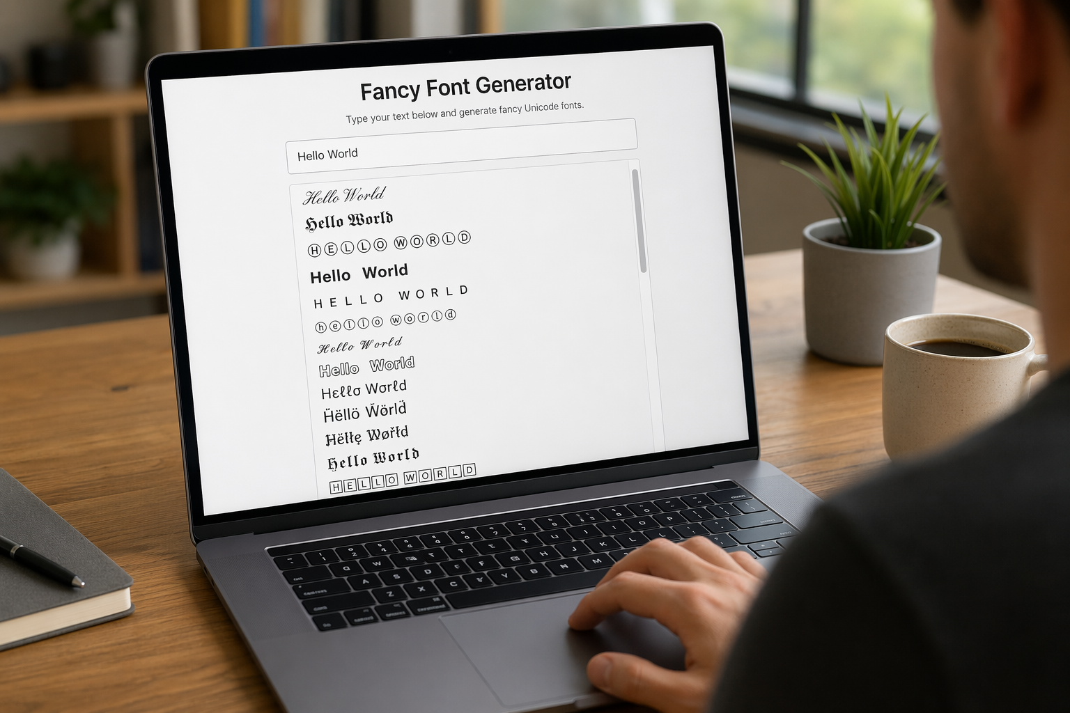
Remember that feeling when your social media posts just... vanished into the feed? I certainly do! For ages, I struggled to make my words pop. Then, I stumbled upon fancy font generators, and honestly, they've been a game-changer. They're my little secret for crafting text that truly stands out, making my content memorable without needing any fancy design degrees.

Have you ever just stopped to stare at the vast, endless blue of the sky or the deep, mysterious ocean? It feels like blue is everywhere, right? But then I started noticing something peculiar: when it comes to living things—plants, animals, us—true blue is incredibly hard to find. It got me wondering: why is such a common color in our world so shockingly rare in the vibrant tapestry of life? Let's explore this beautiful mystery together.
