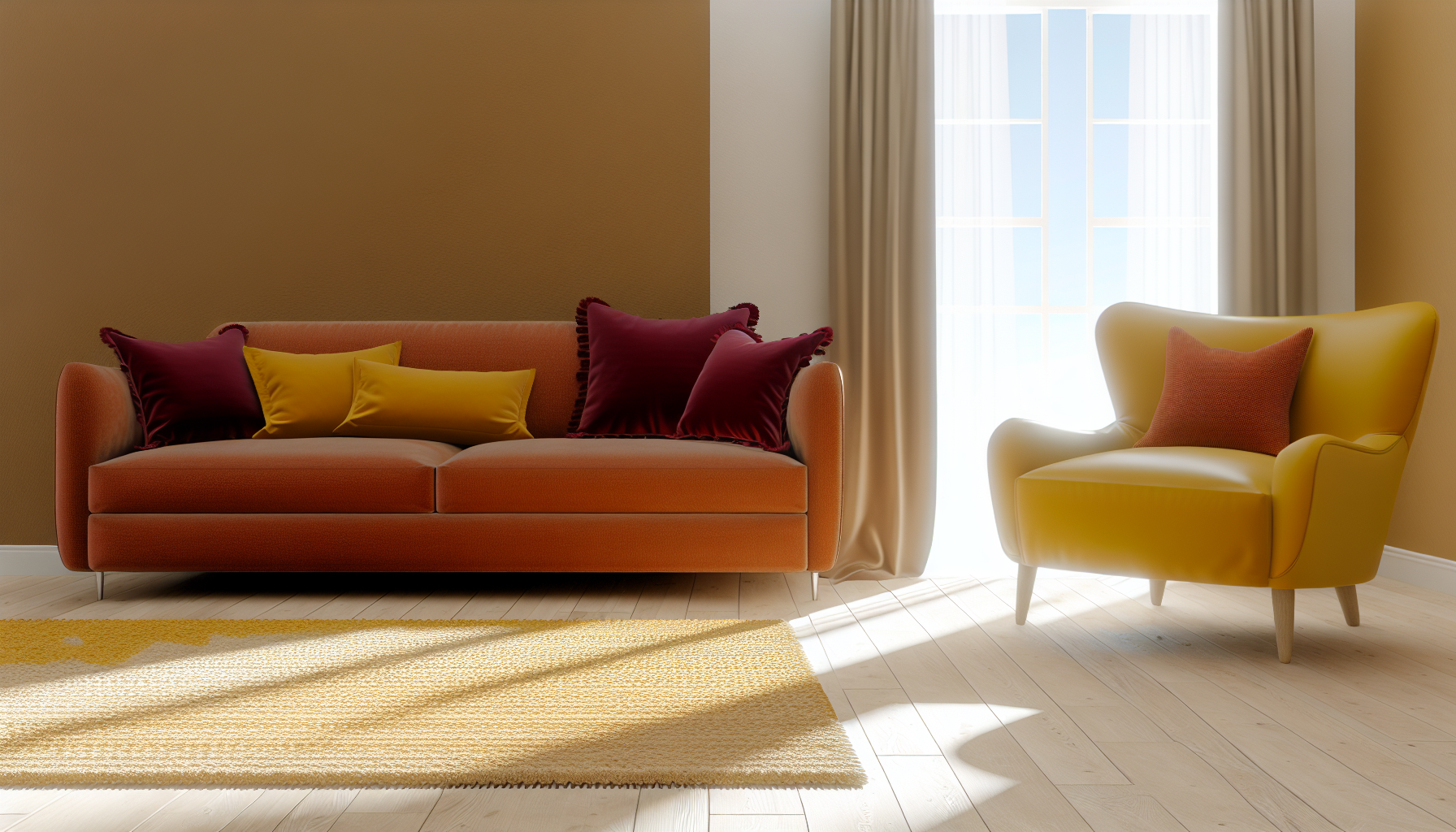
Have you ever walked into a room and just felt something? That undeniable shift in your energy, that sudden sense of calm, or maybe a burst of excitement? I know I have! More often than not, the magic behind those feelings is all thanks to the powerful influence of warm colors, silently stirring our emotions and changing our perceptions.
Warm colors are hues on one side of the color wheel, including red, orange, and yellow, along with their variations. They are associated with sunlight and fire, and they affect your mood by evoking feelings of happiness, optimism, energy, passion, and warmth.
But trust me, the true impact of these vibrant shades goes way beyond simple associations. If you're anything like me, you're probably eager to not just understand, but harness their power in your daily life and design projects. That's why I've dug deep, exploring the fascinating psychological nuances and practical applications to bring you insights you won't easily find elsewhere.
Because it's the brightest color perceived by the eye, large amounts can cause overstimulation, leading to eye strain and frustration.
Ever wondered why a red alert sign quickens your pulse or a yellow room feels cheerful? It's not just a feeling; it's a complex interplay of physics, physiology, and psychology. Let's explore the science that gives colors their emotional power.
The science behind color psychology involves how different wavelengths of light are processed by our eyes and interpreted by our brain. Specific colors can trigger physiological responses by stimulating the hypothalamus and pituitary gland, which in turn affect our hormones, mood, and behavior.
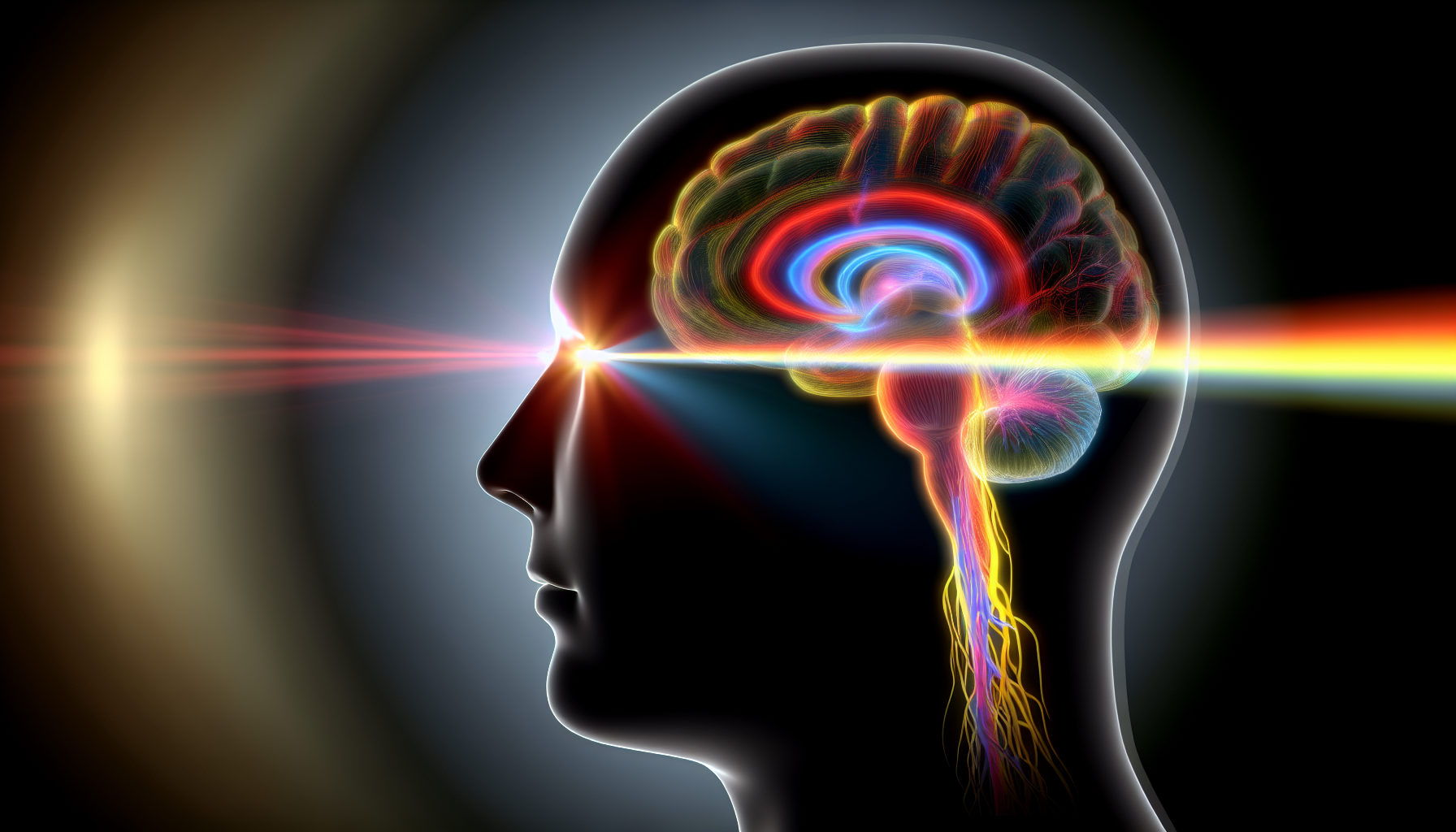
Color psychology isn't just about cultural associations; it's rooted in our biological and neurological responses to light. When we see a color, a chain reaction begins that can significantly influence our mental and physical state.
Our perception of color starts when light waves enter the eye and hit the retina, which contains photoreceptor cells. These cells convert light into electrical signals that travel along the optic nerve to the brain. The signals are processed in the visual cortex, but they also impact the hypothalamus, the part of the brain that controls the pituitary gland.
This process can trigger the release of various hormones. For instance, stimulating colors like red can increase adrenaline production, leading to a faster heart rate and heightened alertness. This is a core part of the autonomic nervous system response1 to environmental stimuli.
While our physiological reactions are partly hardwired, our emotional responses to color are also shaped by personal experiences and cultural backgrounds. A color's meaning can be deeply personal, tied to specific memories. However, there are also universal associations, many of which are linked to the natural world.
For example, the warmth of red and orange is often linked to the sun and fire. These fundamental connections form the basis for many of our shared emotional reactions. Understanding these dual influences is key to grasping the complexities of color perception2.
Here's a breakdown of how specific warm colors can scientifically affect us:
| Color | Physiological Effect | Psychological Association |
|---|---|---|
| Red | Increases heart rate, respiration, and blood pressure. Stimulates the adrenal gland. | Energy, passion, danger, excitement |
| Orange | Stimulates appetite and increases energy levels. Often seen as less aggressive than red. | Enthusiasm, creativity, happiness |
| Yellow | Stimulates the nervous system and can enhance concentration. The brightest color to the human eye. | Optimism, intellect, joy, caution |
This interplay between our bodies and minds is what makes color a powerful, non-verbal communication tool.
Red light stimulates the adrenal gland, releasing adrenaline. This hormone triggers a physiological response, increasing heart rate, respiration, and alertness as part of a fight-or-flight reaction.
Color responses are a mix of innate biological reactions and learned cultural associations. Our brains are hardwired to react to certain light wavelengths, independent of personal experience.
Ready to infuse your home with comfort and positive energy? Using warm colors is a fantastic way to create an inviting atmosphere. Let's explore how to strategically incorporate these vibrant hues to make your space feel like a warm embrace.
To use warm colors in home decor, start with an accent wall in a deep red or terracotta for a bold statement. For a more subtle approach, introduce warm tones through textiles like yellow cushions, orange throws, or a patterned rug. Furniture and lighting with warm metal finishes like brass or copper also work beautifully.
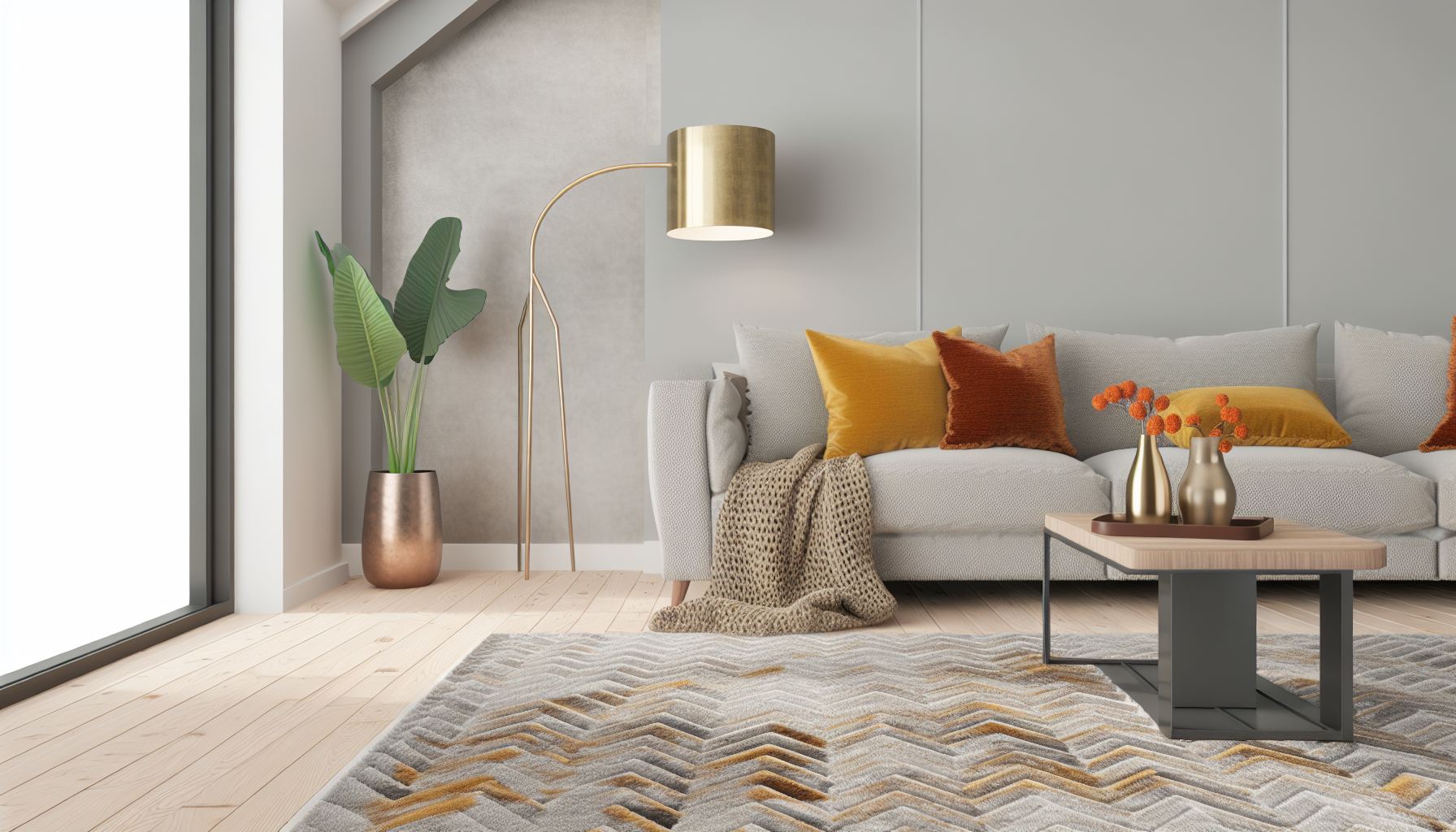
Infusing your home with warm colors can dramatically alter its ambiance, making it feel cozier and more welcoming. However, the key is application and balance. Here are several effective strategies for incorporating reds, oranges, and yellows into your interior design.
If you're hesitant to commit to a bold wall color, start small. Accent pieces are a fantastic, low-risk way to experiment. Think about:
For a more dramatic effect, consider an accent wall. Painting a single wall in a rich, warm color like terracotta, deep red, or mustard yellow can add depth and personality to a room without overwhelming it. This technique works particularly well behind a bed in a bedroom or behind the sofa in a living room to define the space.
Color isn't just about paint. Many natural materials have inherently warm undertones that can contribute to a cozy atmosphere.
While warm colors are inviting, too much of a good thing can feel intense or even agitating. The secret to a sophisticated design is balance. Pair bold warm colors with a generous amount of neutrals like cream, beige, soft gray, or white. This allows the warm tones to pop without dominating the room. You can also introduce small touches of cool colors, like blue or green, to create a dynamic and balanced contrast. Learning how to create color palettes with warm tones5 is key to achieving a harmonious look.
The text advises balancing warm colors with neutrals and cool tones to avoid an intense or agitating feeling, creating a more sophisticated and harmonious design.
The article explicitly lists brass, copper, and gold as warm metals that can be integrated through light fixtures, hardware, or frames to add warmth.
While warm colors are celebrated for their energy and cheer, they have a flip side. Overexposure or using them in the wrong context can turn that vibrant energy into something less desirable, creating spaces that feel more stressful than serene.
Yes, warm colors can have negative effects. Overuse of shades like red, orange, and yellow can lead to feelings of overstimulation, aggression, anxiety, and even eye strain. The key is to use them in moderation to avoid overwhelming the senses.
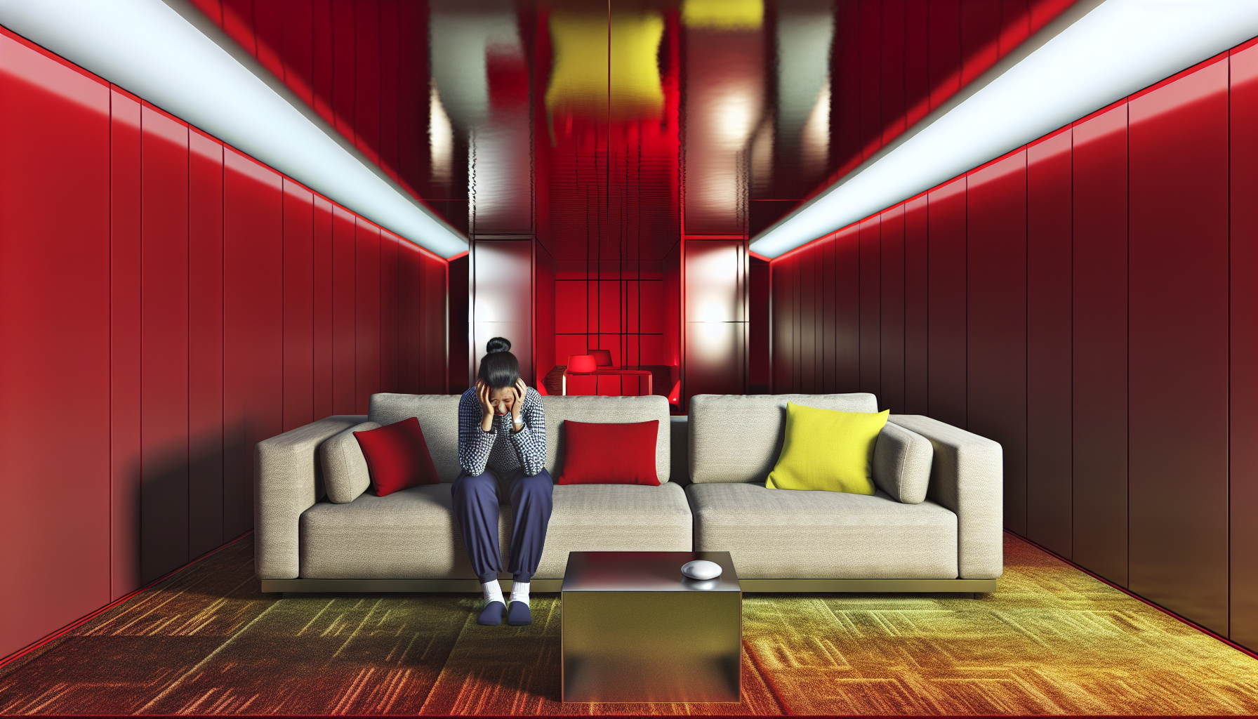
While we often associate warm colors with comfort and joy, their intensity can sometimes work against us. The same properties that make them energetic and attention-grabbing can also lead to negative psychological responses when used excessively or in the wrong environment.
Red is the most powerful warm color, linked to passion and love, but also to anger, danger, and aggression. Its high energy can increase heart rate and blood pressure. This is why it's used for stop signs and warnings—it demands immediate attention. In a room, too much red can create a sense of agitation or hostility, making it a poor choice for spaces intended for relaxation. Understanding the psychology of the color red6 is crucial before painting an entire room with it.
Yellow is the color of sunshine and happiness, but it's also the most fatiguing to the human eye. Large amounts of bright yellow can create feelings of frustration and anxiety. Some studies have even anecdotally suggested that babies tend to cry more in intensely yellow rooms. Lighter, buttery yellows are often fine, but vibrant, pure yellows should be used as accents to avoid overstimulation.
As a mix of red and yellow, orange combines energy with fun. However, it can also be overwhelming if not balanced correctly. Its attention-grabbing nature can feel aggressive and loud, making it difficult to concentrate or rest. Like red and yellow, it's often best used as a pop of color rather than the dominant shade in a room. Mastering color theory in interior design7 helps in using these vibrant hues without their negative side effects.
Here's a quick summary of potential downsides:
| Color | Potential Negative Effects |
|---|---|
| Red | Aggression, agitation, increased stress, danger |
| Yellow | Eye strain, anxiety, frustration, irritation |
| Orange | Overwhelming, attention-demanding, superficiality |
Red's high energy demands attention and can create a sense of agitation, leading to physiological responses like increased heart rate and blood pressure, making it unsuitable for relaxing spaces.
Yellow is the most fatiguing color to the human eye. Large quantities can cause eye strain, frustration, and anxiety, rather than creating a soothing effect.
Ever wondered how to balance the fiery energy of warm colors? The secret lies in their cool counterparts. Combining them creates visual harmony and dynamic contrast, turning any space from simple to stunning and achieving a perfectly balanced aesthetic.
The best cool colors to complement warm tones are their opposites on the color wheel. Blue beautifully complements orange, green pairs well with red, and purple balances yellow. Using these complementary pairs creates a high-contrast, visually appealing, and harmonious design.
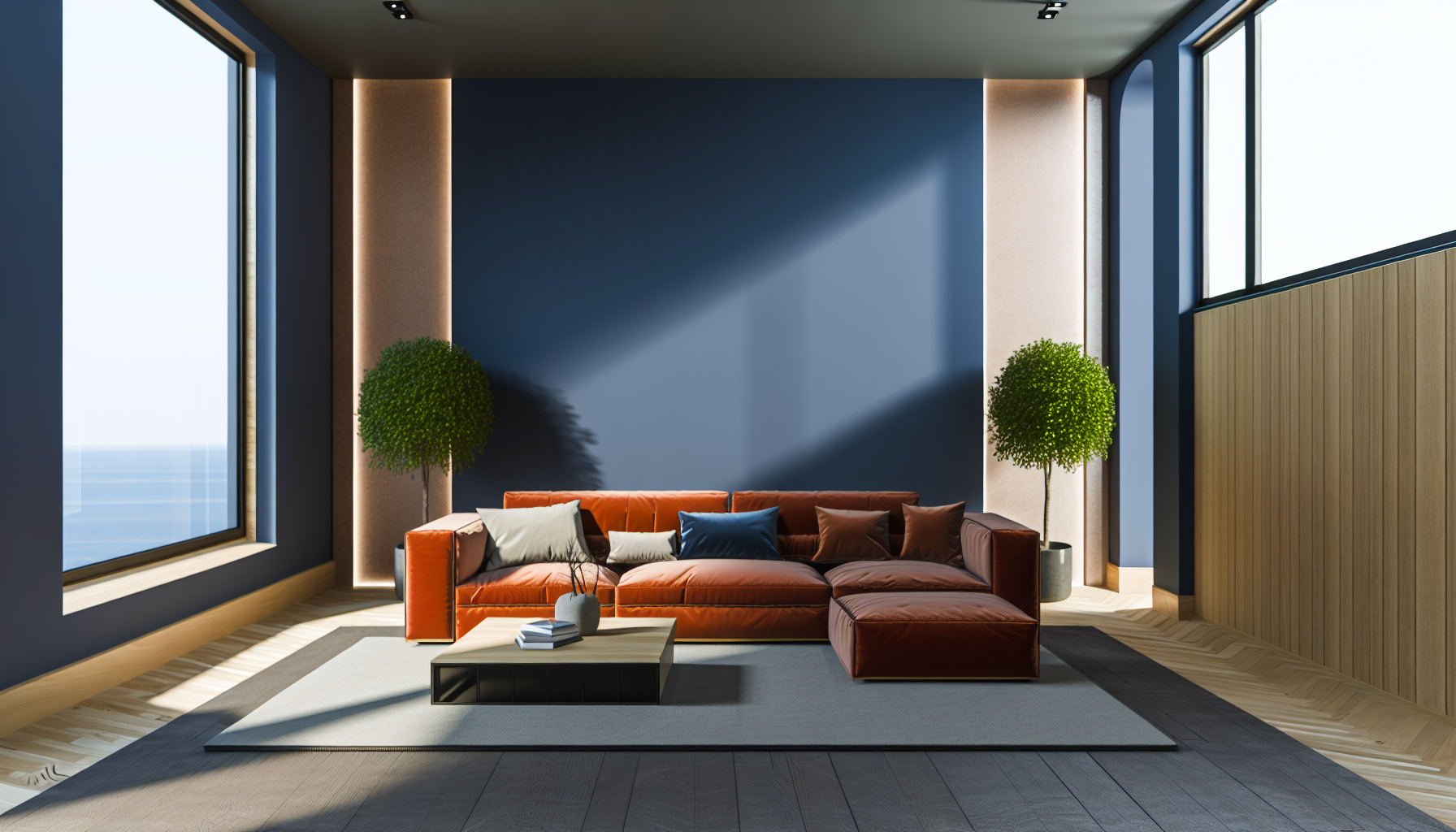
Pairing warm and cool colors is a classic design principle that creates balance and visual interest. The most effective way to do this is by using complementary colors—hues that sit directly opposite each other on the color wheel. This opposition generates a strong, dynamic contrast that is naturally pleasing to the eye.
This is perhaps the most popular complementary pairing. The calmness of blue provides a perfect counterbalance to the vibrant energy of orange. In interior design, a deep navy blue wall can make burnt orange accent pillows or a leather couch pop. For a softer look, light sky blue can be paired with subtle peach or apricot tones. Understanding the fundamentals of color wheel theory8 is key to mastering these combinations.
While often associated with holidays, the red and green combination is deeply rooted in nature. Think of a red rose on a green stem or a ripe strawberry in a field. To avoid a Christmas-like feel, use varied shades. For instance, a sophisticated look can be achieved with deep burgundy and muted olive green. Similarly, a terracotta red paired with a soft sage green creates an earthy, calming atmosphere that works well in living spaces. There are many ways of decorating with complementary colors9 to create a specific mood.
This pairing combines the richness of purple with the brightness of yellow. It can evoke feelings of royalty, luxury, and optimism. A deep plum or eggplant shade can be accented with touches of gold or mustard yellow for a dramatic and elegant effect. For a more playful and lighthearted scheme, pair soft lavender with a buttery yellow. This combination is particularly effective in branding and marketing, where using color psychology in design10 can capture attention and convey a specific message.
Here is a quick reference table for popular pairings:
| Warm Tone | Complementary Cool Tone | Mood Evoked |
|---|---|---|
| Orange | Blue | Energetic & Stable |
| Red | Green | Natural & Vibrant |
| Yellow | Purple | Cheerful & Regal |
Blue sits directly opposite orange on the color wheel, making them a classic complementary pair that creates a balanced and high-contrast look.
This pairing is rooted in nature. Using varied shades like deep burgundy with olive green can create a sophisticated, earthy look, avoiding a festive feel.
So there you have it! Now that you and I have journeyed through the powerful link between warm colors and our moods, you're equipped to intentionally use reds, oranges, and yellows. Go on, create those energetic, happy, and welcoming environments you've always dreamed of!
Learn how your body's automatic systems react to the colors you see daily: by Y Takemura · 2025 · Cited by 2 — Through these visual–emotional pathways, color stimuli can influence the balance between sympathetic and parasympathetic activity, thereby ... ↩
Explore the debate between learned and innate emotional responses to different colors: The study systematically probed infants' color perception, revealing how we perceive colors before we have the words to describe them, says ... ↩
Get inspired with creative and simple ways to add warmth using home accessories: Discover Pinterest's best ideas and inspiration for Warm accent colors. Get ... 10 Living Room Decorating Ideas You'll Want to Steal ASAP | Warm living room. ↩
Explore beautiful furniture pieces that can anchor your warm color design scheme: Learn how warm or cool leather undertones impact the mood of your room and choose the perfect base to match your interior style. ↩
Learn professional techniques for creating a harmonious and balanced color palette: To create a cozy backdrop that allows layered neutrals to shine, Curtis recommends choosing a warm taupe or creamy beige. “Right now I'm loving Neutral Ground ... ↩
Learn about the scientific research behind how the color red affects human behavior: Red is linked to anger and seeing red can mean someone's angry. Wearing red can make athletes appear more dominant and increase their chances of ... ↩
Get practical tips for balancing warm and cool colors in your home decor: An introduction to color theory: what it is, ways you can incorporate it into your spaces, and how I've applied color theory in my own home. ↩
Understand the science behind perfect color pairings for a balanced and harmonious design: Complementary. Two colors that are on opposite sides of the color wheel. This combination provides a high contrast and high impact color combination – together ... ↩
Get inspired with real-world examples of beautiful complementary color schemes in homes: Tips for Using Complementary Colors in Room Décor · Use hard surfaces like tile, brick, marble and flooring to guide color selection. · Create complementary color ... ↩
Learn how color choices can influence emotions and perceptions in your projects: Color psychology is a fundamental aspect of branding and product design. It's important to under the emotional impact of colors in order to know how to apply ... ↩
Recommended reading: the latest three posts in this language.

Ever find yourself scrolling, searching for that perfect little mental escape? I know I do! When it comes to online tile puzzles, the options can feel endless. But don't worry, I've sifted through the colorful chaos to find the absolute best, including the beloved original Google game and some fantastic alternatives, just for you.
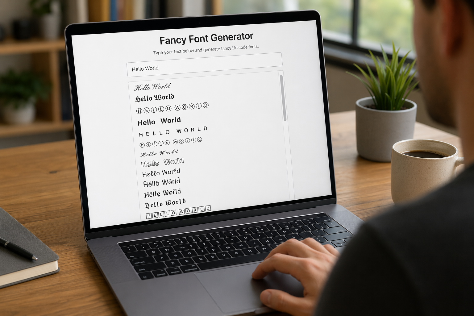
Remember that feeling when your social media posts just... vanished into the feed? I certainly do! For ages, I struggled to make my words pop. Then, I stumbled upon fancy font generators, and honestly, they've been a game-changer. They're my little secret for crafting text that truly stands out, making my content memorable without needing any fancy design degrees.

Have you ever just stopped to stare at the vast, endless blue of the sky or the deep, mysterious ocean? It feels like blue is everywhere, right? But then I started noticing something peculiar: when it comes to living things—plants, animals, us—true blue is incredibly hard to find. It got me wondering: why is such a common color in our world so shockingly rare in the vibrant tapestry of life? Let's explore this beautiful mystery together.
