Color is more than just a visual element; it's a powerful communication tool. When a visitor lands on your site, the colors you've chosen are the first thing to make an impression, setting the tone for their entire experience. Are you using them to your full advantage?
A warm color palette can enhance your website design by evoking feelings of energy, happiness, passion, and comfort. Colors like red, orange, and yellow are psychologically associated with positivity and action, which helps to grab user attention, increase engagement, and create a strong, memorable brand identity.
But simply splashing warm colors across your site isn't enough. To truly unlock their potential, you need a strategic approach. In this guide, we’ll dive deep into the psychology behind these powerful hues and provide actionable tips to help you build a stunning and effective warm color scheme. I've learned these lessons through years of trial and error, and I'm excited to share what I've discovered.
This principle, adapted from interior design, works perfectly for web design to create a balanced, harmonious color scheme by distributing color weights.
Ever wondered why a splash of red grabs your attention or a touch of yellow feels cheerful? It's not a coincidence. It's color psychology at work, subtly influencing our emotions and guiding our actions online.
The psychology behind using warm colors in web design is rooted in their ability to evoke strong emotions. Hues like red, orange, and yellow are linked to energy, happiness, and passion. Their high visibility stimulates the brain, creating a sense of urgency or excitement, which effectively draws user attention.

Warm colors—reds, oranges, and yellows—are known as advancing colors because they appear to come forward, grabbing your attention instantly. This is a primal response tied to our survival instincts; think of fire, sunsets, or ripe fruit. In web design, this translates into a powerful tool for guiding user focus and evoking specific feelings. Understanding the nuances of each color is key to applying color psychology principles1 effectively.
Red is one of the most intense colors in the spectrum. It's associated with a wide range of powerful emotions, from love and passion to anger and danger.
Orange combines the energy of red with the cheerfulness of yellow, resulting in a hue that feels enthusiastic, creative, and friendly.
Yellow is the color of sunshine, universally associated with happiness, optimism, and warmth. It's the most visible color to the human eye.
Here's a quick breakdown of their psychological associations:
| Color | Positive Associations | Negative Associations | Best Used For |
|---|---|---|---|
| Red | Passion, Energy, Love, Urgency | Anger, Danger, Warning | CTAs, Sales, Breaking News, Food Brands |
| Orange | Enthusiasm, Fun, Confidence | Immaturity, Frustration | Creative Brands, Subscriptions, Youth-oriented sites |
| Yellow | Happiness, Optimism, Warmth | Anxiety, Caution, Eye Strain | Highlighting, Accents, Creating a cheerful mood |
Red is an intense color that creates a sense of urgency. This can trigger a physiological response, making it effective for calls-to-action like 'Buy Now'.
While yellow is optimistic, it's the most visible color to the human eye. Overuse of bright yellow can cause significant eye fatigue and strain for users.
Warm colors are powerful, but too much of a good thing can be a disaster. How do you find that perfect harmony? Let's explore the art of creating a balanced warm palette that captivates, not overwhelms, your audience.
To create a balanced warm color scheme, use the 60-30-10 rule: 60% for a dominant neutral color, 30% for a secondary warm color, and 10% for a warm accent. Incorporating ample white space and cooler complementary colors also prevents visual fatigue and ensures a harmonious user experience.
Achieving balance is crucial when working with an energetic warm palette. An overly saturated or poorly distributed scheme can feel aggressive and cause users to leave your site. The goal is to guide the eye and create a specific mood without causing sensory overload.
A timeless interior design principle that works perfectly for web design. This rule helps you distribute colors in a way that is pleasing to the eye.
White space (or negative space) is the empty area around your design elements. It is not wasted space; it's a critical tool for creating focus and preventing visual clutter. When using bold warm colors, generous white space gives them room to breathe, making them feel intentional rather than chaotic. Neutrals like gray or beige can soften the intensity of a warm palette, providing a calming backdrop. These are essential color theory principles3 for any designer.
A small touch of a cool color, like blue or green, can create a beautiful contrast and make your warm colors pop even more. This is known as a complementary color scheme. For example, a website with a primarily orange and beige palette could use hints of deep blue for links or secondary buttons. This contrast adds visual interest and helps establish a clear visual hierarchy. Understanding how to start using complementary colors effectively4 can elevate your design from good to great.
Your warm palette doesn't have to be composed of pure, highly saturated colors. Playing with variations can add sophistication and depth.
| Term | Definition | Example (with Orange) |
|---|---|---|
| Tint | Adding white to a pure color | Peach |
| Tone | Adding gray to a pure color | Burnt Orange |
| Shade | Adding black to a pure color | Brown |
By using a mix of these, you can create a monochromatic or analogous warm scheme that is rich and layered without being overwhelming.
The 60-30-10 rule suggests using the 60% portion for a dominant neutral color to act as a canvas for the design.
This is incorrect. Adding black to a color creates a shade. A tint is created by adding white to a color.
The choice of a color palette isn't arbitrary; it's a strategic decision. While warm colors are powerful, their effectiveness varies dramatically across different sectors. Let’s explore which industries can leverage hues like red, orange, and yellow to connect with their audience.
Industries that benefit most from a warm color palette include food and beverage, travel and hospitality, entertainment, and children's products. These colors are effective because they stimulate appetite, convey energy and happiness, capture attention, and create a friendly, inviting atmosphere perfectly suited to these markets.

Certain industries are naturally aligned with the psychological effects of warm colors. By understanding this connection, brands can create a more powerful and intuitive user experience that resonates with their target audience.
This is perhaps the most classic example. Warm colors are known to stimulate the appetite and create a sense of urgency.
Warm colors are perfect for selling experiences related to fun, sun, and adventure.
In a crowded digital space, grabbing attention is crucial. Warm colors excel at this by creating a sense of excitement and energy.
Warm colors are inherently playful and engaging, making them a natural fit for brands targeting children and families. Bright yellows, friendly oranges, and exciting reds can create a fun, positive, and stimulating environment that appeals to a younger audience.
Red is associated with excitement and can trigger feelings of hunger, making it a classic choice for food brands looking to increase sales.
The context states warm colors like yellow and orange are ideal for travel, as they evoke feelings of sunshine, happiness, and adventure.
Warm colors bring energy and passion, but they can be tricky. A small misstep can transform a welcoming design into an overwhelming one. Let's look at the common pitfalls to sidestep, ensuring your palette is effective, not overpowering.
Common mistakes to avoid when designing with warm colors include using overly saturated hues that cause eye strain, creating poor contrast which harms readability, neglecting the role of neutral colors for balance, and failing to consider the cultural connotations of specific shades, which can lead to misinterpretation.
While warm colors can make a design feel vibrant and inviting, using them incorrectly can have the opposite effect. Being aware of common design traps is key to harnessing their power effectively.
One of the most frequent errors is drenching the entire design in highly saturated warm colors. A bright, fiery red or a neon orange used excessively can feel aggressive and cause visual fatigue for the user. Instead of drawing users in, it pushes them away.
Passion for color should never compromise readability. Placing light-colored text (like yellow) on a white background or dark red text on a black background makes content difficult to read. This not only frustrates users but also negatively impacts your site's accessibility.
Warm colors need breathing room. A design without neutral colors like white, gray, beige, or black can feel claustrophobic and chaotic. Neutrals provide balance, create a clean visual hierarchy, and allow the warm accent colors to truly pop without competing for attention.
Colors carry powerful cultural meanings that can vary dramatically across the globe. For example, while red signifies luck and prosperity in China, it often represents danger or warning in Western cultures. Ignoring this can lead to your brand message being misinterpreted by a global audience.
Here's a quick summary of what to do and what to avoid:
| Do | Don't |
|---|---|
| Use bright warm colors for accents and CTAs. | Saturate the entire page with bright colors. |
| Pair warm colors with plenty of neutral space. | Forget to include white, gray, or black for balance. |
| Check contrast ratios for readability. | Place light text on a light warm background. |
| Research cultural color meanings. | Assume a color's meaning is universal. |
Overusing saturated warm colors causes eye strain and feels overwhelming. They are best used as accents for important elements, not for large background areas.
Colors carry varied cultural meanings. For example, red can mean luck in China but danger in Western cultures, making cultural research essential for global design.
I truly believe that by thoughtfully applying a warm color palette, you can create a website that not only looks great but also connects with users on a deeper, emotional level. Now, it's your turn to bring some warmth and energy to your design!
Understand the fundamental principles of how colors influence consumer behavior: The psychology of color suggests general guidelines for the ways that various hues and shades influence consumer behavior. ↩
Learn how to design CTAs that effectively drive user clicks and conversions: Your CTA should be easy to see and understand. Set it apart from the other text by adding space and making it large and distinct enough to ... ↩
Master this classic design rule for creating perfectly balanced color palettes: How do you apply color in mobile UI design projects? Here's a little tip, the 60-30-10 color rule(it's more like a guideline) will help you ... ↩
Learn how to create dynamic contrast and visual interest with complementary colors: Complementary: For a complementary color scheme, you use “opposite color” pairs (like blue and yellow, below) to maximize contrast. ↩
See real-world examples of how top brands use warm colors to attract customers: Check out these 7 case studies of food and beverage brands that transformed their look, leveled up their game, and built brands people can't ... ↩
Ensure your text is readable for all users by following accessibility standards: A contrast ratio of 3:1 is the minimum level recommended by [ISO-9241-3] and [ANSI-HFES-100-1988] for standard text and vision. The 4.5:1 ratio is used in this ... ↩
Learn how colors are perceived globally to avoid sending the wrong message: Color conveys messages, invokes emotion, and helps establish a brand's identity. Discover how the meanings attributed to colors vary across ... ↩
Recommended reading: the latest three posts in this language.

Ever find yourself scrolling, searching for that perfect little mental escape? I know I do! When it comes to online tile puzzles, the options can feel endless. But don't worry, I've sifted through the colorful chaos to find the absolute best, including the beloved original Google game and some fantastic alternatives, just for you.
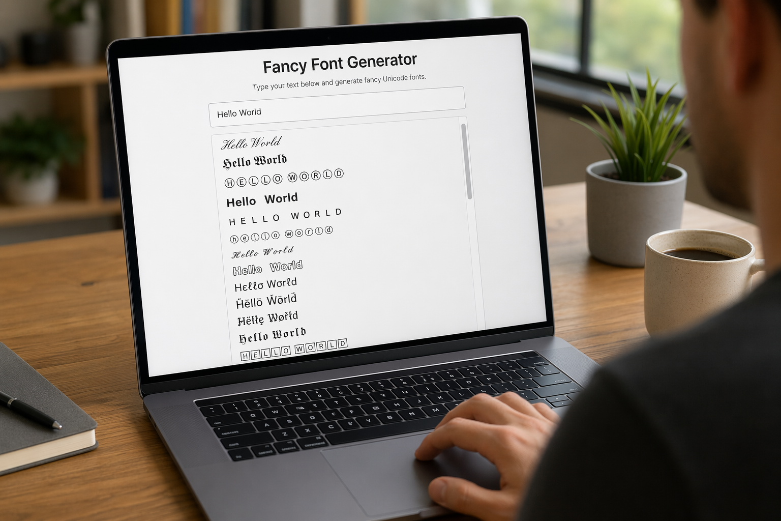
Remember that feeling when your social media posts just... vanished into the feed? I certainly do! For ages, I struggled to make my words pop. Then, I stumbled upon fancy font generators, and honestly, they've been a game-changer. They're my little secret for crafting text that truly stands out, making my content memorable without needing any fancy design degrees.

Have you ever just stopped to stare at the vast, endless blue of the sky or the deep, mysterious ocean? It feels like blue is everywhere, right? But then I started noticing something peculiar: when it comes to living things—plants, animals, us—true blue is incredibly hard to find. It got me wondering: why is such a common color in our world so shockingly rare in the vibrant tapestry of life? Let's explore this beautiful mystery together.
