
Oh, the thrill of a blank canvas or a fresh design! I often find myself staring at two vibrant colors, red and purple, wondering what magic they'll create when they meet. If you've ever felt that same curiosity, you're in the right place, because we're about to unveil the stunning secret behind their blend.
When you mix red and purple, you get the color magenta. Since purple is created by mixing red and blue, adding more red simply intensifies the red tones within the purple. The result is a rich, reddish-purple hue that sits between red and purple on the color wheel.
But wait, there's more to this captivating color than just a simple mix! I've learned firsthand that getting that perfect shade of magenta is a nuanced art. The type of pigments, the ratio, even the medium you're using—it all plays a crucial role. Trust me, I've spent countless hours experimenting, and I'm excited to share the insights I've gathered to help you master this beautiful blend.
Magenta is a secondary color in the RGB model, created by mixing red and blue light. It is a primary color in the CMYK model for printing.
The secret to your perfect magenta lies in the balance. The ratio of red to purple is the key that unlocks a whole spectrum of reddish-purples. Let's explore how to fine-tune this mix for your desired shade.
The ratio of red to purple directly controls the final color's warmth and intensity. Adding more red creates a warmer, more vibrant reddish-magenta. Conversely, increasing the amount of purple results in a cooler, deeper, and more subdued violet-magenta hue.
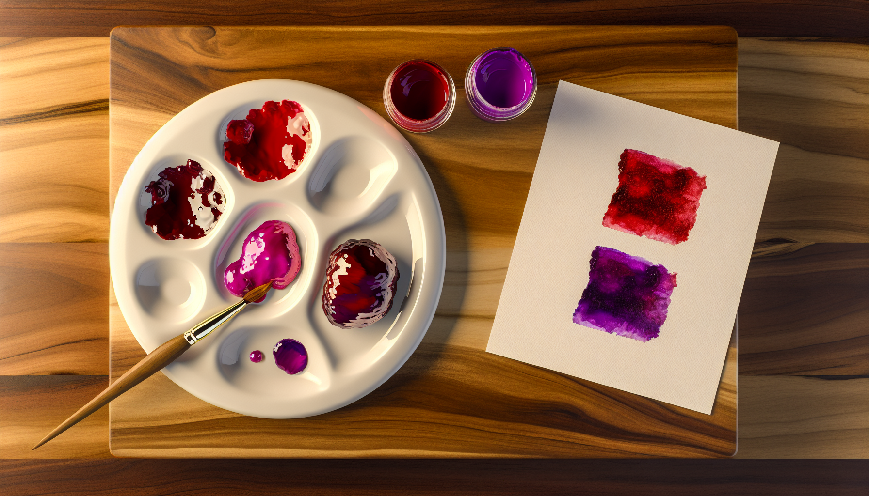
The proportion of each color you use is the most critical factor in determining the final shade when mixing red and purple. Think of it as a sliding scale between the two parent colors. By adjusting the ratio, you can create a wide range of beautiful magenta variations.
When you increase the amount of red in your mixture, you are essentially amplifying the warm undertones. Since purple is made from red and blue, adding more red strengthens the red component that's already present.
On the other hand, adding a higher proportion of purple will cool down the mixture. The blue within the purple becomes more influential, pulling the final color away from pure red and towards a deeper, more mysterious shade.
To get a feel for how the ratios work, it's best to experiment. Start with a base color and slowly add the other. Here’s a simple guide to get you started, which is particularly helpful if you're learning how to mix paint colors2.
| Ratio (Red | Resulting Color Name | Description |
|---|---|---|
| 2:1 | Red-Magenta | A vibrant, warm color with strong red undertones. |
| 1:1 | True Magenta | A balanced, classic reddish-purple. |
| 1:2 | Violet-Magenta | A deeper, cooler color that leans noticeably more towards purple. |
By precisely controlling the amounts, you can customize the final hue to perfectly match your creative vision.
Increasing the purple ratio introduces more blue, which cools down the mixture, resulting in a deeper, cooler shade like violet-magenta.
An equal mix of red and purple creates a balanced, classic reddish-purple hue, which is referred to as true magenta.
Magenta, violet, and fuchsia are often used interchangeably, but they are distinct hues with unique origins and visual properties. Understanding their differences is key to mastering color theory and using these vibrant shades effectively in any creative project.
The main difference lies in their composition. Magenta is a reddish-purple that balances red and blue. Violet is a true spectral color with a shorter wavelength, appearing more bluish. Fuchsia is a vivid purplish-red, often perceived as brighter and more pink-toned than magenta.

While they belong to the same color family, these three hues have fascinating distinctions that are rooted in science and art.
Magenta is unique because it doesn't exist as a single wavelength of light; our brains perceive it when we see an equal mix of red and blue light. In the subtractive color model (like paint or ink), it's a primary color in the CMYK printing process3. It sits perfectly between red and purple, acting as a bridge between the two.
Unlike magenta, violet is a true spectral color. It has its own place at the end of the visible light spectrum, right after blue. This means violet is a pure color with its own wavelength (approximately 380–450 nanometers). It is naturally less saturated and darker than the purples we often mix with pigments. When you see a rainbow, the final band of color you see is true violet.
Fuchsia is named after the fuchsia plant and is known for its vivid, saturated appearance. It's a purplish-red color that often leans more towards pink than magenta does. Think of it as a high-energy, electrifying version of magenta. In digital color systems, fuchsia and magenta can sometimes share the same RGB color values4, but in print and fashion, fuchsia is typically brighter and more intense.
To make it clearer, here is a simple comparison table:
| Feature | Magenta | Violet | Fuchsia |
|---|---|---|---|
| Origin | Mix of red & blue light | Spectral color | Purplish-red pigment |
| Appearance | Balanced reddish-purple | Bluish-purple | Vivid, pinkish-purple |
| On the Spectrum | Not a spectral color | End of the spectrum | Not a spectral color |
Violet has its own wavelength on the visible light spectrum, while magenta and fuchsia are created by mixing other colors and are not on the spectrum.
The text describes fuchsia as a vivid, high-energy, and more intense color than magenta, often appearing brighter and more pink-toned.
Mixing red and purple isn't just for painters. The rules change dramatically when you move from a physical canvas to a digital screen. Let's explore how different mediums transform this color combination and the science behind the stunning results.
In physical mediums like paint (subtractive mixing), combining red and purple creates a deeper magenta. In the world of light (additive mixing), such as on screens, mixing red and purple light produces a brighter, more luminous magenta because you are adding light wavelengths together.
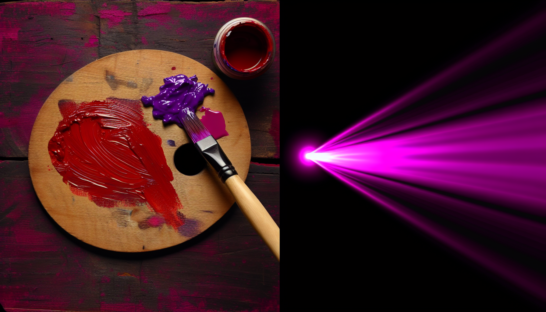
The outcome of mixing red and purple depends entirely on whether you are working with pigments or light. These two methods, known as subtractive and additive color mixing, operate on completely different principles.
When you mix paints, inks, or dyes, you're using a subtractive color model. Pigments absorb certain wavelengths of light and reflect others. The color we see is the light that is reflected back to our eyes.
Digital screens, monitors, and stage lighting use the additive color model. Colors are created by adding different wavelengths of light together. The primary colors of light are red, green, and blue (RGB).
Here is a simple breakdown:
| Medium | Color Model | Process | Result |
|---|---|---|---|
| Paint/Ink | Subtractive | Pigments absorb light | Deeper, darker magenta |
| Screen/Light | Additive | Light sources combine | Brighter, luminous magenta |
Paint mixing is a subtractive process. Pigments absorb light, creating a deeper, darker magenta, not a brighter one.
Screens combine red, green, and blue light (additive mixing) to create colors, which is why mixing red and purple light produces a vibrant magenta.
The color wheel is a map of hues, but where does the vibrant and mysterious magenta find its home? Let's pinpoint its exact location in the spectrum of colors.
Magenta is positioned on the color wheel directly between red and purple. In the subtractive color model (CMYK), used for printing, magenta is a primary color. In the additive color model (RGB), used for screens, it's a secondary color created by mixing red and blue light.

Magenta's position on the color wheel can be a bit confusing because it depends on which color model you are using. It's not a spectral color found in the rainbow; instead, it's what our brains perceive when red and blue light stimulate our eyes simultaneously.
In the world of printing, the color model used is subtractive, often referred to as CMYK. In this system, magenta is not a mix—it's a primary color alongside cyan and yellow. These three colors, plus black (K), are used to create nearly every other hue you see on printed materials. When you mix red and purple pigments, you are essentially creating a version of this primary magenta. The color sits between red and violet on this wheel, created by subtracting green light. For a deeper understanding, you can explore the subtractive color model7.
For screens, televisions, and digital displays, the additive RGB color model is used. In this model, the primary colors are red, green, and blue light. When you mix red light and blue light at full intensity, you get magenta. Therefore, in the RGB color wheel, magenta is a secondary color, sitting perfectly between the primary colors of red and blue. This is why magenta often looks so vibrant and electric on a screen. You can learn more about how screens create color with the additive color model8.
So, while in the physical world of paint mixing (a subtractive process), you create magenta from red and purple, its fundamental place is either as a primary (CMY) or secondary (RGB) color, always nestled between the realms of red and blue/violet.
The subtractive CMYK model, used for printing, considers magenta a primary color alongside cyan and yellow to create a full range of hues on paper.
In the additive RGB model for digital displays, magenta is a secondary color created by mixing the primary colors red and blue.
So, the secret's out: red and purple dance together to create mesmerizing magenta! I truly hope this journey empowers you to confidently blend your own stunning reddish-purple masterpieces. Now, go on, unleash your inner artist!
Understand the fundamental principles of color mixing for better artistic results: Color Mixing 101: Understand how to simplify color mixing and color theory by learning one step at a time just how colors interact. ↩
Get practical tips and techniques for accurately mixing various paint colors: Write the names of your paints in this order: white, black, Your darkest purple/blue, and then follow the color wheel to your last color, which should be your ... ↩
Learn how magenta is used as a primary color in professional printing processes: To save cost on ink, and to produce deeper black tones, dark colors are produced by using black ink instead of or in addition to combinations of cyan, magenta, ... ↩
Get the exact digital codes to differentiate between fuchsia and magenta on screens: "Fuchsia and magenta are essentially the same color in the RGB color model, both represented by the hex code #FF00FF. However, in printing ... ↩
Learn the science of mixing physical pigments like paint and ink: This idealized model is the essential principle of how dyes and pigments are used in color printing and photography, where the perception of color is elicited ... ↩
Discover how digital devices create millions of colors by combining light: In the additive color model, the addition of colored light brings the overall color closer and closer to white. We use RGB values and hex codes ... ↩
Learn how magenta acts as a primary color in printing processes: Subtractive color mixes wavelengths of light to produce what we perceive as color. However, the subtractive model uses pigments or ink to block – subtract – ... ↩
Understand how screens mix red and blue light to create vibrant magenta: The RGB color model is an additive color model in which the red, green, and blue primary colors of light are added together in various ways to reproduce a ... ↩
Recommended reading: the latest three posts in this language.

Ever find yourself scrolling, searching for that perfect little mental escape? I know I do! When it comes to online tile puzzles, the options can feel endless. But don't worry, I've sifted through the colorful chaos to find the absolute best, including the beloved original Google game and some fantastic alternatives, just for you.
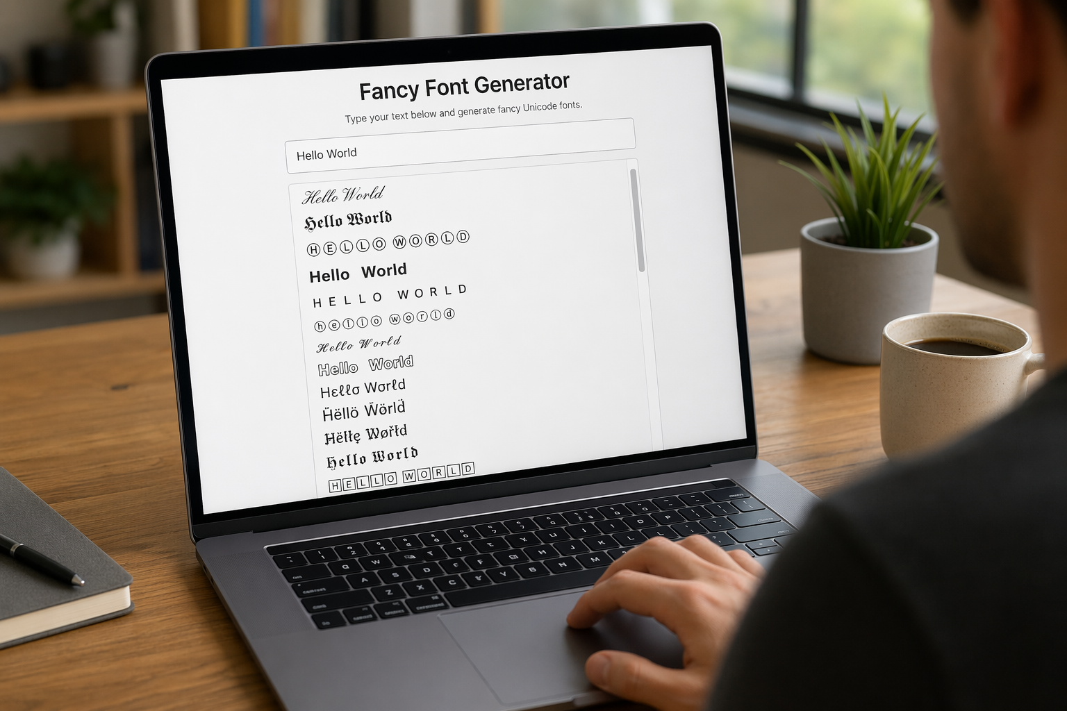
Remember that feeling when your social media posts just... vanished into the feed? I certainly do! For ages, I struggled to make my words pop. Then, I stumbled upon fancy font generators, and honestly, they've been a game-changer. They're my little secret for crafting text that truly stands out, making my content memorable without needing any fancy design degrees.

Have you ever just stopped to stare at the vast, endless blue of the sky or the deep, mysterious ocean? It feels like blue is everywhere, right? But then I started noticing something peculiar: when it comes to living things—plants, animals, us—true blue is incredibly hard to find. It got me wondering: why is such a common color in our world so shockingly rare in the vibrant tapestry of life? Let's explore this beautiful mystery together.
