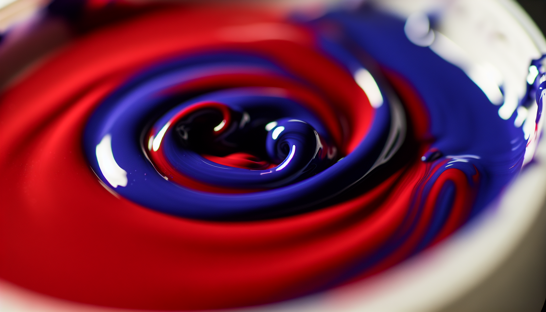
Have you ever stood there, paintbrush poised, dreaming of that perfect purple, only to watch your vision dissolve into a murky mess? Trust me, I've been there more times than I can count. The magic of red and blue together holds more secrets than you'd ever guess!
When mixing red and blue pigments, such as paint or ink, the resulting color is purple or violet. In the additive color model, which applies to light, mixing red and blue light produces magenta. The final shade depends on the color bias and proportions of the specific red and blue used.
But let's be real, actually getting that vibrant, dazzling purple isn't always as simple as it sounds. If you're tired of muddy outcomes and craving those rich, true hues, stick with me. I'm about to pull back the curtain on the hidden truths of color theory that will change your mixing game forever!
Mixing red and blue light is an additive process that creates magenta. Purple results from mixing red and blue pigments, which is a subtractive process.
Expecting a vibrant purple but ending up with a dull, muddy brown is a common frustration for artists. This unexpected outcome isn't a mistake but a predictable result of a fundamental principle in color theory. Let's explore why this happens.
Mixing red and blue can make brown because most paint pigments are not pure primary colors. If the red has a yellow bias (making it a warm red) and the blue also contains some yellow (making it a greenish-blue), you are inadvertently mixing all three primary colors: red, blue, and yellow. This combination neutralizes the colors, resulting in brown.

The surprising appearance of brown when mixing red and blue is almost always due to the inherent impurities and biases within your paints.
In theory, red and blue make purple. In practice, the specific tube of red or blue paint you use is rarely a 'pure' primary color. Each pigment has a 'color bias,' meaning it leans towards another color. A red can be a warm, orange-red (with a yellow bias) or a cool, magenta-red (with a blue bias). Similarly, a blue can be a warm, greenish-blue (with a yellow bias) or a cool, purplish-blue (with a red bias).
When you mix a red with a yellow bias (like Cadmium Red) with a blue that also has a yellow bias (like Cerulean Blue), you're not just mixing red and blue. You're also introducing yellow into the equation. This leads us to the next point.
The secret to making brown is to mix all three primary colors—red, yellow, and blue. When you combine a warm red and a warm blue, the hidden yellow from both pigments gets mixed in. This combination of red, yellow, and blue neutralizes the mixture, desaturating the potential purple and turning it into a muddy brown or a dull gray. The resulting color is essentially a very low-intensity purple or a dark, neutralized orange.
To achieve a vibrant purple, you need to mix a red and a blue that don't have a hidden yellow bias. For instance, mixing a cool red (like Quinacridone Magenta) with a blue that leans towards red (like Ultramarine Blue) will produce a much cleaner, more brilliant purple. Understanding color bias in paint mixing1 is crucial for any artist.
Developing a palette based on this knowledge, such as a split-primary palette, can give you greater control over your color mixing. By having both a warm and a cool version of each primary, you can mix a wider range of clean, vibrant secondary colors. You can find more information by looking into guides on choosing primary colors for a palette2.
Brown is created when a third primary color, yellow, is introduced through pigment impurities. Pure red and blue lack this, creating a clean purple.
This combination introduces yellow from both pigments' warm bias, neutralizing the mix and creating brown instead of a vibrant purple.
Ever noticed how colors on your screen behave differently than paints on your palette? It's not magic, it's science. The key lies in understanding whether you're adding light or subtracting it, a fundamental concept for any creator or artist.
The main difference is that mixing light is an additive process, while mixing paint is a subtractive one. In the additive model (light), you start with black and add colored light to create white; mixing red and blue light makes magenta. In the subtractive model (paint), you start with white and add pigments that absorb light; mixing red and blue paint creates purple.
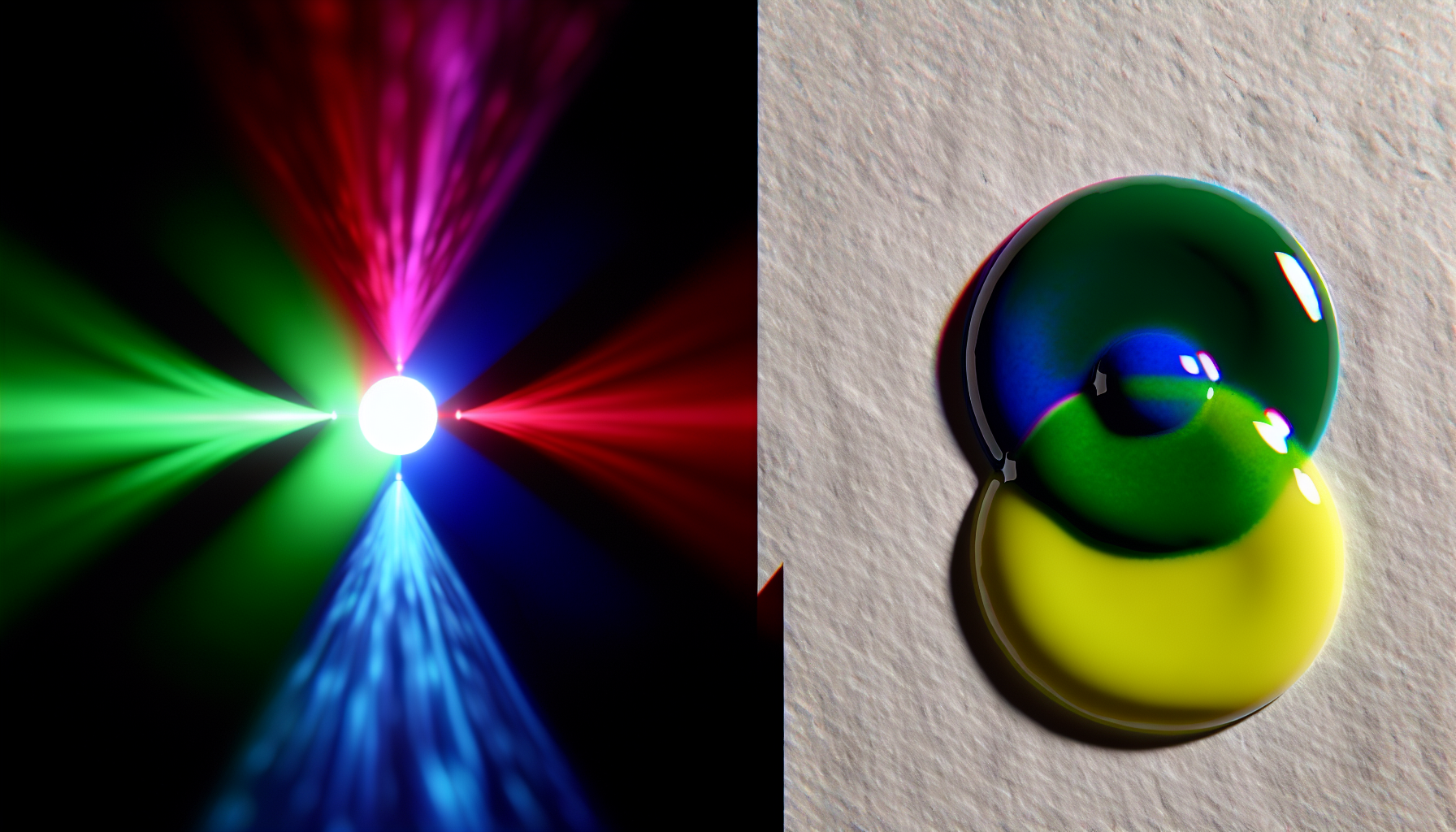
The fundamental difference lies in two opposite processes: additive and subtractive color mixing. One creates color by adding light to a dark space, while the other creates color by absorbing, or subtracting, light from a bright surface.
When we talk about mixing light—such as the pixels on a computer screen, TV, or phone—we are working with the additive color model. The primary colors of light are Red, Green, and Blue (RGB). This process begins with black (the absence of light). As you add colored light sources together, their wavelengths combine, and the colors get lighter, moving toward white.
When all three primary colors of light are combined at full intensity, you get pure white light. This is why mixing red and blue light results in the bright, vibrant color magenta, not the deeper purple you get with paint. You can learn more about how digital screens create millions of colors with the additive color model3.
Mixing physical substances like paint, ink, or dyes is a subtractive process. This model applies to the colors of physical objects. The process starts with a white surface (like paper or canvas) that reflects all colors of light. When you add a pigment, it absorbs (or 'subtracts') certain wavelengths of light and reflects others. The color you perceive is composed of the wavelengths that are reflected back to your eye.
The primary colors in this model are Cyan, Magenta, and Yellow (CMYK). When you mix red and blue paint, the red pigment absorbs green and blue light, while the blue pigment absorbs red and green light. The only significant wavelength they both reflect is violet, which is why your eye perceives the mixture as purple.
| Feature | Additive Mixing (Light) | Subtractive Mixing (Paint) |
|---|---|---|
| Primary Colors | Red, Green, Blue (RGB) | Cyan, Magenta, Yellow (CMY) |
| Starting Point | Black (No Light) | White (All Light Reflected) |
| Mixing All Primaries | White Light | Black (or dark brown) |
| Red + Blue Mix | Magenta | Purple/Violet |
For a deeper dive into how paints and inks work, check out this guide on the subtractive color model4.
In the additive color model (light), combining red and blue light wavelengths creates the secondary color magenta, which is brighter than the purple created with paint.
Mixing paint is a subtractive process. It starts with a white surface, and pigments are added to absorb (subtract) light, creating the perceived color.
Your purple palette doesn't have to be one-note. By mastering a few simple techniques, you can unlock a whole spectrum of purples, from soft lavender to deep, royal violet. Let's explore how to mix the exact shade your project needs.
To create different shades of purple, adjust the proportions of red and blue and introduce neutral colors. More red results in warmer purples, while more blue creates cooler ones. Adding white creates lighter tints (like lavender), black creates darker shades (like eggplant), and gray creates muted tones.
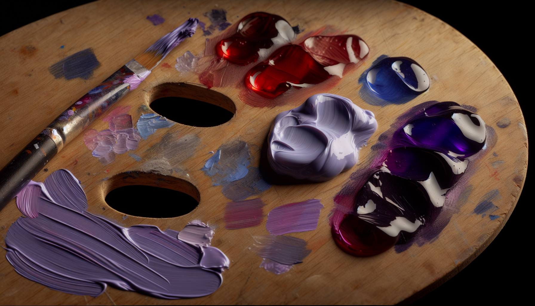
Creating a specific shade of purple is an exercise in control and understanding how colors interact. The possibilities are nearly endless, but they all start with a few core principles.
The most fundamental way to alter your purple is by changing the amount of red and blue in your mixture.
Once you have your base purple, you can modify its value and saturation by adding white, black, or gray.
Not all reds and blues are created equal. The 'temperature' or bias of your primary colors will dramatically affect the final purple. A warm red (with yellow undertones) mixed with a cool blue (with green undertones) can result in a dull, brownish purple. For the cleanest, brightest purples, try mixing a cool red with a warm blue. Experimenting is key to understanding color bias in paints5.
Here is a quick guide to get you started:
| To Create... | Start With | Then Add... | Resulting Shade |
|---|---|---|---|
| Lavender | Basic Purple | A significant amount of white | A light, airy pastel |
| Indigo | Basic Purple | More blue | A deep, cool blue-purple |
| Magenta | More red than blue | A touch of white (optional) | A vibrant, pinkish-purple |
| Aubergine | Basic Purple | A small amount of black | A dark, rich, and warm purple |
Using visual guides like color mixing charts6 can also be incredibly helpful when you're just starting out.
Adding white to purple lightens it, creating tints like lavender. Black is used to create darker shades such as eggplant.
The ratio of red to blue determines the purple's temperature. More red results in warmer, reddish purples, while more blue creates cooler shades.
We've all been taught it in school: red, yellow, and blue are the primary colors. But what if that's not the complete picture? The world of color theory holds a surprising answer that might change how you see your paint palette forever.
No, red and blue are not the true primary colors in the subtractive color model used for paint and ink. The scientifically accurate primary colors are cyan, magenta, and yellow (CMY). While the traditional red, yellow, and blue (RYB) model is widely taught, red can be made by mixing magenta and yellow, and blue can be made by mixing cyan and magenta.

This might sound counterintuitive, especially after years of art classes teaching us otherwise. The distinction lies in two different color models: the traditional model used by artists and the scientific model used in printing.
The Red, Yellow, and Blue (RYB) color model is a historical system used in art and design education. For centuries, painters have used this framework to mix pigments. In this system, red, yellow, and blue are considered primary because, for practical purposes with the pigments available historically, they couldn't be created by mixing other colors. Mixing them produces secondary colors:
While useful and still widely taught, the RYB model has limitations. It cannot produce the full spectrum of visible colors. For instance, mixing RYB primaries often results in less vibrant greens and purples.
The modern and more accurate subtractive primary colors are Cyan, Magenta, and Yellow (CMY). This is the model used by printers, and it's based on the science of how materials absorb light. True primary colors are those that can be mixed to create the widest possible range of other colors (the color gamut).
Here's why CMY works better:
This is the core of subtractive color mixing7. It's called "subtractive" because pigments absorb (subtract) certain wavelengths of light and reflect others. The more pigments you mix, the more light is absorbed, and the darker the color becomes.
It's also important not to confuse this with the additive color model8 (RGB), which applies to light sources like screens. In that system, Red, Green, and Blue are the primary colors, and mixing them adds light, eventually creating white.
So, while red and blue are fundamental in the traditional RYB system, the true subtractive primaries that offer the greatest color-mixing potential are cyan, magenta, and yellow.
The scientifically accurate primary colors for subtractive mixing (paint/ink) are cyan, magenta, and yellow (CMY), which offer a wider color range.
CMY has a wider color gamut, allowing it to create a broader and more vibrant range of colors compared to the traditional RYB model.
So, whether you're working with pigments or pixels, understanding additive and subtractive color is your superpower. I hope you feel empowered to experiment with red and blue, creating those perfect purples and magentas with newfound confidence!
Understand the concept of color bias to avoid muddy mixes and achieve cleaner colors: What is color bias? I am referring to the hue that influences a primary color. For example, a red-blue, a green-yellow, orange-red, etc ... ↩
Learn to select the right paints for your palette to mix any color you want: First mix purple (6 o'clock), and then add more blue for blue-violet (5 o'clock) and red for red-violet (7 o'clock). Now here's the rule that makes this work – ... ↩
Learn the science behind the colors you see on screens and digital displays: The RGB color model is an additive color model in which the red, green, and blue primary colors of light are added together in various ways to reproduce a ... ↩
Discover how pigments create color, which is essential for painting and printing: An simplified explanation of how the CMYK color system and subtractive color work. Subtractive color is especially difficult for many to ... ↩
Learn how to choose the right reds and blues for cleaner, more vibrant purples: What is color bias? I am referring to the hue that influences a primary color. For example, a red-blue, a green-yellow, orange-red, etc ... ↩
Get a visual reference for mixing the perfect shade of purple every time: Need to make purple? This easy step by step guide will show you how to whip up 15+ vibrant purples with these 3 paint colors. ↩
Explore the differences between the traditional and modern primary color systems: RGB is an additive color model used to mix light, whereas CMY is a subtractive color model used to mix pigments or dyes. They are essentially ... ↩
See visual examples of how mixing light differs from mixing paint: Color printing, negative photography, and watercolors are all examples of subtractive mixing. Additive color mixing describes color created by coincident light ... ↩
Recommended reading: the latest three posts in this language.

Ever find yourself scrolling, searching for that perfect little mental escape? I know I do! When it comes to online tile puzzles, the options can feel endless. But don't worry, I've sifted through the colorful chaos to find the absolute best, including the beloved original Google game and some fantastic alternatives, just for you.

Remember that feeling when your social media posts just... vanished into the feed? I certainly do! For ages, I struggled to make my words pop. Then, I stumbled upon fancy font generators, and honestly, they've been a game-changer. They're my little secret for crafting text that truly stands out, making my content memorable without needing any fancy design degrees.

Have you ever just stopped to stare at the vast, endless blue of the sky or the deep, mysterious ocean? It feels like blue is everywhere, right? But then I started noticing something peculiar: when it comes to living things—plants, animals, us—true blue is incredibly hard to find. It got me wondering: why is such a common color in our world so shockingly rare in the vibrant tapestry of life? Let's explore this beautiful mystery together.
