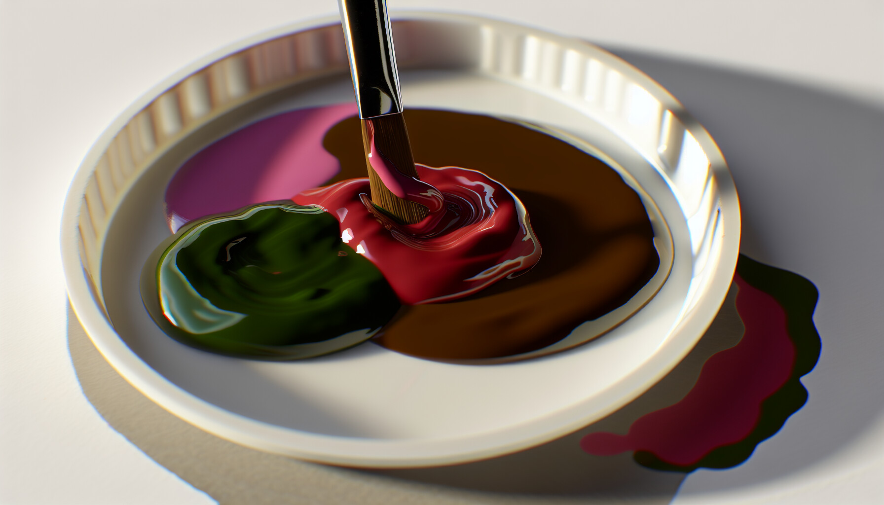
Have you ever found yourself gazing at a vibrant pink and a lush green, maybe on a paint palette or even in your garden, and just had to wonder what glorious (or perhaps wild!) color they'd make if you mixed them? I certainly have! For me, it felt like a little mystery, a bit of magic waiting to happen. But as I discovered, the answer is less about conjuring spells and more about the surprisingly beautiful science of color theory – and trust me, it’s a revelation.
When you mix pink and green, you typically get a neutral color like brown, gray, or a muddy, earthy tone. This happens because pink is a tint of red, and red and green are complementary colors. When mixed, complementary colors cancel each other out, resulting in a neutral hue.
Now, before you think 'brown? boring!', let me tell you, I was initially skeptical too! But I quickly learned that not all browns and grays are created equal. The final shade is a fascinating dance, entirely dependent on the specific pinks and greens you choose to bring to the party. In this guide, I'm excited to share my journey into these variations, showing you how to unlock a whole spectrum of sophisticated, muted tones you might never have imagined.
Because pink is a tint of red, mixing it with its complement (green) neutralizes the colors, resulting in a muted brown or gray.
It's all about the color wheel! Pink and green sit on opposite sides, and when opposites attract in the world of color, they don't create a vibrant new hue. Instead, they neutralize each other, leading to some surprisingly sophisticated shades.
Pink and green make a neutral color because they are based on complementary colors. Pink is a tint of red (red mixed with white). Red and green are complementary, meaning they are opposites on the color wheel. When mixed, they cancel each other out, resulting in a neutral tone like brown or gray.
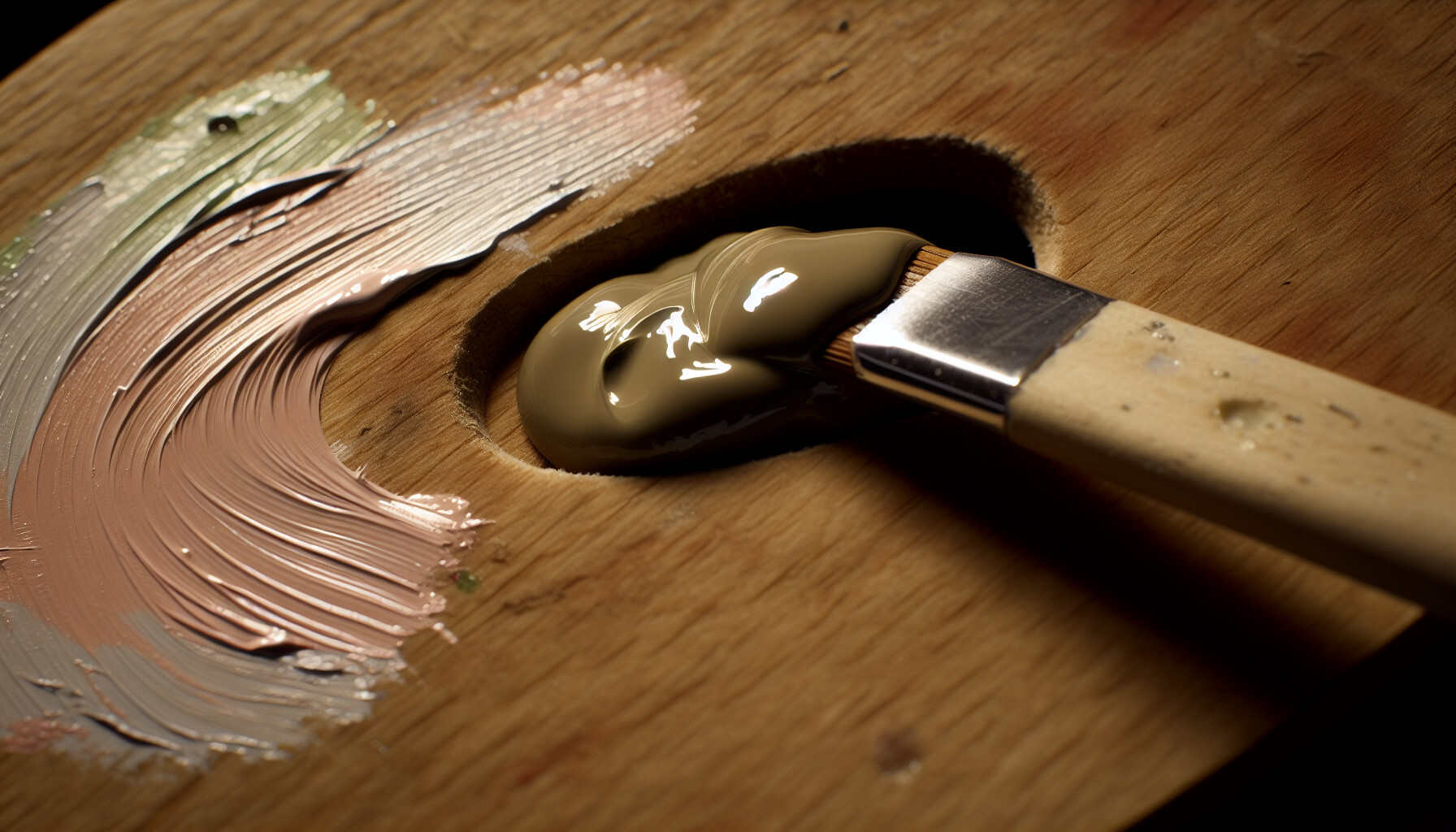
The reason pink and green mix to create a neutral color lies in the fundamental principles of color theory1. To understand this, we need to look at how colors relate to each other on the color wheel.
The color wheel organizes colors based on their relationships. Colors that are directly opposite each other, like red and green, blue and orange, or yellow and purple, are called complementary colors. When you mix two complementary colors in equal proportions, they effectively cancel each other out. Their wavelengths interfere in a way that absorbs most of the light, resulting in a desaturated, neutral color like brown, gray, or black. Think of it as a visual balancing act where neither color wins.
So, where does pink come into play? Pink isn't a primary or secondary color; it's a tint of red. This means it's created by adding white to red. Because its foundational hue is red, it carries red's complementary relationship with green.
When you mix pink and green:
Instead of getting a dark, muddy brown that pure red and green might produce, the white from the pink lifts the value of the final color. This is why the mixture often results in softer, more muted tones like beige, taupe, dusty rose, or a light grayish-brown. The exact neutral depends on the specific shades and proportions, but the underlying principle remains the same: a complementary color relationship is at work.
Red and green are complementary. Pink is a tint of red, so it carries red's neutralizing properties when mixed with green, but is not its direct complement.
Yes, because pink is a tint of red, it neutralizes its complement, green. This cancels out both colors, resulting in a desaturated, neutral tone.
The specific shades of pink and green you choose are the secret ingredients in your color recipe. They dictate whether your final mixture is a soft beige, a deep earthy brown, or a cool, moody gray. Let's explore how these variations work.
The final color depends heavily on the value (lightness/darkness) and temperature (warm/cool) of the pink and green used. For instance, mixing a light pastel pink with a light mint green will yield a soft, pale gray or beige. Conversely, combining a vibrant magenta with a deep forest green results in a dark, rich brown.

Not all pinks are the same, and neither are all greens. A pale rose is worlds away from a hot magenta, just as a lime green differs from a deep olive. These differences in value and temperature are crucial in determining the outcome of your mix.
Value refers to how light or dark a color is. Pink is a tint of red (red mixed with white), but there are still light pinks (like baby pink) and darker pinks (like deep rose). When you mix pink and green, the value of the resulting neutral color is an average of the two starting colors. A helpful resource is a color mixing chart2 that shows these interactions.
| Pink Shade | Green Shade | Resulting Neutral Color |
|---|---|---|
| Light Pink (Pastel) | Light Green (Mint) | Pale Gray or Off-White |
| Medium Pink (Rose) | Medium Green (Kelly) | Mid-Tone Gray or Muddy Brown |
| Dark Pink (Magenta) | Dark Green (Forest) | Dark Brown or Charcoal Gray |
Colors also have a 'temperature.' Warm colors have yellow, orange, or red undertones (like salmon pink or olive green), while cool colors have blue undertones (like fuchsia or emerald green). You can learn more by understanding color temperature3.
The temperature of your pink and green will influence the final neutral tone. Mixing two warm colors will result in a warmer brown or gray. Mixing two cool colors will produce a cooler, more bluish-gray. When you mix a warm and a cool color, they will neutralize each other, but the dominant temperature may still subtly influence the final hue. For example, mixing a warm, peachy pink with a cool, blue-toned green might give you a more balanced, neutral gray than mixing it with a warm, yellow-toned green, which would likely produce a warmer, earthier brown.
Combining light shades of pink and green typically yields a light neutral color, such as pale gray or off-white, not a dark one.
Mixing two warm colors results in a warmer neutral, while mixing two cool colors produces a cooler gray.
Think of yourself as a color chemist. The ratio of pink to green in your mix is your formula. By adjusting the amount of each, you gain precise control over the final neutral shade, moving from warm, rosy browns to cool, earthy grays.
Varying the proportions of pink and green allows you to control the undertone of the resulting neutral color. Adding more pink will create a warmer, reddish-brown or taupe. Conversely, using more green will result in a cooler, earthy shade like a mossy gray or a muted olive.
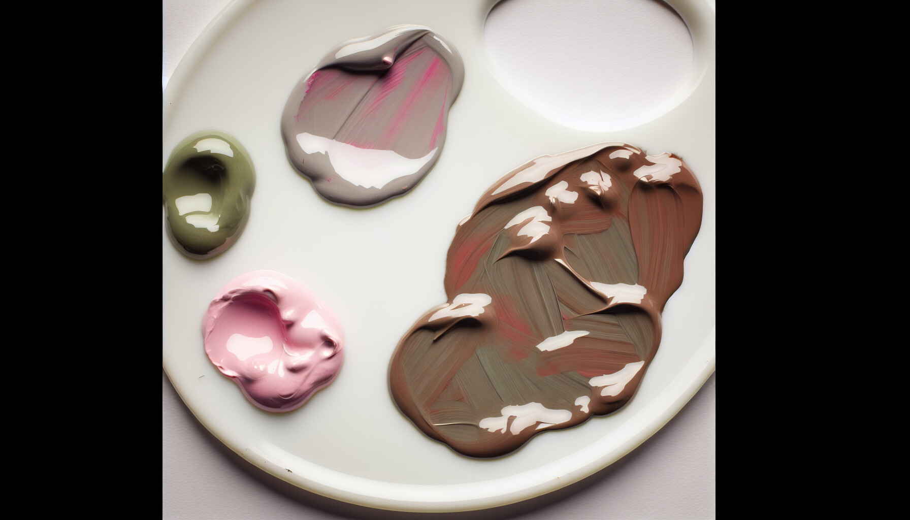
The proportion of each color is the key to mastering this mix. Just like a recipe, a little more of one ingredient can completely change the outcome. By intentionally varying the amounts, you can steer the final neutral color in a specific direction.
When pink dominates the mixture, its reddish qualities warm up the resulting neutral. You're essentially neutralizing the green but leaving a hint of the red from the pink.
When green is the more prominent color, the mix takes on cooler, earthier characteristics. The pink works to desaturate the green, pulling it away from vibrancy and towards a sophisticated neutral.
Here's a simple guide to visualize the effect of different ratios:
| Pink to Green Ratio | Dominant Color | Resulting Color Description |
|---|---|---|
| 3:1 | Pink | A warm, rosy-brown or a deep taupe. |
| 1:1 | Balanced | A balanced, mid-tone gray or brown. |
| 1:3 | Green | A cool, mossy gray or a muted olive/khaki. |
Mastering these ratios is fundamental to achieving your desired shade. For those looking to refine their skills, exploring advanced color mixing techniques4 can provide deeper control over hue, value, and saturation. This allows you to create a whole palette of unique, sophisticated neutrals from just two initial colors.
Adding more pink creates a warmer neutral, like a rosy-brown or taupe, because its reddish qualities warm up the resulting color.
When green is the dominant color in the mix, it creates cooler, earthier shades like a mossy gray or a muted olive.
The neutral tones created by mixing pink and green are far from boring. In the hands of a skilled artist or designer, these earthy browns and grays become powerful tools for creating mood, depth, and sophistication. Let's explore their versatile applications.
In art and design, the mix of pink and green is used to create sophisticated neutral palettes. These earthy browns and grays are perfect for natural landscapes, vintage-inspired aesthetics, and creating balanced backgrounds in interior design that allow brighter accent colors to stand out.

While a straightforward mix might seem uninspiring, the resulting neutral colors are a secret weapon in many creative fields. Their subtlety and depth provide a foundation for stunning visual compositions.
Artists, particularly those working with landscapes or botanical subjects, use the muddy tones from pink and green to render realistic scenes. This mix is excellent for creating the soft, complex colors of soil, tree bark, and the subtle shadows on foliage. Portrait artists also find these neutrals invaluable for building up lifelike skin tones, which are rarely composed of simple, bright colors.
Certain combinations, like a dusty rose mixed with a muted olive green, evoke a strong sense of nostalgia. These resulting taupe and brownish hues were popular in mid-century design. Using them can instantly give a project a retro feel, whether in fashion, illustration, or graphic design. Exploring vintage color palettes5 can provide great inspiration for applying this concept.
The grays and browns from a pink and green mix make for fantastic wall colors or large textile choices (like rugs and sofas). These muted backdrops provide a sophisticated canvas that prevents a room from feeling visually overwhelming. They allow bolder, purer shades of pink and green accents—like throw pillows or artwork—to pop without clashing. This layering of muted and vibrant tones is a key principle of color theory in interior design6.
In branding, these earthy, organic tones can communicate values like sustainability, authenticity, and handcrafted quality. A brand that wants to appear grounded and trustworthy might use a palette derived from these mixes. It’s a subtle alternative to the more common bright and bold corporate colors, helping a brand carve out a unique visual identity. Understanding the color psychology in branding7 is crucial for making these choices effectively.
Mixing these complementary colors neutralizes them, resulting in sophisticated earthy browns and grays, not vibrant hues.
These muted grays and browns create sophisticated backdrops in interior design, allowing brighter accent colors to stand out without clashing.
So, there you have it! My deep dive into why mixing pink and green gives us those wonderfully versatile neutral tones, all thanks to the magic of color theory. I truly hope you feel empowered to experiment with this complementary pair and create your own sophisticated, earthy hues for any project, from your next painting to a new digital design. Happy mixing!
Understand the science behind color mixing with this foundational guide: Usually one of the three colors predominates. Complementary colors are any two colors which are directly opposite each other, such as red and green and red- ... ↩
Explore an interactive chart to see how different color values mix in real-time: duckcolor - is a free online color mixer that helps you blend paint or dye. Mix colors manually or get automatic recipes instantly. ↩
Grasp the concept of warm vs. cool colors to master your color mixes: For portraitists, color temperature can be used to help turn the form. For still-life painters, it can be used to create a sense of distance between objects. ↩
Discover professional methods for precise color control and palette creation: Color Mixing 101: Understand how to simplify color mixing and color theory by learning one step at a time just how colors interact. ↩
Learn to effectively apply nostalgic color schemes in your creative projects: The following selection of websites with vintage color palettes is intended to inspire you in creating your own website color combination. ↩
Discover professional tips for balancing color and creating sophisticated interior spaces: Earth tones like olive, evergreen, sea blue, and even bold navy are perfect complements to a neutral color palette. Add eye-catching dimension ... ↩
Understand how color choices influence consumer perception and brand messaging. See how color psychology explains our emotional responses to color—and how to use it to design a meaningful, memorable brand. ↩
Recommended reading: the latest three posts in this language.

Ever find yourself scrolling, searching for that perfect little mental escape? I know I do! When it comes to online tile puzzles, the options can feel endless. But don't worry, I've sifted through the colorful chaos to find the absolute best, including the beloved original Google game and some fantastic alternatives, just for you.

Remember that feeling when your social media posts just... vanished into the feed? I certainly do! For ages, I struggled to make my words pop. Then, I stumbled upon fancy font generators, and honestly, they've been a game-changer. They're my little secret for crafting text that truly stands out, making my content memorable without needing any fancy design degrees.

Have you ever just stopped to stare at the vast, endless blue of the sky or the deep, mysterious ocean? It feels like blue is everywhere, right? But then I started noticing something peculiar: when it comes to living things—plants, animals, us—true blue is incredibly hard to find. It got me wondering: why is such a common color in our world so shockingly rare in the vibrant tapestry of life? Let's explore this beautiful mystery together.
