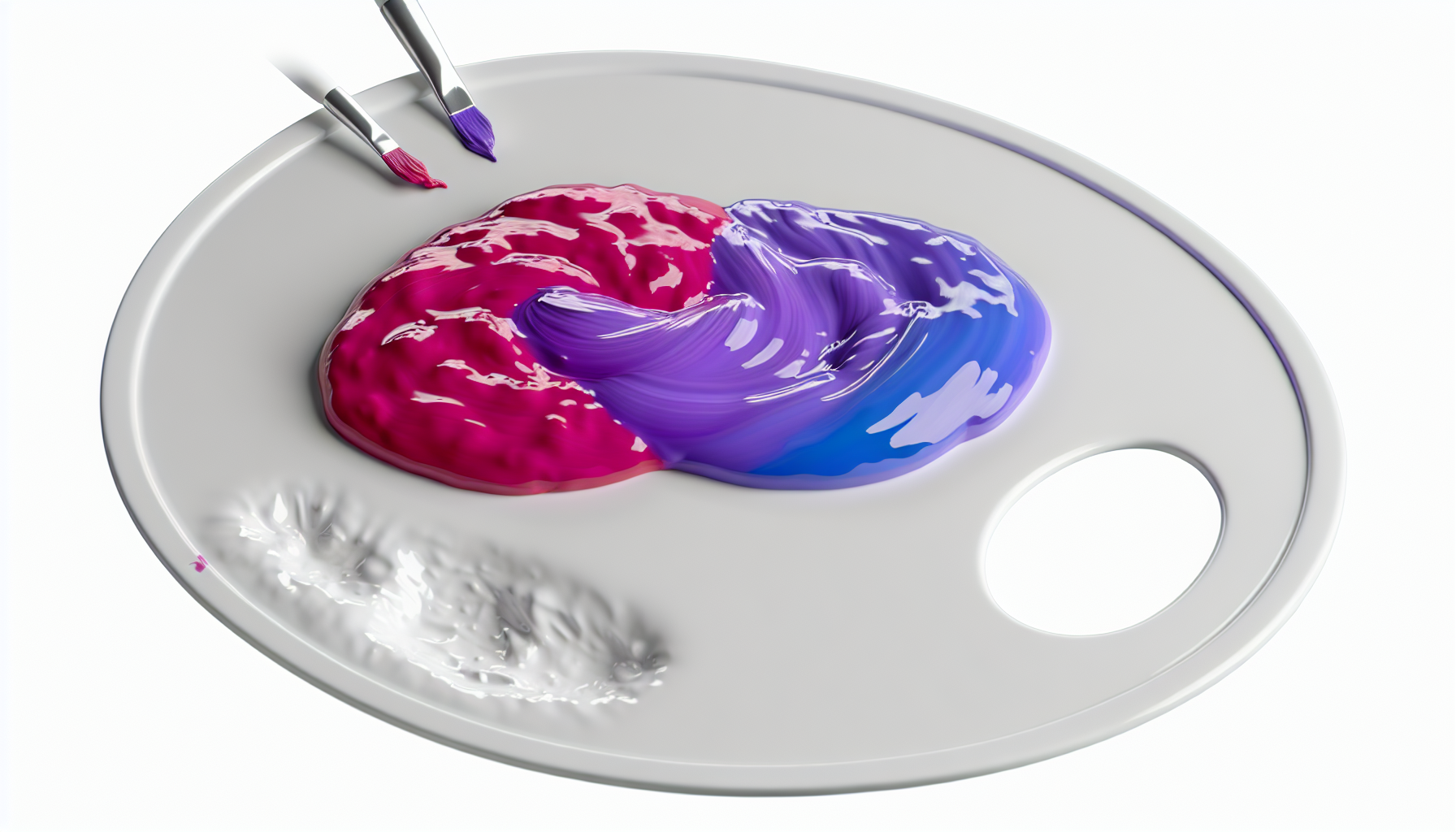
You know that feeling when you're staring at a blank canvas or a fresh set of paints, and a little spark of curiosity just ignites? I get that all the time, especially when I'm wondering about color combinations. Let's explore the beautiful possibilities!
When you mix pink and blue, you get purple or a shade of violet. The exact outcome depends on the specific shades of pink and blue used and the ratio of each color in the mixture. Lighter pinks and blues will create softer lavenders, while darker, more saturated tones will produce deeper purples.
But getting the perfect shade of purple isn't as simple as just splashing two colors together. Trust me, I've learned that the hard way with many a 'muddy' experiment! To truly master this combination, it's crucial to understand the nuances. We've delved into color theory and practical experiments to show you how different shades and proportions can dramatically change the outcome, giving you the power to create exactly what you envision.
The final shade varies significantly depending on the specific shades of pink and blue and the proportions used.
Not all pinks and blues are created equal. The specific shades you choose are the most important factor in determining the final purple hue. From soft lavenders to deep violets, the possibilities depend entirely on your starting colors.
The shades of pink and blue you mix directly control the resulting color. For instance, mixing a light, pastel pink with a sky blue will create a soft lavender. Conversely, combining a vibrant magenta (a deep pink) with a dark navy blue will produce a rich, deep royal purple or violet.
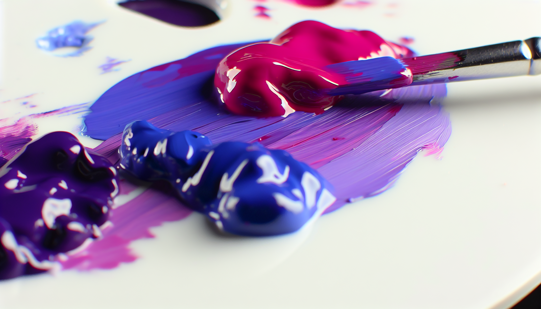
The final color is a direct reflection of its ingredients. Since pink is a tint of red (red mixed with white), the amount of white in your pink and the specific hue of your blue will dramatically alter the outcome.
The type of pink you use sets the foundation for the warmth and brightness of your purple.
The blue you select determines the depth and coolness of the final purple mixture. A deeper understanding of color undertones1 can help you predict these outcomes.
To make it clearer, here’s a quick guide to potential outcomes:
| Pink Shade | Blue Shade | Resulting Color |
|---|---|---|
| Baby Pink | Sky Blue | Lavender |
| Hot Pink | Cerulean Blue | Bright, Warm Purple |
| Salmon Pink | Turquoise | Muted, Bluish-Gray Purple |
| Magenta | Royal Blue | Deep Violet |
For those who prefer a hands-on approach without the mess, using a digital color mixing tool2 can be a great way to experiment with different combinations.
Pinks with more white, like pastel pink, cool down red undertones, leading to softer purples such as lavender when mixed with blue.
The final shade depends on the specific pink and blue used. Lighter shades create softer, more delicate purples like lavender, not always vibrant ones.
The ratio of your colors is your secret weapon. By tweaking the proportions of pink and blue, you can move beyond a standard purple and unlock a vast spectrum of unique hues, from warm magentas to cool, dusky violets. Let's explore this creative control.
When mixing unequal proportions of pink and blue, the dominant color will steer the final result. Using more pink creates warmer, reddish-purples like magenta or fuchsia. Conversely, adding more blue results in cooler, blue-dominant purples such as periwinkle, indigo, or violet-blue.

The secret to creating a specific shade of purple lies in mastering the ratio of your ingredients. The color you use in a larger quantity will become the dominant 'parent' color, influencing the final hue's temperature and character. Think of it as a sliding scale between pink and blue.
When pink is the dominant color in your mixture, the result leans towards the red side of the color spectrum. You'll create vibrant, warm purples that feel energetic and lively.
Adding more blue cools down the mixture, pulling it towards the blue side of the spectrum. This creates calmer, more contemplative shades of purple that are perfect for creating depth and mood.
Here’s a simple table to visualize the effects of different proportions:
| Pink Proportion | Blue Proportion | Resulting Color Family |
|---|---|---|
| 75% | 25% | Magenta, Fuchsia, Hot Purple |
| 60% | 40% | Warm Purple, Red-Violet |
| 40% | 60% | Cool Purple, Royal Purple |
| 25% | 75% | Periwinkle, Indigo, Blue-Violet |
Understanding these ratios allows you to fine-tune your colors with precision, moving beyond a generic purple to create the exact shade your project requires. It's a fundamental skill in artistic color mixing5.
Adding more blue to a pink mixture results in cooler, blue-dominant purples like periwinkle or indigo, not warmer ones.
Magenta is a warm, reddish-purple. It is created by making pink the dominant color in the mixture, pulling the hue towards the red spectrum.
It's not just random splashing of paint; there's a fascinating science behind why pink and blue create shades of purple. Understanding basic color theory is the key to unlocking predictable, beautiful results every time you mix these two colors.
Color theory explains the mixing of pink and blue through the subtractive color model. Pink is a tint of red (red mixed with white). When you mix it with blue, you are essentially combining the primary colors red and blue, which create the secondary color purple. The white in the pink lightens the resulting mixture, leading to shades like lavender or magenta.

To truly grasp why pink and blue make purple, we need to look at the foundational principles of color. It's a predictable outcome based on how colors interact, particularly within the subtractive color model used for paints and pigments.
First, it's essential to recognize that pink isn't a primary color. It's a tint of red, created by adding white to red. Blue, on the other hand, is a primary color. Therefore, the act of mixing pink and blue is fundamentally about mixing red, white, and blue together.
When we mix paints, we are working with the subtractive color model6. In this model, pigments absorb (subtract) certain wavelengths of light and reflect others.
This is different from the additive color model7 (RGB), which applies to light (like on screens), where mixing red and blue light creates magenta.
Not all pinks and blues are the same. Their 'temperature'—whether they lean warm or cool—significantly impacts the final shade.
Pink is a tint, not a primary color. It is created by adding white to the primary color red. The primary colors are red, yellow, and blue.
Since pink is a tint of red, mixing it with blue combines red and blue to make purple. The white in the pink lightens the resulting hue.
Beyond a simple color wheel exercise, the blend of pink and blue unlocks a rich palette with profound artistic potential. From ethereal landscapes to futuristic digital designs, this combination offers artists a powerful tool for expressing mood and atmosphere. Let's explore its practical uses.
In art, mixing pink and blue to create shades of purple is used to paint atmospheric skies like sunsets and twilight, convey moods of fantasy or mystery, and create vibrant gradients in digital design. It's also popular in fashion and interior decor for its romantic and modern appeal.

The purple hues created by mixing pink and blue are incredibly versatile, finding their place across various artistic disciplines. Artists harness these shades to evoke specific emotions and create visually stunning effects.
In traditional painting, the blend of pink and blue is a go-to for capturing the delicate and shifting light of the sky. Artists use these custom purples to render breathtaking sunsets, the soft glow of dawn, or the deep, moody atmosphere of twilight. Beyond landscapes, these shades are perfect for fantasy art, illustrating magical effects, mystical creatures, or otherworldly environments. For instance, a light lavender can add a soft, ethereal quality to a fairy's wing, while a deep violet can create dramatic, mysterious shadows in a portrait.
The digital realm is filled with the vibrant energy of pink-and-blue combinations. This mix is fundamental to popular aesthetics like vaporwave and synthwave, where neon pinks and electric blues create a retro-futuristic vibe. Graphic designers use these gradients to make bold statements in branding, posters, and UI elements. The resulting purples can feel both calming and energetic, making them a flexible choice for creating vibrant color palettes8 that capture attention.
In fashion, the colors resulting from a pink and blue mix can signify anything from soft romance to bold luxury. A pale lavender dress might be perfect for a spring collection, while a deep plum velvet jacket exudes opulence. Textile artists also use this combination in techniques like tie-dye and batik to create unique, flowing patterns. The interaction between the colors can produce beautiful, organic blends that make each piece of fabric one-of-a-kind. By understanding how to mix these colors, designers can create custom shades that perfectly match their creative vision for innovative textile designs9.
This combination is also fundamental to digital art aesthetics like vaporwave, graphic design, and fashion, showcasing its versatility beyond traditional painting.
The text states this mix is fundamental to these aesthetics, where neon pinks and electric blues are used to create a retro-futuristic vibe.
So, there you have it! Mixing pink and blue creates a beautiful spectrum of purples. I truly encourage you to grab your paints or open a digital palette and experiment. Find your perfect hue, and let your creativity shine!
Learn the fundamentals of color theory to predict mixing outcomes more accurately: Mass tone vs. undertone. Whenever a color is made by mixing two or more colors together, that color will have both a mass tone and an undertone. The mass tone ... ↩
Experiment with different shades of pink and blue virtually to find your perfect purple: Key Features. Discover powerful tools designed to make color mixing precise and effortless. Color Mixer. Select colors from your starting palette, mix them on ... ↩
Learn the precise ratios and shades needed to create a vibrant magenta: However is is a colour that can't be mixed from primary colours, you have to use magenta pigment. ↩
Get a step-by-step guide on mixing the perfect, dreamy shade of periwinkle: How to make periwinkle blue color with acrylics. Color Brand :- Camel Acrylic Paints Thanks for watching! ↩
Explore advanced color mixing tips and techniques to elevate your painting skills: In this video I will be taking you through my top five color mixing mistakes that you might be making with acrylic paint and how to fix them. ↩
Learn the fundamentals of mixing pigments for painting and printing: This idealized model is the essential principle of how dyes and pigments are used in color printing and photography, where the perception of color is elicited ... ↩
Understand the critical difference between mixing light (screens) and paint (pigments): Additive color models include red, blue and green. Subtractive colors include cyan, yellow, magenta and black. Understanding these applications ... ↩
Explore tools to help you generate beautiful and harmonious color schemes for your projects: DuckColor is the lightning-fast, ultra-intuitive color palette generator for designers, creators, and anyone seeking visual harmony. Instantly generate beautiful ... ↩
Learn contemporary fabric dyeing methods to create unique and stylish textile patterns at home: This video will show you how to tie-dye a draft design using a blue dye on a pink fabric. We got really amazing results. ↩
Recommended reading: the latest three posts in this language.

Ever find yourself scrolling, searching for that perfect little mental escape? I know I do! When it comes to online tile puzzles, the options can feel endless. But don't worry, I've sifted through the colorful chaos to find the absolute best, including the beloved original Google game and some fantastic alternatives, just for you.
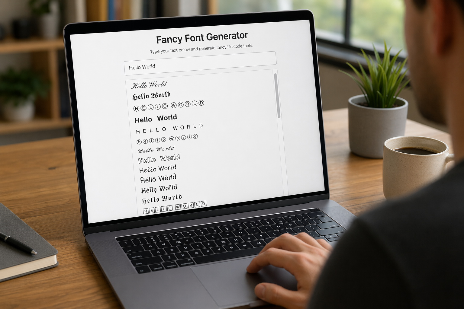
Remember that feeling when your social media posts just... vanished into the feed? I certainly do! For ages, I struggled to make my words pop. Then, I stumbled upon fancy font generators, and honestly, they've been a game-changer. They're my little secret for crafting text that truly stands out, making my content memorable without needing any fancy design degrees.

Have you ever just stopped to stare at the vast, endless blue of the sky or the deep, mysterious ocean? It feels like blue is everywhere, right? But then I started noticing something peculiar: when it comes to living things—plants, animals, us—true blue is incredibly hard to find. It got me wondering: why is such a common color in our world so shockingly rare in the vibrant tapestry of life? Let's explore this beautiful mystery together.
