
Ever found yourself holding blue and green paint, wondering what beautiful hue they create together? You're not alone. This classic color-mixing question has a surprisingly rich answer that goes beyond a single color.
Mixing blue and green pigments results in a range of blue-green colors, most commonly known as teal or cyan. The final shade depends on the proportions of each color used and the specific types of blue and green pigments.
But the answer isn't always that simple, is it? I remember the first time I realized the result changes completely if you're mixing light instead of paint. It blew my mind! We've explored the fascinating science behind this to help you master every single shade of blue-green, because who doesn't love a good color secret?
This is false. Mixing light is an additive process, which combines wavelengths to create a brighter color—in this case, cyan light.
Why does combining blue and green paint yield a darker shade, while blending blue and green light creates a brighter one? The secret lies in two distinct color systems: subtractive and additive mixing. Let's illuminate the science behind these fascinating processes.
The primary difference lies in subtractive versus additive color mixing. Mixing blue and green paint is a subtractive process where pigments absorb light, resulting in a darker blue-green shade like cyan. Conversely, mixing blue and green light is additive, combining wavelengths to create a brighter cyan light.

Understanding how colors interact is key to mastering them, and the rules change entirely depending on your medium. The distinction between paint and light is the most fundamental concept to grasp.
When you mix paints, you're engaging in subtractive mixing. This process starts with white light, which contains all the colors of the spectrum. Pigments in the paint work by absorbing (or subtracting) certain wavelengths of light and reflecting the ones we see.
When you mix them, the pigments combine their light-absorbing properties. The new mixture absorbs most wavelengths except for the narrow band of blue-green light that both pigments reflect. This is why mixing pigments generally leads to darker colors—more light is being subtracted.
Additive mixing is the process of creating color by mixing sources of light. This is how digital screens, from your phone to your TV, create images. The process starts with darkness (black) and adds light to create colors.
The primary colors of light are Red, Green, and Blue (RGB). When you combine these light sources, you get lighter colors:
Mixing all three primary light colors in equal intensity produces white light. This is a core principle of the additive and subtractive color models1. The combination of blue and green light adds their wavelengths together, which our eyes perceive as the bright, vibrant color cyan.
| Feature | Subtractive Mixing (Paint) | Additive Mixing (Light) |
|---|---|---|
| Starting Point | White (e.g., a canvas) | Black (e.g., a dark screen) |
| Process | Wavelengths are absorbed/subtracted | Wavelengths are combined/added |
| Primary Colors | Cyan, Magenta, Yellow (CMY) | Red, Green, Blue (RGB) |
| Result of Mixing | Creates progressively darker colors | Creates progressively lighter colors |
This is false. Mixing paints is a subtractive process where pigments absorb more light, resulting in a darker color.
This is true. Additive color mixing, used for screens, combines red, green, and blue light to create a spectrum of colors.
Ready to move beyond a single blue-green mix? Unlocking a vibrant spectrum of teals and cyans is easier than you think. Let's explore how simple adjustments in your palette can create a world of custom colors for your projects.
To create different shades of teal and cyan, adjust the ratio of blue and green paint. For a lighter tint, add white. For a darker shade, add black. To create a more muted tone, mix in a small amount of gray or a complementary color like red.

The secret to a rich blue-green palette lies in understanding how to manipulate your base colors. By adjusting ratios and introducing neutral colors, you can create an almost endless variety of teals and cyans.
The most direct way to alter your blue-green is by changing the proportions of the two primary colors. The dominant color will pull the final hue in its direction, creating either a cooler or warmer feel.
| Ratio (Blue | Resulting Color |
|---|---|
| More Blue | Cooler, Deeper Teal |
| Equal Parts | Balanced Teal or Cyan |
| More Green | Warmer Aqua/Turquoise |
Once you have a base hue, you can modify its value and saturation to create even more variations. This is a fundamental aspect of color mixing techniques2.
Not all blue and green paints are created equal. The specific pigment used has a natural undertone, or 'bias'. For example, an Ultramarine Blue has a slight violet bias, while a Phthalo Blue has a green bias. Mixing these different blues with the same green will yield noticeably different teals. Experimenting with your specific paints is key to discovering unique combinations.
Black darkens a color to create a shade. White is added to create a lighter tint.
Adding gray to a color reduces its intensity, resulting in a more subdued or muted tone.
Beyond their visual appeal, the blue-green hues of teal and cyan carry profound symbolic meanings. These colors can evoke a wide range of emotions and ideas, from tranquility to innovation, making them powerful tools in art, design, and communication.
Teal and cyan symbolize tranquility, clarity, and emotional balance. They merge the calming stability of blue with the refreshing optimism of green. Teal often represents open communication and healing, while cyan is associated with serenity, clarity of mind, and the digital age.

Teal is often seen as a color of trustworthiness and reliability. It combines the calming properties of blue with the renewal qualities of green, making it a symbol of restfulness and spiritual balance. It is believed to represent open communication and clarity of thought, encouraging introspection and emotional healing. In color psychology, teal is thought to help manage stress and restore a sense of well-being. The psychology behind color symbolism3 provides deeper insights into how these hues affect our mood and behavior.
Cyan is a vibrant, refreshing color that sits between blue and green on the visible spectrum. It is strongly associated with the sky and tropical waters, evoking feelings of serenity, calmness, and tranquility. Cyan symbolizes clarity of mind, emotional control, and rational thinking. In the modern era, it has also become synonymous with technology and the digital world, representing innovation and clear communication. Understanding how colors are used in branding4 can reveal why many tech and health companies favor this shade.
While they share a common blue-green heritage, teal and cyan have distinct symbolic nuances. Here’s a quick comparison:
| Feature | Teal | Cyan |
|---|---|---|
| Primary Association | Emotional balance, healing | Clarity, serenity, technology |
| Psychological Impact | Soothing, restorative | Calming, refreshing |
| Represents | Open communication, sophistication | Rational thought, innovation |
| Common Use Cases | Interior design, wellness brands | Digital interfaces, healthcare logos |
Both colors create a sense of stability and peace, making them versatile choices for conveying a message of calm confidence and thoughtful innovation.
While both are blue-green hues, teal is more linked to emotional healing, while cyan is associated with clarity, serenity, and technology.
According to color psychology, teal combines blue's calming properties and green's renewal qualities, making it a symbol of restfulness and balance.
Found your perfect blue-green shade? The next step is choosing companion colors to make it truly stand out. Whether you're aiming for bold contrast or serene harmony, the right palette can transform your space.
Blue-green palettes pair beautifully with a range of colors. For a vibrant, high-contrast look, use complementary shades like coral, orange, or terracotta. For a harmonious feel, opt for analogous colors like deep blues and lime greens. Neutrals such as white, gray, and beige provide a sophisticated and balanced backdrop.

A blue-green palette, which includes shades like teal and cyan, is incredibly versatile. The key to a successful color scheme is understanding the relationship between colors and the mood you want to create.
To make your blue-green hues pop, look directly across the color wheel. You'll find warm, fiery shades that create a dynamic and energetic contrast. Think of a teal wall accented with a burnt orange sofa or coral throw pillows. These combinations are confident and eye-catching, perfect for making a feature stand out.
For a more subtle and calming effect, choose colors that sit next to blue-green on the color wheel. Pairing teal with navy blue, sky blue, or mint green creates a cohesive, nature-inspired look reminiscent of deep oceans or lush forests. This approach is ideal for creating a serene and relaxing environment, such as in a bedroom or bathroom.
Neutrals are the foundation of any timeless design. Pairing blue-green with crisp white, soft gray, warm beige, or even black allows the color to be the star without overwhelming the space. This combination is clean, modern, and sophisticated, working well in minimalist or contemporary interiors.
Here is a quick guide to help you choose:
| Palette Type | Best Color Matches | Vibe Created |
|---|---|---|
| Complementary | Coral, Terracotta, Burnt Orange | Vibrant, Energetic, Bold |
| Analogous | Navy Blue, Mint Green, Chartreuse | Harmonious, Calm, Natural |
| Neutral | White, Gray, Beige, Cream | Sophisticated, Balanced |
If you want to experiment further, using a digital color palette tool5 can help you visualize different combinations and discover unique schemes for your project.
This pairing uses complementary colors, which create a vibrant and energetic contrast, not a calming one. Analogous colors like navy blue produce a harmonious vibe.
Analogous colors sit next to blue-green on the color wheel and create a cohesive, nature-inspired look reminiscent of deep oceans or lush forests.
So, mixing blue and green isn't just one color; it's a whole spectrum! I hope you feel confident to experiment with teal and cyan in all your creative adventures.
Explore the fundamental science of how color is created in print and on screens: Additive color models include red, blue and green. Subtractive colors include cyan, yellow, magenta and black. Understanding these applications ... ↩
Learn the core principles of modifying color value and saturation for your art: Learn how to create tints tones and shades with acrylic paint. I also give you tips on color mixing and how to utilize the space on your ... ↩
Explore the deep psychological effects and emotional responses associated with the color teal: Teal symbolizes clarity of thought, emotional balance, and rejuvenation, making it an ideal color for promoting wellness and self-care. In ... ↩
See how top brands effectively use cyan to convey trust and innovation: Explore a diverse collection of cyan logos for your inspiration. Get ideas for your own brand identity with our curated cyan logo gallery. ↩
Explore this tool to create and visualize your own unique color palettes: Discover the ultimate color palette generator tailored for interior design enthusiasts and professionals. Effortlessly create harmonious color schemes. ↩
Recommended reading: the latest three posts in this language.

Ever find yourself scrolling, searching for that perfect little mental escape? I know I do! When it comes to online tile puzzles, the options can feel endless. But don't worry, I've sifted through the colorful chaos to find the absolute best, including the beloved original Google game and some fantastic alternatives, just for you.
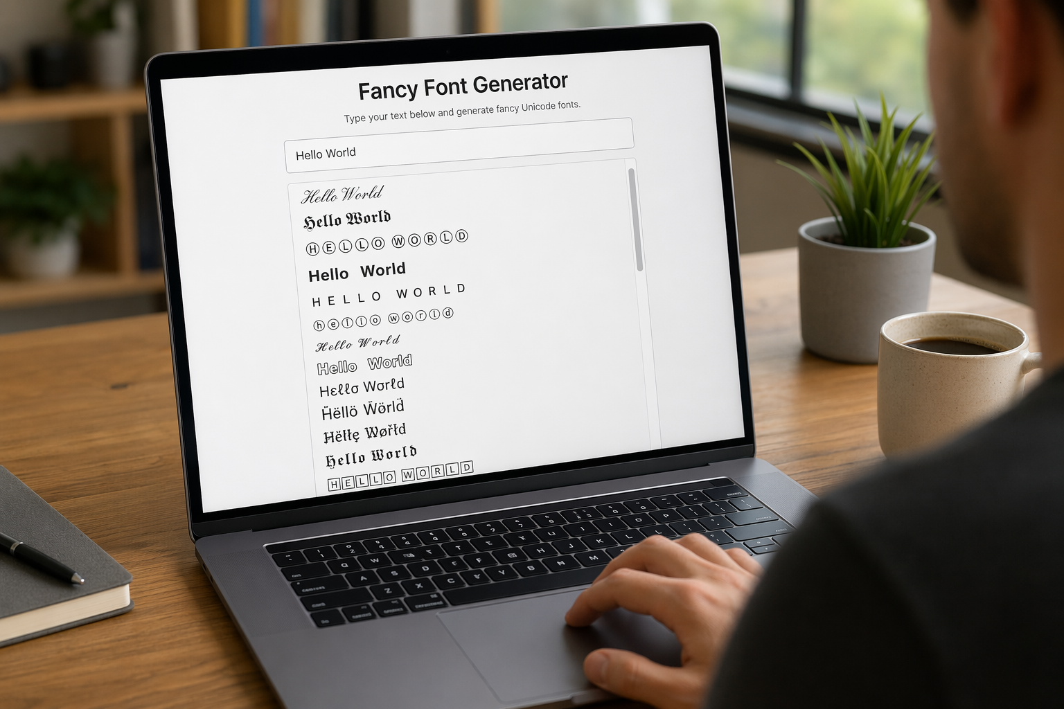
Remember that feeling when your social media posts just... vanished into the feed? I certainly do! For ages, I struggled to make my words pop. Then, I stumbled upon fancy font generators, and honestly, they've been a game-changer. They're my little secret for crafting text that truly stands out, making my content memorable without needing any fancy design degrees.

Have you ever just stopped to stare at the vast, endless blue of the sky or the deep, mysterious ocean? It feels like blue is everywhere, right? But then I started noticing something peculiar: when it comes to living things—plants, animals, us—true blue is incredibly hard to find. It got me wondering: why is such a common color in our world so shockingly rare in the vibrant tapestry of life? Let's explore this beautiful mystery together.
