
I remember early in my design journey, feeling completely lost in a sea of hues. How many is too many? Is there a magic number that just works? It felt like a riddle, and I was desperate for the answer that would transform my designs from 'meh' to 'marvelous' without causing a visual headache.
There is no single ideal number, but a widely accepted best practice is to use three to five colors. The most common application is the 60-30-10 rule, which allocates 60% to a dominant primary color, 30% to a secondary color, and 10% to an accent color for a balanced and harmonious design.
But here’s the thing I quickly learned: knowing the what is only half the battle. To really make color sing in your designs, you need to dig into the why and the how. Trust me, it’s not just about picking pretty colors; it’s about wielding them like a pro. So, let’s pull back the curtain and explore the secrets I've picked up from seasoned designers, showing you how to craft palettes that don't just look good, but truly work.
A UI palette expands on brand colors, adding functional hues for states like 'error' or 'success' and ensuring usability and accessibility.
Ever wonder why some designs just feel 'right'? Often, it's not magic but a simple, powerful principle. The 60-30-10 rule is a classic design secret for creating palettes that are balanced, engaging, and easy on the eyes, preventing visual chaos.
The 60-30-10 rule creates visual harmony by establishing a clear hierarchy. The 60% dominant color provides a stable foundation, the 30% secondary color adds interest without competing, and the 10% accent color draws the eye to key elements, ensuring a balanced and uncluttered experience.

This timeless design guideline is rooted in creating a sense of balance and order that is naturally pleasing to the human eye. Instead of colors competing for attention, they work together in a structured way. By assigning specific roles and proportions to each color, the rule prevents any single hue from overwhelming the design.
The magic of this rule lies in its specific proportions, each serving a distinct purpose to guide the viewer's experience. A breakdown of these roles helps clarify how they collaborate to produce a cohesive look.
| Percentage | Role | Purpose |
|---|---|---|
| 60% | Dominant Color | Sets the overall tone and acts as the backdrop for the entire design. |
| 30% | Secondary Color | Complements the dominant color, adding contrast and visual interest. |
| 10% | Accent Color | Used sparingly to highlight key information, like CTAs or icons. |
Beyond simple balance, the 60-30-10 rule is a powerful tool for controlling visual flow. The expansive 60% dominant color allows the eyes to rest, creating a calm foundation. The 30% secondary color then helps break up the space and guide the eye through the composition. Finally, the 10% accent color acts as a focal point, drawing immediate attention to the most important elements you want users to notice.
This structure makes a design feel intentional and professional. It’s a foundational concept seen in everything from interior design to web interfaces. Exploring real-world examples of the 60-30-10 rule1 can provide practical inspiration. Understanding the principles of color psychology in marketing2 further enhances your ability to select a palette that not only looks good but also evokes the right emotions and drives action.
The 60% dominant color sets the overall tone, while the 10% accent color is used to highlight key information like CTAs or icons.
This rule establishes harmony by assigning specific roles to a dominant, secondary, and accent color, guiding the viewer's eye through the design.
While the 3-5 color rule is a fantastic starting point for balance, some designs demand a richer, more expansive palette. Let's explore the specific scenarios where breaking this rule is not just acceptable, but essential for achieving clarity and impact.
It is appropriate to use more than five colors in specific contexts like complex data visualization, detailed illustrations, maximalist or eclectic brand aesthetics, and comprehensive UI systems. In these cases, a larger palette is necessary to differentiate information, create visual richness, or communicate various system states effectively.

While a limited palette promotes harmony and simplicity, rigidly adhering to it can be counterproductive in certain situations. The key is to use color with purpose, regardless of the number. An expanded palette, when used correctly, can enhance user experience and convey complex messages with precision.
When designing charts, maps, or infographics, each color often represents a distinct category or data point. Limiting yourself to five colors could make a complex dataset impossible to read. In this context, using a wider array of distinct, accessible colors is crucial for clarity and accurate interpretation. The goal is to make data digestible, and a larger palette is the tool to achieve that. Explore some effective data visualization color palettes3 to see how experts handle this challenge.
Minimalism thrives on restraint, but other design styles, like maximalism, surrealism, or psychedelic art, are defined by their vibrant and extensive use of color. These aesthetics aim to be bold, energetic, and visually rich. For brands that want to project an image of creativity, excitement, or diversity, a palette of ten or more colors might be perfectly aligned with their identity. Check out these stunning maximalist design examples4 for inspiration.
A product's core palette might be simple, but the total number of colors in a complex UI design system often exceeds five. This is because colors are needed to communicate various interactive states and feedback to the user.
Consider this breakdown:
| State Type | Example Color | Purpose |
|---|---|---|
| Primary Action | Bright Blue | Main call-to-action buttons, links |
| Secondary Action | Light Blue/Gray | Less important actions, outlines |
| Success | Green | Confirmation messages, successful operations |
| Warning | Amber/Yellow | Alerts that require user attention |
| Error/Danger | Red | Failed operations, critical error messages |
| Neutral/Info | Gray | Informational text, disabled states |
When you add hover, active, and focus variations for each of these, the palette quickly grows. Following established UI color state best practices5 ensures that your interface remains intuitive and easy to navigate.
This is a guideline, not a strict rule. Designs for data visualization or maximalist aesthetics often require a richer palette to achieve clarity and impact.
UI designs need distinct colors for various interactive states like success, error, and warnings, which, with variations, easily exceed a five-color limit.
Stuck with a limited palette? You don't need more colors to create depth. By mastering tints, tones, and shades, you can unlock a spectrum of possibilities from a single hue, adding sophistication and versatility to your design without introducing new colors.
You can expand a color palette by creating monochromatic variations of your existing colors. Add white to a base color to create tints (lighter versions), add gray for tones (more subtle, muted versions), and add black for shades (darker versions). This technique adds depth and contrast while maintaining a cohesive and harmonious look.
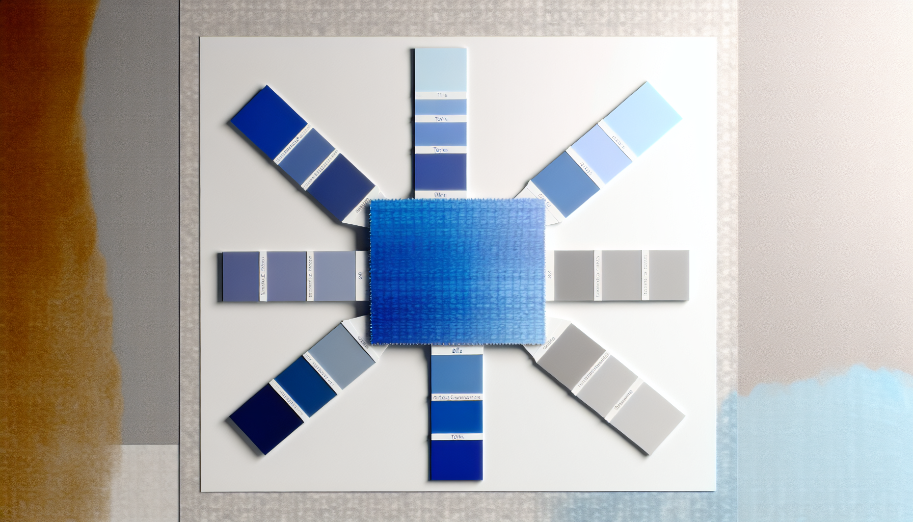
Expanding your core palette doesn't mean adding more unrelated colors; it means exploring the full potential of the ones you already have. Tints, tones, and shades are the key to creating a richer, more functional color system that maintains visual harmony.
Understanding the difference between these three terms is the first step. They are all derived from a single base hue but modified in a specific way, which is a core concept in color theory fundamentals6.
| Term | Formula | Result |
|---|---|---|
| Tint | Hue + White | Lighter, paler, less saturated version of the color. Often used for backgrounds. |
| Tone | Hue + Gray | Muted, more complex version of the color. Tones are less intense and can create a sophisticated feel. |
| Shade | Hue + Black | Darker, richer version of the color. Excellent for text, borders, and creating strong contrast. |
Using these variations intelligently is crucial for building a clear visual hierarchy and improving user experience. By systematically applying them, you can guide the user's eye and define the function of different elements without overwhelming the design.
By employing this method, you can build out comprehensive monochromatic color schemes7 from each of your primary colors, giving you a much wider and more flexible palette to work with while ensuring every color feels like it belongs.
This is incorrect. Adding white to a color creates a tint, making it lighter. A shade is created by adding black.
Correct. Adding gray to a hue creates a tone, which is a more muted and subtle version of the original color.
Your brand colors are your identity, but do they translate directly to a digital screen? The worlds of brand and UI design are closely linked, yet their color needs can be surprisingly different. Let's explore why.
Yes, your color palette should adapt when moving from brand to UI design. While the core brand colors provide the foundation, a UI palette must expand to include functional colors for interactive states (hovers, disabled), system feedback (success, error), and a wider range of neutrals. These additions ensure usability and accessibility without diluting the brand's identity.
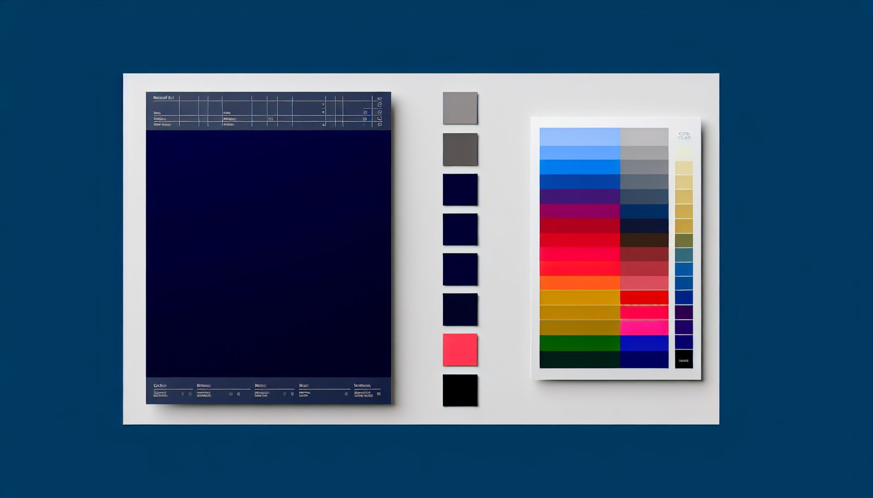
While brand and UI design are two sides of the same coin, their approach to color serves distinct purposes. A brand palette is about identity and emotion, while a UI palette is about function and interaction.
A brand's color palette is its signature. It's designed to be memorable, evoke specific feelings, and ensure consistency across all marketing materials—from a billboard to a business card. The primary goal is to build brand recognition and create an emotional connection with the audience. These palettes are often tight and focused, emphasizing a few core colors to maximize impact.
In contrast, a UI palette is a functional system built for interaction. It takes the foundational brand colors and expands upon them to create a usable and intuitive digital experience. This palette needs to account for a multitude of scenarios that don't exist in traditional branding:
The solution isn't to discard the brand palette but to expand it intelligently. Designers often start with the primary brand colors and then create a full spectrum of tints (lighter versions) and shades (darker versions) for each. This provides the necessary variety for complex interfaces while maintaining brand consistency. The best approach involves following established UI color palette best practices9 to build a scalable system.
Here is a table summarizing the key differences:
| Feature | Brand Design Palette | UI Design Palette |
|---|---|---|
| Primary Goal | Recognition & Emotion | Usability & Clarity |
| Key Colors | 2-3 core brand colors | Core brand colors + functional and neutral colors |
| Color Focus | Marketing, identity, print | Interaction, feedback, accessibility |
| Expansion | Limited for consistency | Extensive (tints, shades, neutrals) |
| Constraints | Brand guidelines | Accessibility standards (e.g., WCAG) |
A UI palette must expand on brand colors to include functional colors for interactive states, system feedback, and a wider range of neutrals for usability.
Unlike brand palettes, UI palettes must adhere to WCAG guidelines to ensure readability and usability for users with visual impairments.
Ultimately, I’ve found that mastering color isn't just about counting hues; it's about striking that perfect balance. Embrace these principles, and I promise, you'll craft palettes that aren't just beautiful, but incredibly effective. Now, I'm curious, what masterpiece will you bring to life first?
See stunning real-world examples to inspire your next design project: How do you apply color in mobile UI design projects? Here's a little tip, the 60-30-10 color rule(it's more like a guideline) will help you ... ↩
Learn how colors influence emotion and decision-making for more impactful designs: The psychology of color suggests general guidelines for the ways that various hues and shades influence consumer behavior. ↩
Learn how to use color effectively to make your charts and graphs clear: A general rule of thumb is to avoid overly high levels of color saturation and brightness in order to reduce eyestrain. This also allows room for highlighting ... ↩
Get inspired by vibrant examples of using many colors in a cohesive way: From sophisticated jewel tones to vibrant shades of blue, these hues are a bold take on room color ideas that can be embraced throughout the home. ↩
Understand standard conventions for using color to communicate various UI states effectively: I've designed primary secondary, success, warning, information, and danger colors by adjusting the hue. Although they seem to match well visually, I want to ... ↩
Deepen your understanding of color relationships and how they impact user perception: Color theory is the study of how colors work together and how they affect our emotions and perceptions. It's like a toolbox for artists, designers, ... ↩
See practical examples of how to apply monochromatic schemes in real-world designs: Today we're going to be talking about and implementing monochromatic color schemes. ↩
Ensure your designs are accessible to all users with these essential guidelines: How to Meet Non-text Contrast. (Level AA). The visual presentation of the following have a contrast ratio of at least 3:1 against adjacent color ... ↩
Learn systematic approaches to build a user-friendly and scalable UI color system: 1. Choose Primary, Secondary, and Accent/Supplementary Colors Wisely · 2. Follow the 60-30-10 Rule · 3. Understand Your Audience · 4. Use Photos to ... ↩
Recommended reading: the latest three posts in this language.

Ever find yourself scrolling, searching for that perfect little mental escape? I know I do! When it comes to online tile puzzles, the options can feel endless. But don't worry, I've sifted through the colorful chaos to find the absolute best, including the beloved original Google game and some fantastic alternatives, just for you.
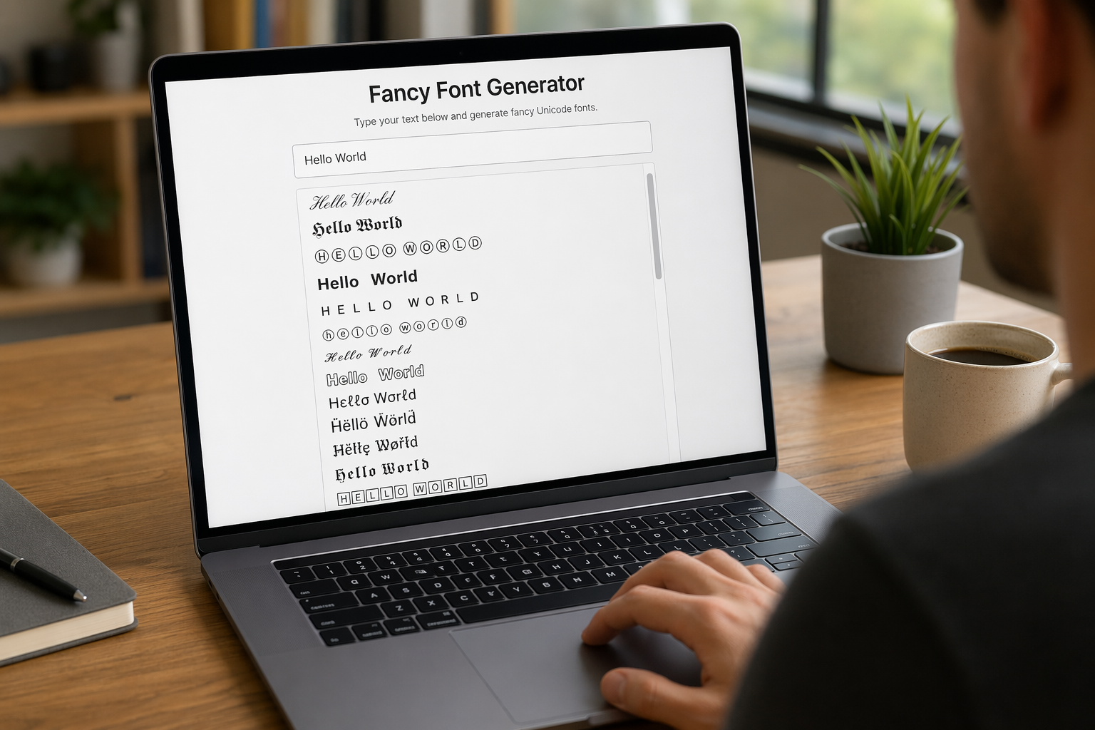
Remember that feeling when your social media posts just... vanished into the feed? I certainly do! For ages, I struggled to make my words pop. Then, I stumbled upon fancy font generators, and honestly, they've been a game-changer. They're my little secret for crafting text that truly stands out, making my content memorable without needing any fancy design degrees.

Have you ever just stopped to stare at the vast, endless blue of the sky or the deep, mysterious ocean? It feels like blue is everywhere, right? But then I started noticing something peculiar: when it comes to living things—plants, animals, us—true blue is incredibly hard to find. It got me wondering: why is such a common color in our world so shockingly rare in the vibrant tapestry of life? Let's explore this beautiful mystery together.
