
I remember feeling completely lost when it came to choosing colors. It felt like some secret language only 'real' designers spoke. But trust me, it's not magic – it's a few foundational 'golden rules' that anyone, including you and me, can master to create stunning palettes.
The golden rules for choosing a color palette involve applying established principles for harmony and balance. The most crucial is the 60-30-10 rule, which dictates using a dominant color (60%), a secondary color (30%), and an accent color (10%) to create a visually pleasing scheme.
Now, while the 60-30-10 rule is a fantastic launchpad (and honestly, it saved me from so many color disasters!), it's really just the tip of the iceberg. To truly master color, to make it yours, we need to dive deeper into the 'why.' I've pulled together some of my favorite insights on color theory and psychology – the kind of stuff that will transform your palettes from 'meh' to absolutely unforgettable, just like it did for mine.
This rule dictates a balanced hierarchy: 60% for a dominant color, 30% for a secondary color, and 10% for an accent color.
Ever feel like your design is missing something? The 60-30-10 rule is a timeless design principle that ensures your color palette feels harmonious and intentional, preventing visual chaos before it even starts.
The 60-30-10 rule creates a balanced design by assigning specific proportions and roles to your colors. It allocates 60% to a dominant hue, 30% to a secondary color, and 10% to an accent, establishing a clear visual hierarchy that guides the eye and prevents any single color from overpowering the composition.
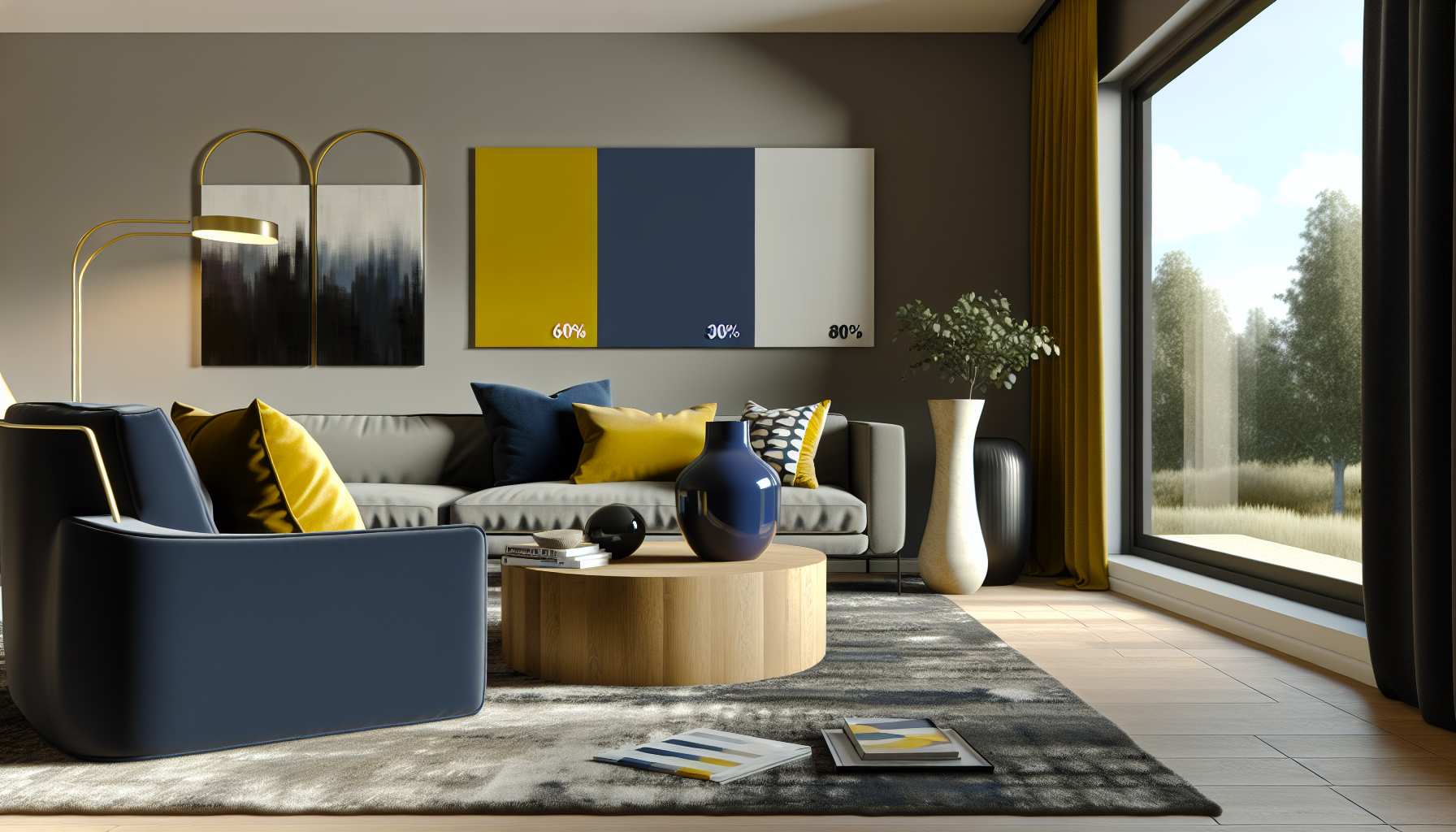
The magic of the 60-30-10 rule lies in its simplicity and psychological effectiveness. By giving each color a clear job, it creates a visual roadmap for the viewer, making the space feel cohesive and complete.
Think of it as casting roles for a play. Each color has a specific part to perform, and their combined effort creates the final masterpiece.
Without a clear structure, colors can compete for attention, resulting in a design that feels chaotic and overwhelming. The 60-30-10 rule imposes order by establishing a clear hierarchy. The dominant color provides a restful base, the secondary color adds depth without confusion, and the accent color creates focal points without cluttering the visual field. This structured approach ensures that the elements in your design have room to breathe.
This rule is a masterclass in directing attention. The expansive 60% dominant hue makes the viewer feel comfortable, while the 30% secondary color helps define different areas within the space. The small, vibrant 10% accent color acts like a magnet for the eyes, naturally pulling focus to the most important elements. This is a core concept in creating strong visual hierarchy principles2, ensuring that users see what you want them to see, when you want them to see it.
The accent color is used sparingly to highlight key elements, while the 60% dominant color typically serves as the main background.
By assigning dominant, secondary, and accent roles, the rule guides the viewer's eye and prevents visual chaos, creating a clear hierarchy.
Colors are more than just visual flair; they are powerful communicators that speak directly to our emotions. Choosing a palette is about sending the right message and creating a specific feeling to connect with your audience on a deeper level.
Color psychology is crucial in palette selection because it allows you to intentionally evoke specific emotions and associations to influence audience perception. By understanding how colors like blue inspire trust or yellow signifies optimism, you can build a palette that aligns perfectly with your brand's message and goals.

Color psychology is the study of how colors affect human behavior and emotion. When selecting a palette, you're not just picking pretty shades; you're choosing a set of emotional cues that will define the user's experience. The right colors can increase brand recognition, convey a specific mood, and even influence purchasing decisions.
Warm colors like red, orange, and yellow sit on one side of the color wheel and are often associated with energy, excitement, and positivity.
On the opposite side of the wheel, cool colors like blue, green, and purple typically have a calming and soothing effect. They are often used to build trust and a sense of security.
Understanding these associations is key to effective design. Examining how color psychology is used in famous brands3 provides excellent real-world examples of its impact. Here is a quick reference table:
| Color | Common Positive Associations | Industry Examples |
|---|---|---|
| Red | Energy, Passion, Urgency | Coca-Cola, Netflix, Target |
| Blue | Trust, Security, Calm | Facebook, IBM, Chase Bank |
| Green | Nature, Health, Wealth | Whole Foods, Starbucks, TD Bank |
| Yellow | Optimism, Clarity, Warmth | McDonald's, IKEA, Snapchat |
| Purple | Royalty, Creativity, Wisdom | Cadbury, Hallmark, Yahoo! |
Ultimately, the context is critical. The meaning of a color can shift based on culture, personal experience, and the other colors it's paired with. A successful palette uses color psychology not as a rigid rulebook, but as a guide to create a cohesive and emotionally resonant design.
Warm colors, particularly red, are associated with urgency and excitement. Cool colors like blue and green typically have a calming effect, conveying trust and stability instead.
Color is a strategic tool used to evoke specific emotions and influence audience perception, directly impacting brand recognition and consumer behavior, not just for visual flair.
The color wheel is more than just a rainbow in a circle; it's a designer's essential map to visual harmony. By understanding its structure, you can move from random guesses to intentional, beautiful color combinations that captivate your audience.
A color wheel ensures harmony by visually organizing colors based on their relationships. It allows you to apply proven color theory schemes—such as complementary, analogous, or triadic—to create palettes that are balanced, cohesive, and aesthetically pleasing for any design project.
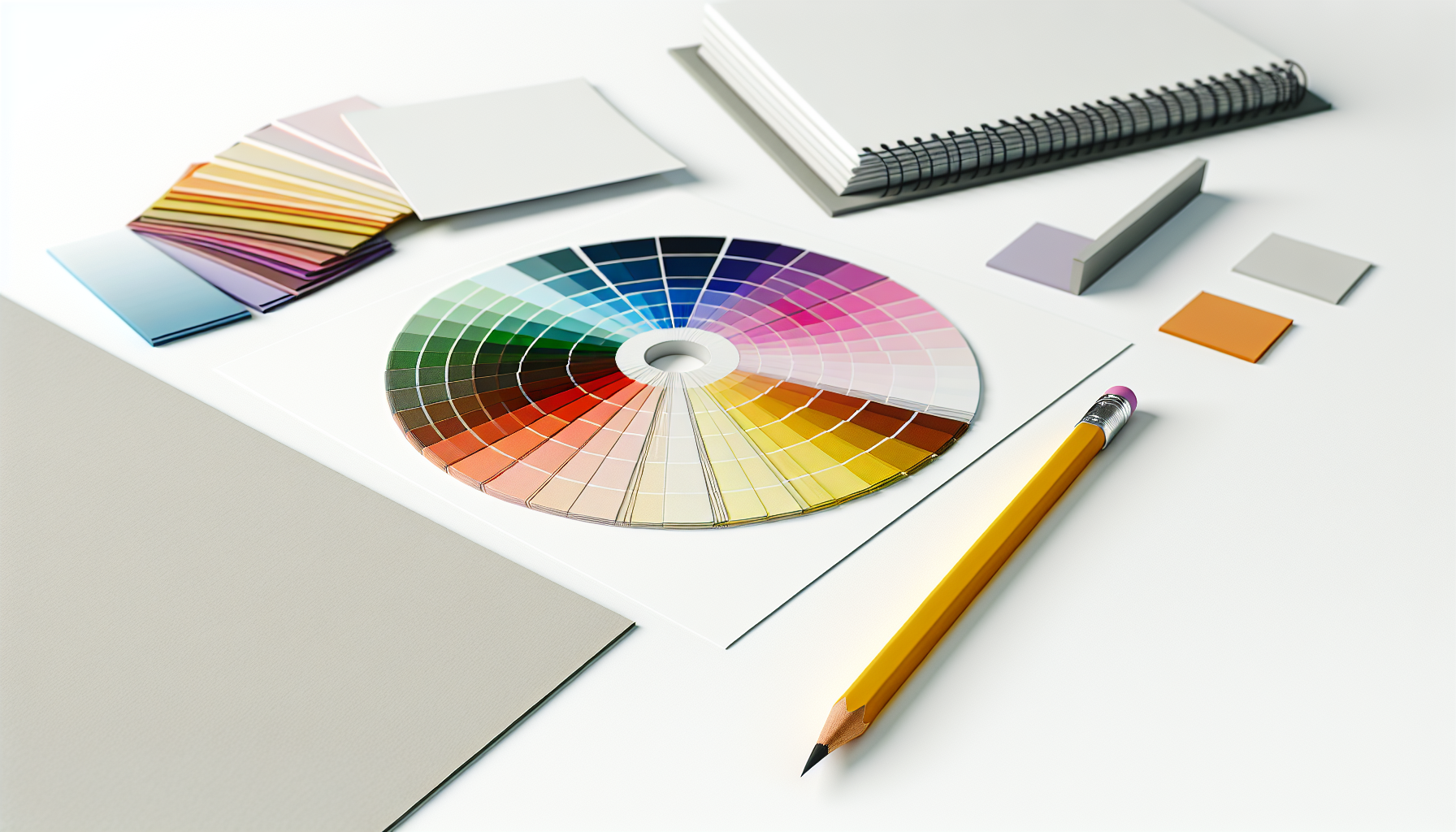
The color wheel is a visual representation of colors arranged according to their chromatic relationship. It's built on primary (red, yellow, blue), secondary (green, orange, purple), and tertiary colors. Using this tool, you can easily create harmonious palettes based on logical formulas.
Complementary colors are located directly opposite each other on the color wheel (e.g., blue and orange). This combination creates the highest level of contrast, making it ideal for drawing attention to specific elements. When used effectively, it produces a vibrant, energetic feel. However, be cautious not to overuse them, as they can be visually jarring if not balanced.
Analogous colors are a group of three colors that sit next to one another on the color wheel, such as blue, blue-green, and green. This scheme is often found in nature and is known for creating serene, comfortable, and cohesive designs. Because the colors are similar, the palette is pleasing to the eye and lacks strong contrast, making it perfect for creating a sense of unity.
A triadic color scheme uses three colors that are evenly spaced around the color wheel, forming a perfect triangle. This combination offers strong visual contrast while retaining balance and harmony. It's more balanced than a complementary scheme, providing a dynamic yet less intense palette. You can explore combinations with an interactive color wheel tool4.
While the main three are a great starting point, other schemes offer different effects. Understanding them allows for greater flexibility in your design work.
| Scheme | Description | Best For |
|---|---|---|
| Complementary | Colors opposite each other | High contrast, vibrant designs |
| Analogous | Colors next to each other | Serene, comfortable layouts |
| Triadic | Three evenly spaced colors | Balanced, dynamic palettes |
| Split-Complementary | A base color and the two colors adjacent to its complement | High contrast with less tension |
By leveraging these established relationships, you move from hoping colors work together to knowing they will. You can see many color schemes in web design5 that apply these principles effectively.
This is false. The text states analogous colors are next to each other on the wheel and create serene, comfortable designs with low contrast, not high contrast.
This is true. The context explains that a triadic scheme uses three colors evenly spaced around the color wheel, forming a triangle for a balanced, dynamic palette.
Choosing colors can be exciting, but it's easy to go wrong. A poor color combination can undermine your entire design. Let's explore the common mistakes to ensure your palette is effective and visually appealing.
Common pitfalls to avoid when combining colors include poor contrast, which hinders readability, and using too many colors, which creates visual chaos. Other key mistakes are ignoring the psychological impact of colors, disregarding the context of the design, and mismatching color undertones.

Navigating color combinations requires more than just picking your favorites. A few common missteps can easily turn a promising design into a confusing mess. By being aware of these pitfalls, you can create palettes that are both beautiful and functional.
One of the most frequent errors is insufficient contrast between text and its background. If colors are too similar in value, the content becomes difficult to read, alienating users, especially those with visual impairments. Always test your combinations for readability. Adhering to web content accessibility guidelines6 is not just good practice; it's essential for inclusive design.
The temptation to use every color you love is strong, but it often leads to a cluttered and unprofessional look. A design with too many competing colors lacks a clear focal point and can overwhelm the viewer. Sticking to a limited palette, like the 60-30-10 rule, helps create hierarchy and guides the user's eye effectively.
Colors carry powerful psychological associations that vary across cultures and contexts. Using bright, playful colors for a serious financial institution, for example, would create a disconnect. It's crucial to consider the brand's message and target audience. Understanding the psychology of color7 ensures your palette supports your message instead of contradicting it.
Even colors that seem to go together can feel discordant if their undertones clash. Every color has a warm (yellow/red-based) or cool (blue-based) undertone. Mixing a warm gray with a cool beige, for instance, can look muddy and unintentional.
Here's a quick guide to identifying undertones:
| Color Category | Warm Undertone Examples | Cool Undertone Examples |
|---|---|---|
| Reds | Tomato Red, Coral | Berry Red, Crimson |
| Blues | Turquoise, Teal | Cobalt Blue, Navy |
| Grays | Mushroom Gray, Taupe | Slate Gray, Silver |
Paying attention to these subtle temperature differences is key to achieving a truly harmonious and sophisticated palette.
Overloading a design with too many colors often leads to a cluttered, unprofessional appearance that can overwhelm the viewer and obscure the focal point.
Sufficient contrast is essential for readability, especially for users with visual impairments. It ensures content is accessible and easy to consume for all audiences.
Looking back, I can confidently say that embracing the 60-30-10 rule and truly understanding color harmony changed my entire approach to design. So, go on, give these principles a try! I bet you'll be amazed at how quickly you can create palettes that perfectly capture the mood you're going for.
See real-world examples of this rule applied in professional interior design: 60-30-10 Rule Example Your room has all white walls and a white sectional sofa (60%), neutral flooring, side tables, and upholstered side ... ↩
Understand the principles behind how color guides user attention effectively: Visual hierarchy is the order in which a visitor processes the elements on a website. So, for example, whether a visitor notices your call to action (CTA) ... ↩
See real-world examples of how top brands use color to influence consumer perception: Research has shown that color can increase brand recognition by up to 80%. How Color Psychology Impacts Your Brand. ↩
Experiment with color combinations in real-time using this powerful interactive tool: Want to know what colors look good together? Canva's Color Wheel makes color combinations easy. 1. Pick a color 2. Choose a color combination ↩
See how professionals apply these color theories to create stunning and effective websites: This article shares a list of 50 color schemes from award-winning websites and how to apply them in Visme using the hex color codes. ↩
Learn the official accessibility standards to ensure your design is readable for everyone: WCAG 2.0 level AA requires a contrast ratio of at least 4.5:1 for normal text and 3:1 for large text. WCAG 2.1 requires a contrast ratio of at least 3:1 for ... ↩
Explore how different colors influence emotions to strengthen your brand message: Color Psychology Chart ... What follows is a list of the 12 most commonly used branding and marketing colors, along with the color psychology guidelines for each. ↩
Recommended reading: the latest three posts in this language.

Ever find yourself scrolling, searching for that perfect little mental escape? I know I do! When it comes to online tile puzzles, the options can feel endless. But don't worry, I've sifted through the colorful chaos to find the absolute best, including the beloved original Google game and some fantastic alternatives, just for you.
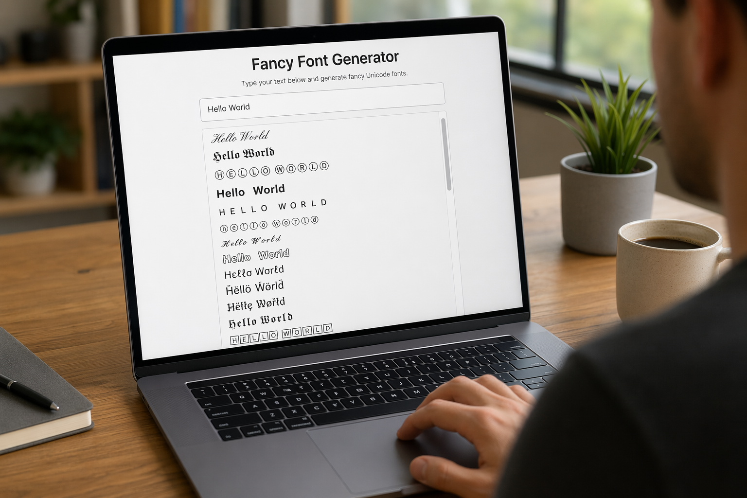
Remember that feeling when your social media posts just... vanished into the feed? I certainly do! For ages, I struggled to make my words pop. Then, I stumbled upon fancy font generators, and honestly, they've been a game-changer. They're my little secret for crafting text that truly stands out, making my content memorable without needing any fancy design degrees.

Have you ever just stopped to stare at the vast, endless blue of the sky or the deep, mysterious ocean? It feels like blue is everywhere, right? But then I started noticing something peculiar: when it comes to living things—plants, animals, us—true blue is incredibly hard to find. It got me wondering: why is such a common color in our world so shockingly rare in the vibrant tapestry of life? Let's explore this beautiful mystery together.
