
Oh, the magic of color! I remember countless times standing in front of my closet, wondering why some outfits just clicked and others felt utterly wrong. It turns out, it's not magic, but a beautiful blend of science and art. Unlocking your personal color palette isn't just about clothes; it's about transforming your entire presence and letting your natural glow truly shine.
To find your perfect color palette, start by determining your skin's undertone—cool, warm, or neutral. You can do this by checking your vein color or seeing how your skin reacts to gold versus silver jewelry. Next, identify your 'season' (Winter, Spring, Summer, or Autumn) based on your unique combination of skin, hair, and eye color.
Now, I know what you might be thinking: 'Is that all there is to it?' Not quite! While that snippet gives you a fantastic head start, truly mastering your personal palette is a journey, not a quick pit stop. I've poured over countless resources, sifted through expert advice, and even tried some questionable fashion choices myself, all to bring you the most foolproof methods, incredible tools, and detailed insights for each season. Trust me, this deep dive will empower you to confidently identify and apply the colors that were always meant for you.
Your undertone is the permanent hue beneath your skin's surface and doesn't change, unlike your surface tone which can tan.
Imagine a system that categorizes your personal coloring—skin, hair, and eyes—into a 'season' to reveal your most flattering shades. That's the core idea behind seasonal color analysis, a transformative tool for simplifying your style choices and boosting your confidence.
Seasonal color analysis is a method that classifies your natural coloring into one of four seasons: Winter, Spring, Summer, or Autumn. It works by assessing your skin's undertone (cool or warm) and the overall value and chroma of your hair and eyes to identify a harmonious palette of colors that enhance your features.
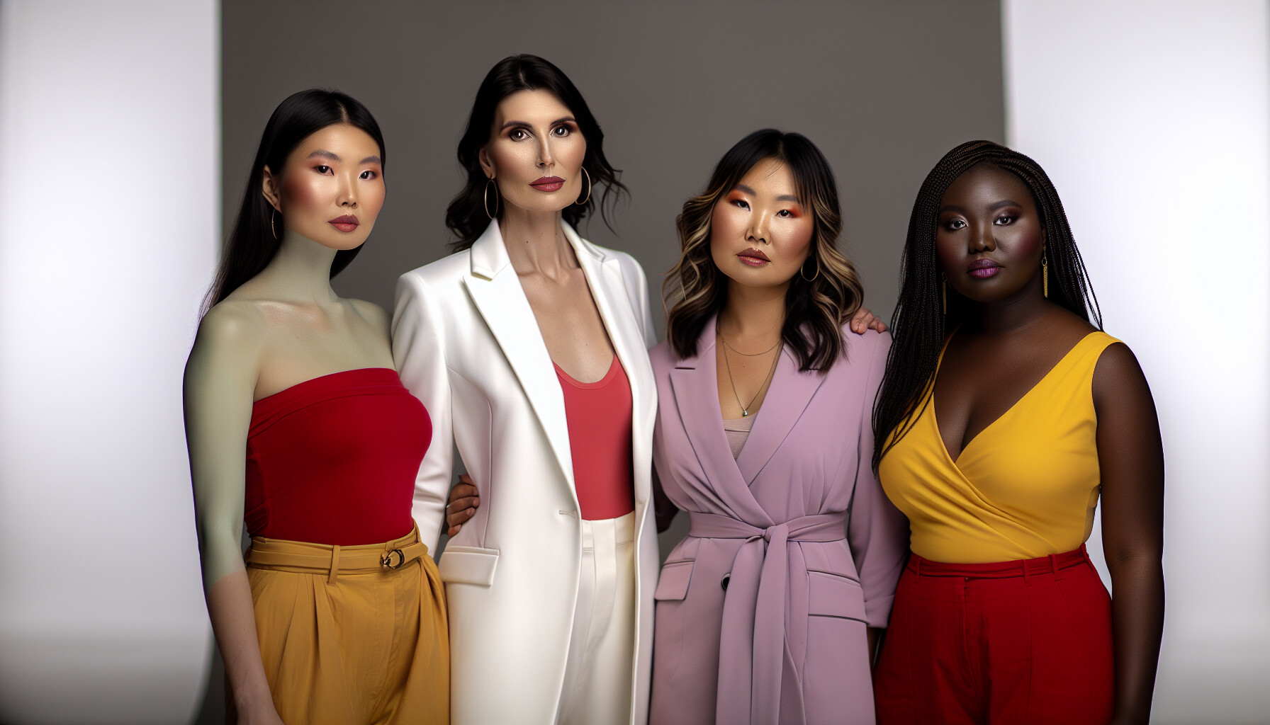
Seasonal color analysis is a framework designed to help you discover a range of colors that naturally complement your appearance. This theory, which has been refined over decades, operates on the principle that every individual's combination of skin, hair, and eye color corresponds to one of the four seasons of nature. Understanding the history of color theory1 can provide deeper context on how these principles were developed.
The system evaluates your coloring based on three key dimensions:
These dimensions are combined to assign you to a specific season, which then provides a curated palette of harmonious colors.
Each season has a distinct profile based on the interaction of undertone, value, and chroma. While the original system focuses on four seasons, modern interpretations have expanded this into more detailed categories like the 12-season color analysis system2 for greater accuracy.
Here is a basic breakdown of the four primary seasons:
| Season | Undertone | Key Characteristics | Best Colors |
|---|---|---|---|
| Winter | Cool | High contrast, clear, deep | Bold, crisp, icy colors like true black, pure white, navy, and jewel tones. |
| Spring | Warm | Low contrast, clear, light | Bright, fresh, and lively colors like peach, light green, and clear blues. |
| Summer | Cool | Low contrast, muted, light | Soft, dusty, and pastel-like colors such as powder blue, lavender, and rose pink. |
| Autumn | Warm | Low contrast, muted, deep | Rich, warm, and earthy colors like mustard yellow, olive green, and terracotta. |
The 'Winter' palette features bold, crisp, and icy colors like pure white and jewel tones, not soft pastels which are better for 'Summer' types.
While the original system has four seasons, modern interpretations have expanded this into more detailed systems, such as the 12-season analysis.
Figuring out your skin's undertone is the first step to unlocking your best colors. Forget confusing guides; these simple, at-home tests will give you a clear answer in minutes, using items you already own.
To determine your skin's undertone at home, check the veins on your wrist: blue or purple veins indicate a cool undertone, while green veins suggest a warm undertone. If you can't tell, you likely have a neutral undertone. Another quick method is the jewelry test; silver flatters cool tones, while gold complements warm tones.
Your undertone is the permanent, subtle hue beneath your skin's surface, and it doesn't change with sun exposure. It falls into one of three categories: cool, warm, or neutral. Here are four easy tests you can do right now.
Look at the inside of your wrist under natural light. The color of your veins can be a major clue.
Grab your favorite silver and gold jewelry. In good lighting, hold each piece up to your face.
Hold a piece of stark white clothing or paper next to your face (without makeup). Then, do the same with an off-white or cream-colored piece.
Think about how your skin typically reacts to sun exposure after you've been outside for a while without sunscreen.
Here's a quick summary table to help you out:
| Test | Cool Undertone | Warm Undertone | Neutral Undertone |
|---|---|---|---|
| Veins | Blue / Purple | Green / Olive | Indistinct / Mix |
| Jewelry | Silver | Gold | Both |
| White Fabric | Pure White | Off-White / Cream | Both |
| Sun Reaction | Burns Easily | Tans Easily | Burns then Tans |
This is false. Greenish veins are a sign of a warm undertone, while blue or purple veins suggest a cool undertone.
Correct. While your surface skin tone can tan or burn, the underlying undertone (cool, warm, or neutral) remains the same throughout your life.
In today's digital age, you don't need a personal stylist to discover your color palette. Your smartphone can be your guide! A variety of apps and online quizzes are designed to analyze your features and reveal the colors that make you shine.
The best apps and quizzes for finding your colors include Style DNA, Dressika, and Colorwise.me. These tools typically use your phone's camera and Artificial Intelligence (AI) to analyze your skin, hair, and eye color, providing a personalized seasonal color palette and style recommendations.
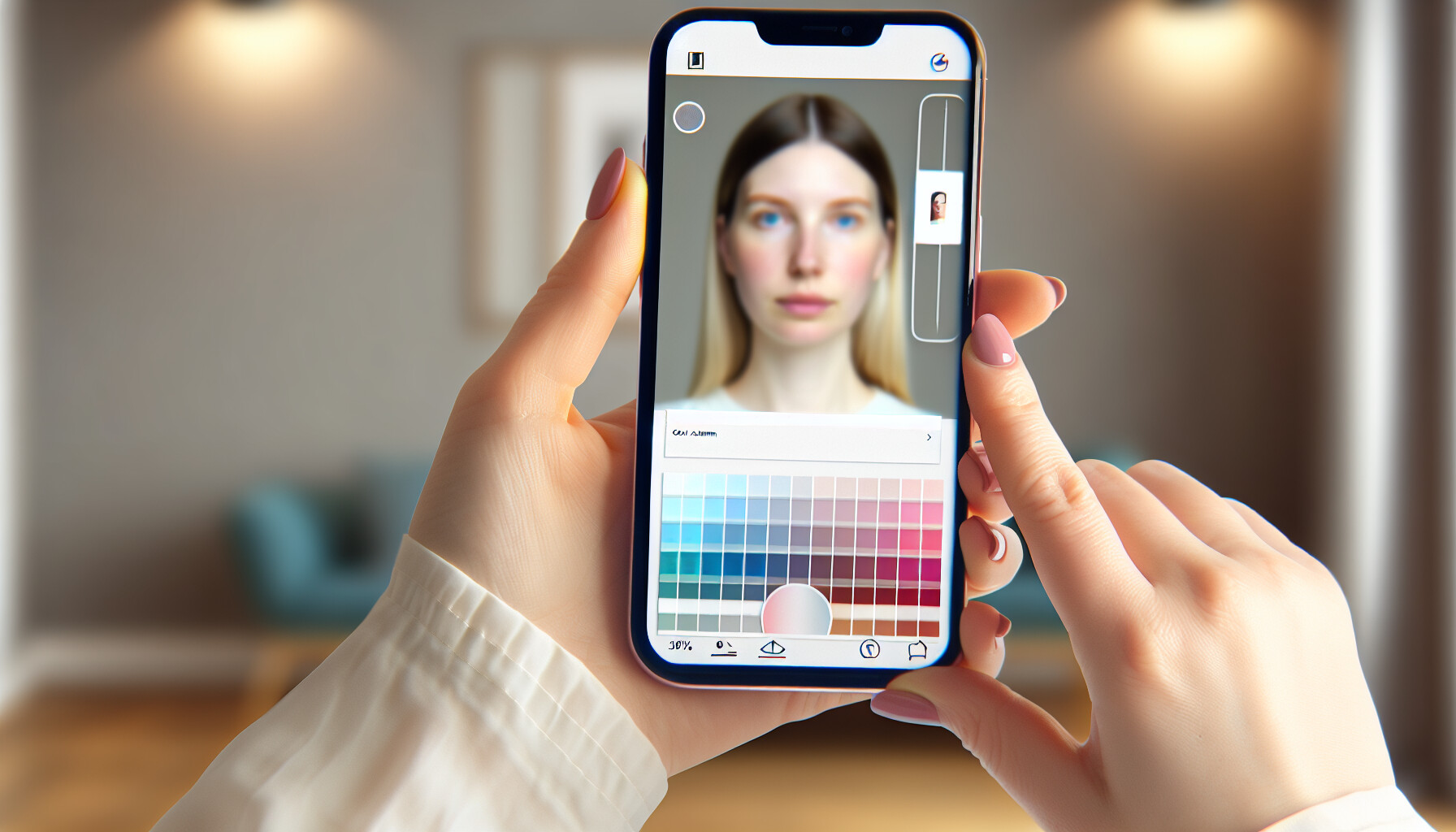
Navigating the world of digital color analysis can be exciting. These tools offer a convenient and accessible way to get an initial assessment of your personal palette right from home. Here’s a breakdown of what’s available.
Many modern apps use AI to analyze a selfie, determining your undertones and suggesting a seasonal palette. They offer a more objective analysis compared to self-assessment quizzes. These AI-powered color analysis apps4 are becoming increasingly sophisticated.
If you prefer a less technical approach, numerous insightful online quizzes5 can guide you. While they rely on your self-assessment rather than AI, they are a great starting point for understanding the principles of color theory and how they apply to you.
Here is a comparison of the different tool types:
| Tool Type | Examples | How It Works | Best For |
|---|---|---|---|
| AI Apps | Style DNA, Dressika | Uses your phone's camera and AI to analyze your features. | A more objective, data-driven analysis. |
| Online Quizzes | Colorwise.me, Kettlewell Colours | Asks a series of questions about your skin, hair, and eye color. | A quick, fun, and free way to explore your potential season. |
While these tools are incredibly helpful, remember that lighting can significantly affect photo analysis, and self-perception can influence quiz answers. Use them as a strong guide, but always confirm the results by draping fabrics of the recommended colors near your face to see the real-life effect.
The text confirms both apps use your phone's camera and AI to analyze your features, providing a data-driven personal color palette and style recommendations.
The text states that AI apps provide a more objective analysis, while online quizzes are based on subjective self-assessment and perception.
You've discovered your seasonal colors—now for the fun part! Let's translate that beautiful palette from a concept into a tangible, stunning reality in your closet and makeup bag. It's time to make every color count.
To apply your color palette, start by building a wardrobe with core neutrals from your season. Use your palette's brighter shades as accent colors for tops and accessories. For makeup, choose foundation that matches your undertone and select lipstick, blush, and eyeshadows from your seasonal colors.
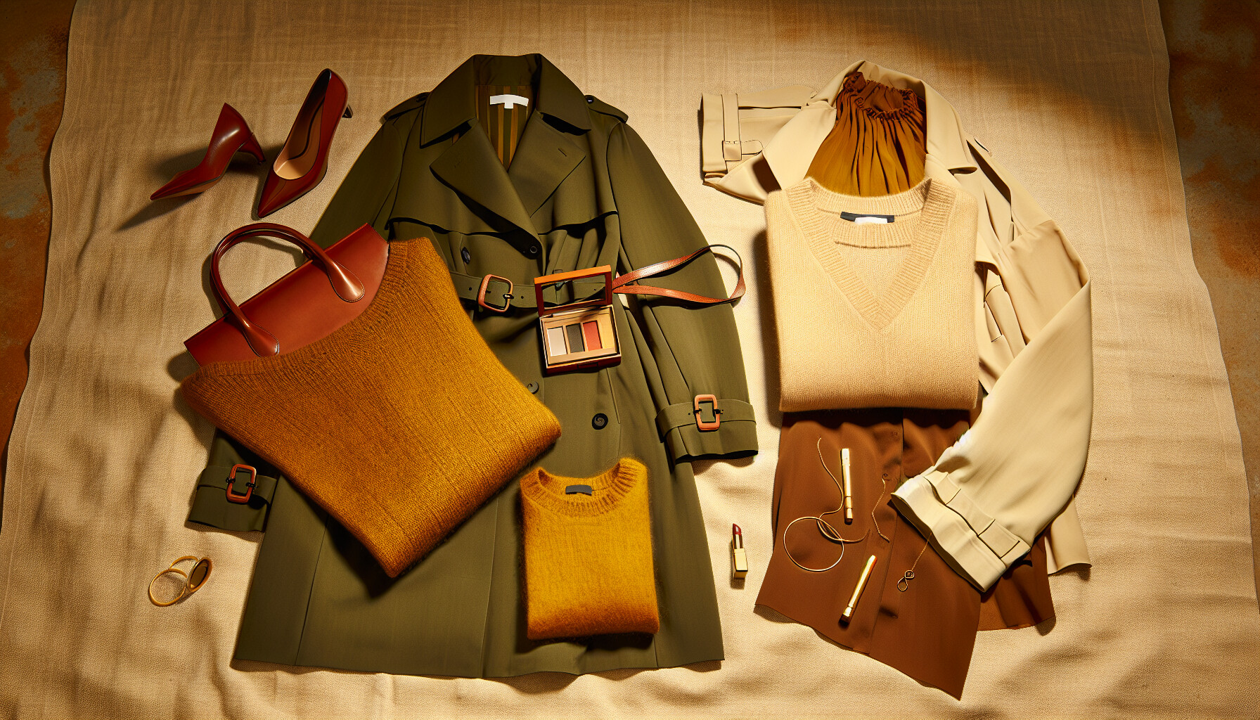
Applying your personal color palette is a creative process that transforms how you shop and get dressed. It's not about replacing your entire wardrobe overnight but about making intentional choices that highlight your natural beauty.
A great way to start is by using the 60-30-10 rule, a concept borrowed from interior design. This principle helps create balanced and visually appealing outfits.
Here’s an example of how this might look for a 'True Autumn' palette:
| Percentage | Role in Outfit | 'True Autumn' Color Examples |
|---|---|---|
| 60% | Neutrals (Base) | Olive Green, Cream, Warm Beige, Dark Brown |
| 30% | Main Colors | Mustard Yellow, Terracotta, Burnt Orange, Salmon Pink |
| 10% | Accent Colors | Deep Teal, Rich Gold, Rust |
This method simplifies creating cohesive outfits and is a core principle for building a capsule wardrobe6 that is both versatile and perfectly suited to you.
Your makeup should harmonize with your skin's undertone and seasonal colors to create a fresh, natural look.
This rule suggests 60% should be neutral colors, forming the foundation of your wardrobe, with only 10% dedicated to accent colors.
Foundations with yellow or golden bases are recommended for warm undertones (Spring/Autumn), not cool ones (Winter/Summer).
Discovering my perfect palette felt like unlocking a secret level of confidence I didn't even know existed. I hope these insights empower you to curate a wardrobe and style that truly feels like you, making you shine in the colors that were always meant to be yours. So, tell me, what’s the first color experiment you're excited to try?
Learn about the origins of this theory and how it has evolved over time: The theory was first developed by Bernice Kentner and Carole Jackson. ↩
Explore the more nuanced 12-season system for an even more precise color match: Twelve seasons colour analysis comprises four main seasons – Spring, Summer, Autumn and Winter. These are further divided into three sub-seasons each. ↩
See real-life photo examples to confirm your skin's undertone more accurately: This guide on How to Determine Your Own Skin Undertones will walk you through various methods to accurately identify whether you have cool, warm, or neutral ... ↩
Get in-depth user reviews and comparisons to choose the best app for you: AWFUL - App! DNA AI color Analysis offers a screen of colors. Also, this App advertises free analysis and once you enter you are trapped to ... ↩
Explore different quizzes to find one that resonates with your personal style: Take this free color analysis quiz and find out your possible seasonal color palette! Are you Warm or Cool, Soft or Clear, Light, or Deep? These six illustrated ... ↩
Learn to create a versatile and stylish capsule wardrobe with your personal colors: A curated capsule wardrobe is built on a thoughtfully chosen color palette. This video breaks down the steps to create a seasonal capsule ... ↩
Find specific makeup shades and looks that perfectly match your seasonal palette: There are four main color seasons: Spring, summer, autumn, and winter. Each season is further divided into three subcategories based on your ... ↩
Recommended reading: the latest three posts in this language.

Ever find yourself scrolling, searching for that perfect little mental escape? I know I do! When it comes to online tile puzzles, the options can feel endless. But don't worry, I've sifted through the colorful chaos to find the absolute best, including the beloved original Google game and some fantastic alternatives, just for you.

Remember that feeling when your social media posts just... vanished into the feed? I certainly do! For ages, I struggled to make my words pop. Then, I stumbled upon fancy font generators, and honestly, they've been a game-changer. They're my little secret for crafting text that truly stands out, making my content memorable without needing any fancy design degrees.

Have you ever just stopped to stare at the vast, endless blue of the sky or the deep, mysterious ocean? It feels like blue is everywhere, right? But then I started noticing something peculiar: when it comes to living things—plants, animals, us—true blue is incredibly hard to find. It got me wondering: why is such a common color in our world so shockingly rare in the vibrant tapestry of life? Let's explore this beautiful mystery together.
