
Have you ever scrolled past a design and just felt it? That instant connection, that sense of awe? For me, that's often the power of color at play. It's not just about picking pretty shades; it's about crafting an experience.
The most essential color palettes for a perfect design are rooted in color theory and include monochromatic (variations of a single color), analogous (colors adjacent on the color wheel), complementary (opposite colors), and triadic (three evenly spaced colors). These foundational schemes create visual harmony and impact.
But trust me, knowing the definitions is just the tip of the iceberg! I've poured my heart into uncovering the real-world impact of these palettes, sharing the tools I personally rely on, and laying bare the mistakes I've learned to avoid (sometimes the hard way!). Stick with me, and let's unlock the true potential of color together.
WCAG guidelines require a minimum contrast ratio of 4.5:1 for normal text to ensure readability for users with visual impairments.
Colors aren't just visual flair; they're a silent language spoken to our subconscious. This powerful tool can shape how users feel about your brand, influencing their trust, engagement, and purchasing decisions without them even realizing it.
Color psychology influences user perception by using specific hues to evoke emotions, create associations, and communicate brand values. For example, blue often conveys trust and security, while red can create a sense of urgency, directly impacting user behavior and their impression of a product or service.

Color is a fundamental element of design that carries significant psychological weight. The colors you choose can dramatically alter how users perceive your brand, website, or product. This isn't just about aesthetics; it's about tapping into a universal, subconscious language of emotion and association.
Different colors trigger distinct emotional and psychological responses. Understanding these associations is key to crafting a design that communicates your intended message effectively.
Here's a quick breakdown of common color associations in Western cultures:
| Color | Common Associations | Potential Use Cases |
|---|---|---|
| Red | Passion, excitement, urgency, danger | Call-to-action buttons, sales, fast food |
| Blue | Trust, security, calmness, professionalism | Banking, tech, healthcare |
| Green | Nature, growth, health, wealth, peace | Environmental brands, finance, wellness |
| Yellow | Optimism, warmth, happiness, caution | Creative fields, grabbing attention |
| Orange | Enthusiasm, creativity, energy | Youthful brands, e-commerce |
| Purple | Royalty, luxury, wisdom, creativity | High-end products, beauty, fantasy |
| Black | Sophistication, power, elegance, formality | Luxury brands, fashion, tech |
| White | Cleanliness, simplicity, minimalism, purity | Healthcare, minimalist design, tech |
While the associations above are a good starting point, the meaning of color is not universal. It can be heavily influenced by personal experiences, context, and cultural background. For instance, while white symbolizes purity in many Western countries, it's associated with mourning in many Eastern cultures.
Therefore, understanding your target audience is crucial. A color that works perfectly for one demographic might be completely inappropriate for another. Researching the cultural nuances in color psychology1 is essential for any brand aiming for a global reach. By considering these factors, you can create a more inclusive and effective design that resonates positively with all users.
Color meanings are culturally dependent. For example, white is associated with purity in the West but with mourning in many Eastern cultures.
The color blue is commonly associated with trust, security, and professionalism, making it a strategic choice for financial institutions to build user confidence.
Ready to move from theory to practice? The right tools can transform color selection from a daunting task into an inspiring creative process. Let's explore the top digital assistants that help designers craft the perfect palette with ease and precision.
The best tools for creating a color palette include Adobe Color for its deep integration with creative apps, Coolors for its speed and user-friendly interface, and Paletton for its focus on color theory. These platforms streamline the process of generating harmonious and effective color schemes.

Choosing the right tool often depends on your specific workflow and needs. Whether you're a seasoned designer or just starting, there's a perfect tool out there for you.
These are the workhorses of color palette creation. Tools like the Adobe's powerful color wheel2 offer deep integration with the Adobe Creative Cloud suite, allowing you to save palettes directly to your libraries. For speed and inspiration, the fast and intuitive Coolors generator3 is a crowd favorite; simply press the spacebar to generate endless new schemes. Paletton is excellent for those who want to explore color relationships based on classic theory like monochromatic or triadic schemes.
For a more personalized approach, AI-powered tools are changing the game. Khroma uses AI to learn which colors you like and generates limitless palettes tailored to your taste. Other innovative AI color tools4 can create palettes from a simple text description, an uploaded image, or even a website URL, providing a unique and intelligent starting point.
Beyond general palette creation, specialized tools can solve specific problems. For instance, ensuring your colors are accessible to everyone, including people with visual impairments, is crucial. Tools that check your color choices against the Web Content Accessibility Guidelines (WCAG)5 are essential for creating inclusive designs. These tools measure the contrast ratio between text and background colors to ensure readability.
Here is a quick comparison of some popular tools:
| Tool | Best For | Key Feature |
|---|---|---|
| Adobe Color | Adobe CC Users | Seamless integration with Photoshop, Illustrator, etc. |
| Coolors | Quick Generation | Generate palettes with a single keypress; export options. |
| Paletton | Color Theory Nerds | Live visualization of color relationships. |
| Khroma | AI Personalization | Learns your color preferences to create custom palettes. |
The text states Coolors is favored for its speed and quick generation, while Paletton is the tool focused on exploring color theory relationships like triadic schemes.
These tools measure contrast ratios between colors to ensure readability, which is essential for creating inclusive designs for people with visual impairments.
You've crafted the perfect color palette. Now comes the real challenge: ensuring it's used consistently everywhere your brand appears. This is the key to building strong brand recognition and trust, turning colors into a powerful asset.
To apply a color palette consistently across a brand, create a comprehensive brand style guide that specifies primary, secondary, and accent colors with their exact values (HEX, RGB, CMYK) and usage rules. Distribute this guide and use digital asset management systems to ensure all teams apply the correct colors across every touchpoint, from websites to print materials.
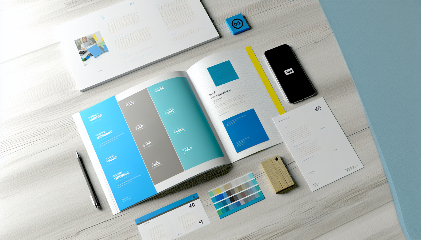
Consistency is the cornerstone of a strong brand identity. When your audience sees the same colors across every platform, it builds familiarity and trust. A haphazard approach, on the other hand, can make your brand look unprofessional and fragmented. Here’s how to ensure your color palette is applied with precision every time.
The single most important tool for color consistency is a brand style guide. This document is the ultimate source of truth for your brand's visual identity. For colors, it should go beyond just listing the swatches.
Your guide should explicitly define:
For each color, specify its exact codes for different mediums:
| Color Role | Swatch Example | HEX Code | RGB Value | CMYK Value |
|---|---|---|---|---|
| Primary | Blue | #0A4ABF | 10, 74, 191 | 95, 61, 0, 25 |
| Secondary | Teal | #4DD5E1 | 77, 213, 225 | 66, 6, 0, 12 |
| Accent | Yellow | #FFD700 | 255, 215, 0 | 0, 16, 100, 0 |
| Text | Dark Gray | #333333 | 51, 51, 51 | 0, 0, 0, 80 |
Creating a comprehensive brand style guide6 ensures that every designer, marketer, and developer on your team is working from the same playbook.
It's not enough to just define the colors; you must also guide how to use them. A popular and effective guideline is the 60-30-10 rule. This interior design concept adapts perfectly to digital and print branding:
This rule provides a simple framework that prevents one color from overpowering the others and maintains a balanced, harmonious look.
Finally, apply these rules universally. Your brand's colors must be identical everywhere a customer interacts with you. This includes:
To streamline this process, many companies rely on digital asset management (DAM) systems7. These platforms act as a central library for all brand assets, including official color palettes and logos, ensuring everyone has access to the correct files.
The 60-30-10 rule is a helpful guideline for achieving color balance, not a mandatory rule. It provides a framework but can be adapted based on design needs.
Specifying color codes for different mediums (digital and print) ensures that the brand's colors are reproduced accurately and consistently across all touchpoints.
A beautiful design concept can quickly fall flat with the wrong color choices. Many designers, both new and experienced, stumble into the same color traps. Let's explore these common mistakes to ensure your palettes are always effective and visually appealing.
The most common color palette mistakes to avoid are using an excessive number of colors, which creates chaos; neglecting contrast and accessibility standards, making content unreadable; using overly vibrant or dull saturation inappropriately; and ignoring the psychological context and target audience for your color choices.

Avoiding common pitfalls is just as important as knowing which colors to pick. A flawed palette can undermine user experience and weaken brand messaging. By being mindful of these frequent errors, you can create designs that are not only beautiful but also functional and effective.
One of the most frequent mistakes is using too many colors. While it might seem like more colors make a design vibrant, it often leads to visual chaos and a lack of focus. A cluttered palette confuses the viewer's eye, making it difficult to identify calls-to-action or important information. As a rule of thumb, stick to the 60-30-10 rule, which allocates percentages to a dominant primary color (60%), a secondary color (30%), and an accent color (10%) for highlights.
Color contrast is not just an aesthetic choice; it's a fundamental aspect of usability and accessibility. Poor contrast between text and its background can make content difficult or impossible to read, especially for users with visual impairments. It's crucial to adhere to the WCAG accessibility guidelines8, which set minimum standards for contrast ratios.
| Level | Contrast Ratio | Description |
|---|---|---|
| AA (Minimum) | 4.5:1 | For normal text. |
| AA (Large Text) | 3:1 | For text that is 18pt or 14pt bold. |
| AAA (Enhanced) | 7:1 | For normal text, providing enhanced contrast. |
Using a contrast checker tool during the design process is a non-negotiable step to ensure your content is readable for all users.
Saturation refers to the intensity or purity of a color. A common error is using colors that are too highly saturated across the entire design. Bright, neon-like colors can cause eye fatigue and often make a design feel unprofessional or overwhelming. Conversely, a palette with exclusively low-saturation, muted colors can appear dull and fail to capture attention. The key is balance—use vibrant colors sparingly as accents to draw the eye to key elements, and rely on more subdued tones for broader surfaces.
Colors evoke emotions and carry cultural connotations. A mistake is to choose colors based solely on personal preference without considering their psychological impact on the target audience. For example, while red can signify passion and excitement, it can also signal danger or error. It's vital to research and understand the principles of understanding color psychology9 and how they relate to your brand's industry and audience. A palette for a healthcare app would be very different from one for a fast-food chain, and for good reason.
Using too many colors often leads to visual chaos and a lack of focus, making it hard to identify important information.
This is false. The 4.5:1 ratio is for normal text; large text only requires a 3:1 ratio to meet the AA standard.
So, there you have it—my personal journey and insights into mastering color. Now that you're armed with these principles, I can't wait to see the incredible, emotionally resonant designs you'll create. What masterpiece will you bring to life first?
Learn how color meanings vary across cultures for effective global branding: This article looks at how color is perceived by different cultures, so you can understand the effect your visual choices will have on the people you're ... ↩
Learn to leverage Adobe Color's full potential within your creative workflow: In this video, I'll be showing you how to design with intention using color wheels and Adobe Color. As meticulous designers, we often ... ↩
Master this super-fast tool for generating, refining, and sharing color palettes: I'm going to show you how to use coolers.co to create color schemes super fast so you can spend less time playing with colors. ↩
Discover cutting-edge AI tools that create palettes from images, text, and preferences: Khroma uses AI to learn which colors you like and creates limitless palettes for you to discover, search, and save. ↩
Ensure your designs are accessible and compliant with universal web standards: WCAG conformance should be evaluated for color pairs specified in the content that an author would expect to appear adjacent in typical presentation. ↩
See real-world examples of how leading brands document their color rules: Examples of how to and how not to use colors are shown in the Do's & Don'ts section of the brand guidelines. This includes how to use colors against backgrounds ... ↩
Learn how DAM tools can automate and enforce your brand's color palette: In the context of Digital Asset Management (DAM), brand consistency ensures that all digital assets used by an organization adhere to the established brand ... ↩
Get official guidelines to ensure your designs are accessible to everyone: The visual presentation of text and images of text has a contrast ratio of at least 7:1, except for the following: Large Text. Large-scale text ... ↩
Learn how to use color to influence perception and connect with your audience: Putting the psychology of every color together, this chart combines each color's associated moods and logo examples to help guide your branding. ↩
Recommended reading: the latest three posts in this language.

Ever find yourself scrolling, searching for that perfect little mental escape? I know I do! When it comes to online tile puzzles, the options can feel endless. But don't worry, I've sifted through the colorful chaos to find the absolute best, including the beloved original Google game and some fantastic alternatives, just for you.
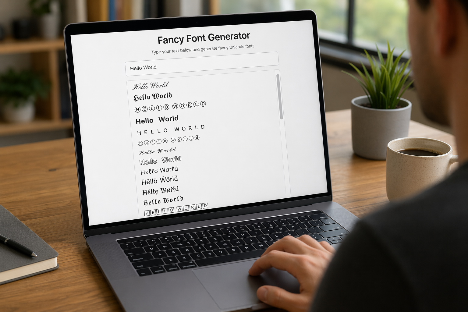
Remember that feeling when your social media posts just... vanished into the feed? I certainly do! For ages, I struggled to make my words pop. Then, I stumbled upon fancy font generators, and honestly, they've been a game-changer. They're my little secret for crafting text that truly stands out, making my content memorable without needing any fancy design degrees.

Have you ever just stopped to stare at the vast, endless blue of the sky or the deep, mysterious ocean? It feels like blue is everywhere, right? But then I started noticing something peculiar: when it comes to living things—plants, animals, us—true blue is incredibly hard to find. It got me wondering: why is such a common color in our world so shockingly rare in the vibrant tapestry of life? Let's explore this beautiful mystery together.
