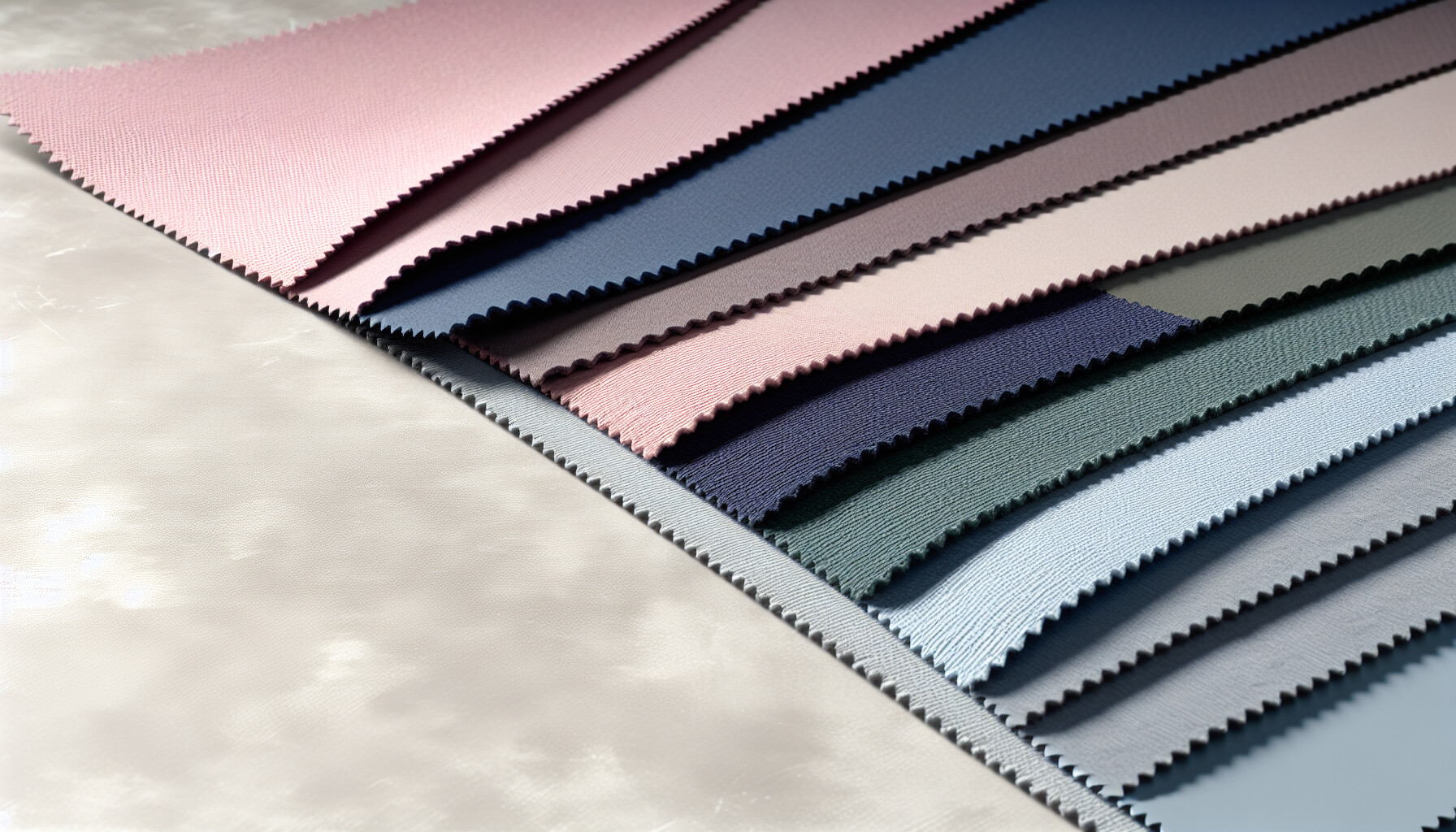
Have you ever put on an outfit and just felt it? That magical moment when your skin glows, your eyes sparkle, and you look effortlessly put-together? For me, that feeling clicked into place once I discovered I was a Cool Summer. It's like finding the secret code to your personal style!
The best colors for a Cool Summer palette are cool, soft, and muted shades with blue or pink undertones. Key colors include dusty rose, lavender, soft navy, powder blue, spruce, and cool grays. These colors harmonize with your natural coloring, enhancing your skin, eyes, and hair.
But let me tell you, truly understanding your palette goes way beyond just knowing a few colors. It’s about building a wardrobe that works for you, discovering those perfect neutrals, and knowing which colors to politely decline. I’ve been there, sifting through endless advice, and I'm so excited to share what I've learned through my own deep dives and style experiments to guide you to your most radiant self.
Cool Summers should avoid warm, earthy colors like mustard yellow, as they clash with their cool, blue-based undertones and can create an unflattering, sallow look.
Think you might be a Cool Summer but aren't quite sure? Pinpointing your exact season can be tricky, but a few key characteristics set this cool and gentle palette apart from the rest. Let's examine the clues to see if you belong to this elegant season.
You can tell you're a Cool Summer if your overall coloring has cool, blue-based undertones and is muted or soft, rather than bright. Your skin likely has a pink or rosy cast, your hair is ashy (from blonde to brown), and your eyes are typically blue, gray, or soft green.

Identifying yourself as a Cool Summer involves looking at the interplay between your skin, hair, and eyes. It's all about coolness and softness. Unlike the high-contrast Cool Winter, a Cool Summer's features blend more gently.
A Cool Summer's skin has distinct cool, blue-based or pinkish undertones. You won't find any warm, golden, or peachy hues here.
Understanding your undertones is the foundational step in seasonal color analysis1.
Your natural hair color is a major clue. Cool Summers have hair that is inherently ashy, meaning it lacks red or golden tones.
The eyes of a Cool Summer are typically soft and cool, mirroring the overall gentle quality of the palette.
To help you distinguish further, here's a quick comparison with neighboring seasons:
| Feature | Cool Summer | Cool Winter | Light Summer |
|---|---|---|---|
| Dominant Trait | Cool | Cool | Light |
| Secondary Trait | Muted | Bright | Cool |
| Contrast | Low to Medium | High | Low |
| Overall Vibe | Gentle, rosy, soft | Crisp, clear, intense | Airy, delicate, fresh |
If you find yourself fitting the "Cool" and "Muted" characteristics but are still unsure, exploring the differences between the three summer sub-seasons can provide more clarity. A deeper dive into summer palettes2 can help you pinpoint your exact type.
Cool Summers are defined by cool, blue-based or pinkish undertones, not warm, golden hues.
According to the chart, a Cool Summer's dominant trait is 'Cool' and their secondary trait is 'Muted', not 'Bright'.
Just as important as knowing your best colors is knowing which ones to steer clear of. Wearing the wrong shade can wash you out, highlight imperfections, and clash with your natural coolness, undoing all the benefits of your ideal palette.
Cool Summers should avoid warm, earthy, and overly bright colors. This includes shades like mustard yellow, pumpkin spice, terracotta, olive green, and vibrant orange. Pure black and stark white are also too harsh and should be replaced with softer alternatives like charcoal gray and soft white.

Knowing which colors to avoid is crucial for letting your Cool Summer essence shine. The primary culprits are colors that are too warm, too bright, or too dark, as they overwhelm your delicate and muted coloring.
The biggest mistake a Cool Summer can make is wearing colors with strong yellow or orange undertones. These shades clash directly with your cool, blue-based skin, creating a jarring effect that can make you look sallow or tired. Your palette is defined by coolness and softness, whereas these colors are the complete opposite. Understanding the 'why' behind this comes down to basic color theory fundamentals3.
Key colors to avoid in this category include:
While Cool Summers have some clarity, your primary characteristic is softness. Extremely bright, saturated, or neon colors will overpower your muted features. Similarly, very dark and stark colors like true black can be too severe. While other seasonal analyses might place similar colors differently, the core principle of avoiding warmth and harshness remains consistent across most different color analysis systems4.
| Colors to Avoid | Better Alternatives for Cool Summer |
|---|---|
| True Black | Soft Navy, Charcoal Gray, Deep Taupe |
| Stark Optic White | Soft White, Light Gray, Powder Pink |
| Electric Blue | Powder Blue, Periwinkle, Cadet Blue |
| Hot Pink | Dusty Rose, Watermelon, Orchid |
| Bright Orange | Coral Pink (used sparingly), Watermelon |
By sidestepping these unflattering colors, you allow your natural beauty to take center stage, creating a harmonious and effortlessly chic appearance.
These warm, earthy tones clash with a Cool Summer's blue-based undertones, creating a jarring effect that can make them look sallow or tired.
Stark white is too harsh for a Cool Summer's soft and muted coloring. Soft white is a better alternative that creates a more harmonious appearance.
Neutrals are the foundation of a versatile and sophisticated wardrobe. For a Cool Summer, choosing the right foundational shades is crucial for creating harmonious looks that let your natural coloring shine. But which neutrals should you pick?
The best neutral colors for a Cool Summer are those with cool, grayed-out undertones. Key choices include soft navy, charcoal gray, slate gray, cool taupe, and soft white. These shades provide a perfect, non-overpowering base that complements the soft and cool primary colors of the palette.

While vibrant colors are exciting, a well-curated selection of neutrals is what makes a wardrobe truly functional. They provide the canvas for your more colorful pieces and are essential for creating polished, cohesive outfits. For Cool Summers, the key is to steer clear of warm, yellow-based neutrals and embrace shades with a blue, pink, or gray base.
Gray is arguably the most important neutral for a Cool Summer, serving as a softer, more flattering alternative to black. A variety of grays can add depth and sophistication to your wardrobe.
Soft navy is another cornerstone. It's less harsh than black and harmonizes beautifully with the entire Cool Summer palette, from dusty pinks to lavenders.
Stark, brilliant white can be too harsh against a Cool Summer's soft complexion. Instead, opt for softer, slightly muted versions. Look for shades described as "soft white" or light gray. These off-whites will illuminate your face without overwhelming your features. Getting this right is key, as the white you choose for a simple t-shirt can make a huge difference. If you're unsure, you can find guides on choosing the right white5.
Most browns are too warm for a Cool Summer. Avoid golden, camel, and orange-based browns. However, there are a few exceptions that work beautifully:
Building a wardrobe around these foundational colors will make getting dressed effortless. For more ideas, explore guides on building a neutral capsule wardrobe6 tailored to your color season.
Here is a quick reference table for your go-to neutrals:
| Category | Best Shades for Cool Summer |
|---|---|
| Grays | Charcoal, Slate Gray, Dove Gray, Pewter |
| Blues | Soft Navy, Denim Blue |
| Whites | Soft White, Light Gray |
| Taupes/Browns | Cool Taupe, Rose-Beige, Cocoa |
The text states that charcoal gray and soft navy are better, less harsh alternatives to black for a Cool Summer's soft complexion.
Stark, brilliant white can be too harsh. Softer, muted whites illuminate the face without overwhelming a Cool Summer's features.
Feeling stuck pairing your Cool Summer colors? It's easier than you think! Moving beyond single colors opens up a world of sophisticated and harmonious outfits that perfectly complement your cool, soft undertones. Let's explore how to mix and match like a pro.
To combine colors in the Cool Summer palette, focus on monochromatic, analogous, and neutral-based pairings. For example, pair different shades of blue like soft navy and powder blue, or combine adjacent colors like lavender and dusty rose. Use your neutrals (cool grays, soft navy) as a base and add pops of color like periwinkle or soft fuchsia.
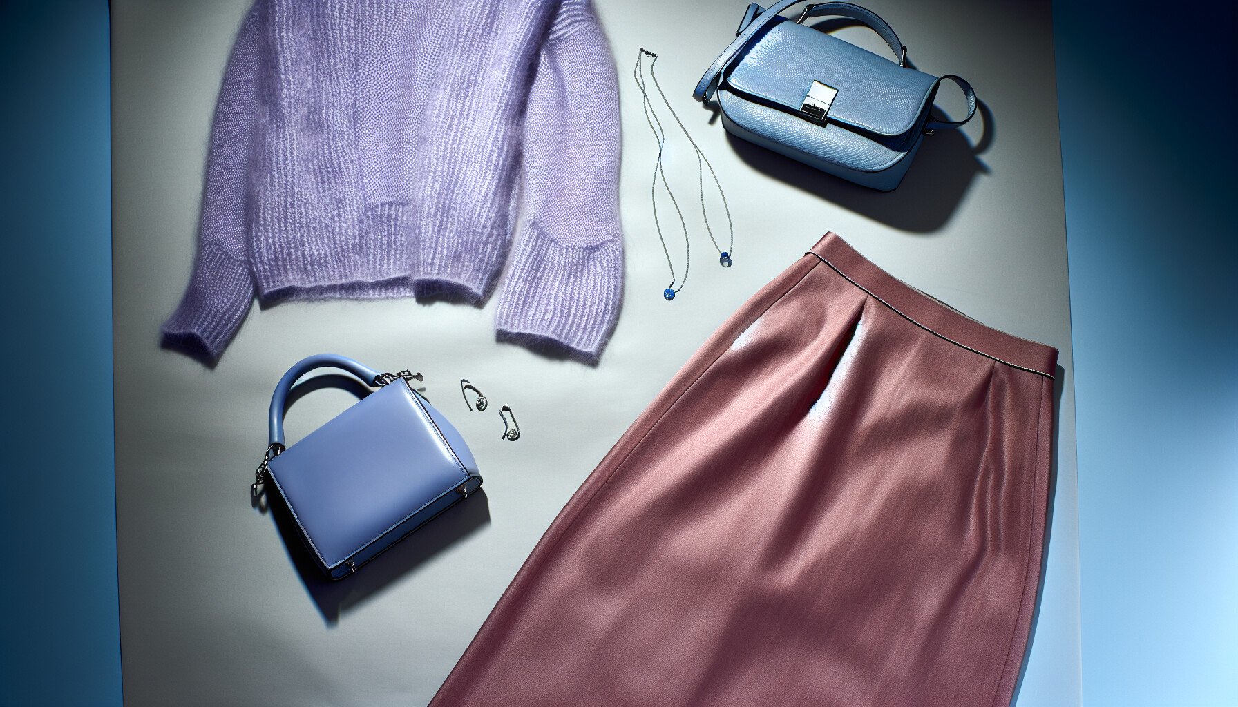
Combining the colors in your Cool Summer palette is all about creating harmony and flow. Instead of stark contrasts, you'll aim for gentle, blended looks that echo your natural coloring. Here are some trusted methods to create stunning outfits.
This is the simplest and most elegant way to combine colors. It involves wearing different tints, tones, and shades of a single color. For a Cool Summer, this creates a sophisticated, elongated silhouette.
Analogous colors sit next to each other on the color wheel, creating a serene and pleasing look. Since Cool Summer colors are already harmonious, this method is a natural fit. Think of pairing different cool-toned pinks, purples, and blues.
While high-contrast complementary colors are generally too harsh for a Cool Summer, you can use muted versions for a subtle pop. Instead of bright orange with blue, a Cool Summer might use a soft, cool green with a deep rose. Using a color wheel for seasonal analysis7 can help you identify these gentler opposites.
Your neutral colors are the foundation of your wardrobe. Use them as the main component of your outfit and then add one or two of your main Cool Summer colors as accents.
Here's a quick reference table for inspiration:
| Combination Type | Base Color | Pairing/Accent Color | Outfit Example |
|---|---|---|---|
| Monochromatic | Soft Navy | Powder Blue | A soft navy dress with a powder blue cardigan. |
| Analogous | Lavender | Dusty Rose | A lavender top paired with a dusty rose skirt. |
| Complementary Accent | Spruce Green | Soft Burgundy | Spruce green trousers with a soft burgundy handbag. |
| Neutral-Based | Cool Gray | Periwinkle | A cool gray suit with a periwinkle blouse. |
The Cool Summer palette favors soft, blended looks. High-contrast colors are generally too harsh, with muted accents being the recommended approach for a harmonious effect.
Neutrals like cool grays and soft navy serve as a versatile base for outfits, allowing other palette colors to be added as harmonious pops of color.
Embracing your Cool Summer essence is a journey of self-discovery. By choosing soft, cool shades, I've found my style confidence soar! What beautiful color combination will you try first to enhance your natural glow?
Learn reliable methods to identify your skin's undertone for accurate color matching: Stand in front of a window to get some natural lighting, then look at your complexion and assess how light or dark it is. ↩
See a detailed comparison of the summer sub-seasons to find your perfect fit: On Light Summers, yellow hair can emphasize the delicacy of their coloring; Emily's skin seems to be calling for more depth. ↩
Learn the basics of color theory to understand why certain shades flatter you: In general, the colors on the right will flatter people with warm undertones and the colors on the left will flatter people with cool undertones. ↩
Explore how Cool Summer fits into various color analysis frameworks for a deeper understanding: *You can sometimes find the seasons are called different names such as Muted (the same as Soft), Clear (the same as Bright) and Dark (the same ... ↩
Learn to distinguish between warm and cool whites to find your perfect match: White is not one-size-fits-all. In this episode of Midlife Moxie, Gail and Jen break down the surprisingly complex world of white—from icy ... ↩
Get inspired with examples of how to build a versatile wardrobe with these neutrals: Discover Pinterest's best ideas and inspiration for Capsule wardrobe cool summer. Get inspired and try out new things. 475 people searched this. ↩
Visualize color relationships to confidently create harmonious and dynamic outfit pairings: An interrogation of the Cool Summer palette - what colours are in it and which colours are to be avoided. How to combine your colours. ↩
Recommended reading: the latest three posts in this language.

Ever find yourself scrolling, searching for that perfect little mental escape? I know I do! When it comes to online tile puzzles, the options can feel endless. But don't worry, I've sifted through the colorful chaos to find the absolute best, including the beloved original Google game and some fantastic alternatives, just for you.

Remember that feeling when your social media posts just... vanished into the feed? I certainly do! For ages, I struggled to make my words pop. Then, I stumbled upon fancy font generators, and honestly, they've been a game-changer. They're my little secret for crafting text that truly stands out, making my content memorable without needing any fancy design degrees.

Have you ever just stopped to stare at the vast, endless blue of the sky or the deep, mysterious ocean? It feels like blue is everywhere, right? But then I started noticing something peculiar: when it comes to living things—plants, animals, us—true blue is incredibly hard to find. It got me wondering: why is such a common color in our world so shockingly rare in the vibrant tapestry of life? Let's explore this beautiful mystery together.
