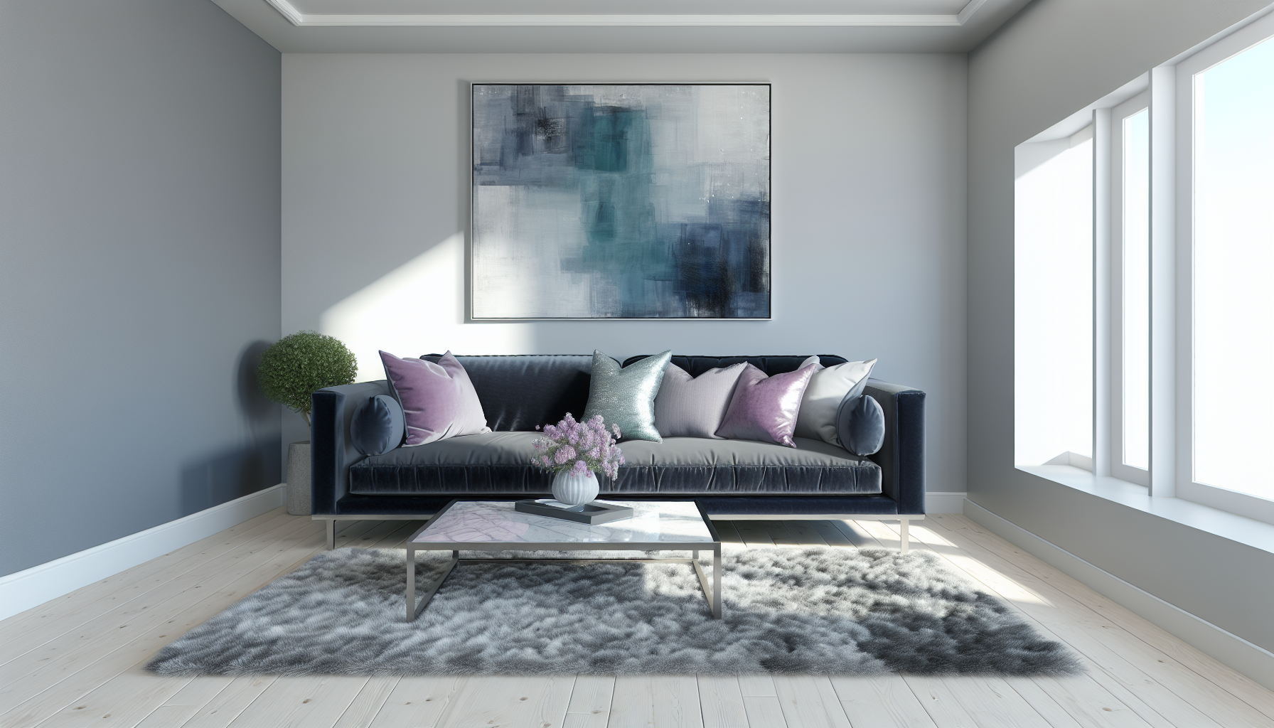
You know that feeling when a space just clicks? Or when a design makes you feel instantly calm? I've spent years chasing that magic, and I've learned that often, it all comes down to the subtle, powerful whispers of cool colors.
Cool colors are hues that include blue, green, and purple, along with their various shades and tints. They are typically associated with water, nature, and the sky, and are known to evoke feelings of calmness, serenity, professionalism, and spaciousness in viewers.
But trust me, simply knowing their names is just scratching the surface. I've discovered that to truly master these hues—whether you're painting a masterpiece, redecorating your sanctuary, or crafting a brand that resonates—you need to dive deep into their psychology and composition. Come with me, and I'll share the expert strategies I've picked up to help you unlock their full, transformative potential.
Cool colors mimic atmospheric perspective, where distant objects appear bluer and less saturated, creating an illusion of depth and space.
Ever felt a sense of peace by the ocean or tranquility in a lush forest? That's the powerful psychological effect of cool colors at play, subtly shaping our emotions and perceptions every day, often without us even realizing it.
Cool colors, primarily blue, green, and purple, generally have a calming and soothing effect on our psychology. They can help reduce stress and anxiety, lower blood pressure, and evoke feelings of serenity, trust, and spaciousness. However, depending on the shade and context, they can also convey coldness or sadness.

The psychological impact of cool colors is deeply rooted in our collective human experience, often tied to elements of the natural world. Understanding these associations can help you use color more intentionally in any creative project.
Blue is the quintessential cool color, overwhelmingly associated with calm and serenity. Think of a clear sky or a vast ocean. This connection makes it a powerful tool for creating a peaceful and stable environment. It's known to slow the heart rate and promote feelings of trust and dependability, which is why it's a favorite for corporate logos (like Facebook and LinkedIn) and professional settings. In a room, light blue can make a space feel larger and more open, while dark blue can convey strength and reliability. However, an overabundance of blue can sometimes feel cold, distant, or even sad—hence the phrase "feeling blue."
Green is the color of life, nature, and renewal. Positioned between calming blue and energetic yellow, it strikes a perfect balance, promoting feelings of harmony and restoration. Because it's so prevalent in the natural world, our eyes are accustomed to it, making it a restful color that can reduce eye strain and alleviate stress. It's often used in healthcare to create a calming atmosphere and in branding to signify health, sustainability, and growth. These concepts are central to biophilic design principles1, which integrate natural elements into built environments to improve well-being. On the flip side, some shades of green can be associated with envy or boredom.
Purple is a unique blend of blue's stability and red's energy. Historically associated with royalty and luxury, it carries an air of sophistication, wisdom, and creativity. Lighter shades like lavender are gentle and serene, often used in spas and bedrooms to promote relaxation. Darker, richer purples can feel dramatic, mysterious, and powerful. Because it occurs less frequently in nature, purple can sometimes appear artificial, but it's highly effective when used to make a statement. Understanding color theory in branding2 can help you leverage purple’s unique qualities to create a memorable and impactful identity.
To summarize the dual nature of these colors, here’s a quick overview:
| Color | Positive Psychological Associations | Negative Psychological Associations |
|---|---|---|
| Blue | Calm, Trust, Stability, Peace, Productivity | Coldness, Sadness, Aloofness |
| Green | Nature, Health, Growth, Harmony, Freshness | Envy, Boredom, Stagnation |
| Purple | Royalty, Luxury, Creativity, Wisdom, Mystery | Arrogance, Frustration, Gloominess |
The specific shade, tint, and tone you choose will ultimately determine the final mood. A bright, vibrant turquoise feels very different from a somber, deep navy blue.
While blue can evoke sadness, it is overwhelmingly associated with positive feelings like calm, trust, and stability, reminiscent of a clear sky or ocean.
Because green is so common in the natural world, our eyes are accustomed to it, making it a relaxing color that can alleviate stress and eye fatigue.
Struggling to make your 2D artwork feel vast and three-dimensional? The secret might be hiding in plain sight on the cool side of your palette. Discover how blues, greens, and purples can create breathtaking depth and expansive space.
To create depth and space with cool colors, leverage the principle of atmospheric perspective. Cool colors, especially blues and light purples, naturally recede, meaning they appear farther away to the human eye. Use them for distant objects like mountains or skies to create a convincing illusion of distance.
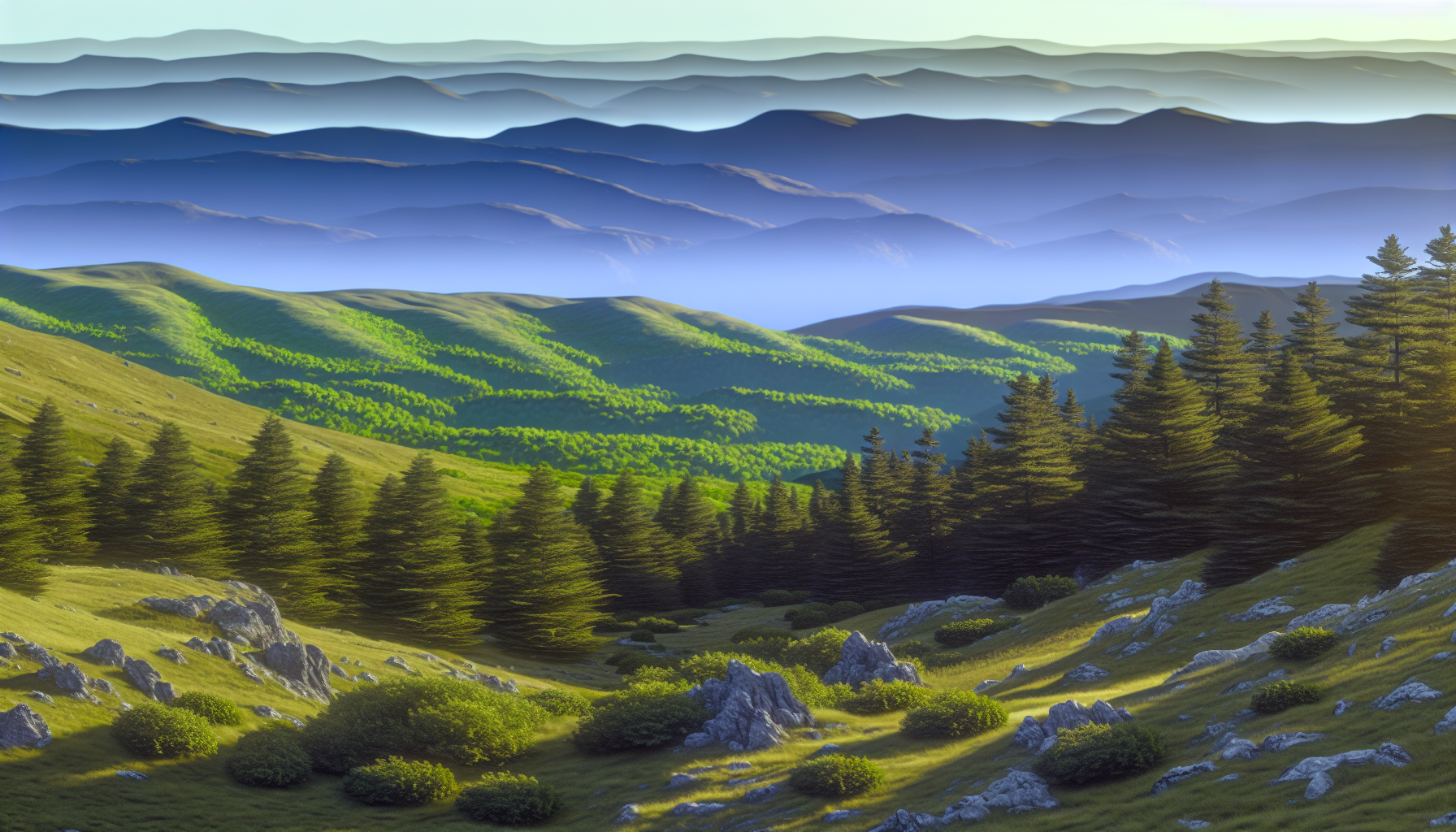
Artists have long understood a fundamental trick of visual perception: cool colors recede. This optical illusion is the key to transforming a flat canvas into a deep, immersive world. By strategically placing blues, greens, and violets, you can guide the viewer's eye through your composition, creating a powerful sense of space and distance.
One of the most effective techniques is emulating atmospheric perspective. In nature, objects in the distance appear lighter, less detailed, and bluer because we are looking at them through more of the Earth's atmosphere. You can replicate this in your art:
This gradual shift creates a believable progression from front to back. For a deeper understanding, you can explore examples of atmospheric perspective in painting3.
Hue is only one part of the equation. Value (lightness/darkness) and saturation (intensity) are also critical for creating depth.
Combining these elements gives you precise control. To master this, consider practicing with color value and saturation techniques4.
Here's a simple guide to applying these principles:
| Layer | Color Characteristics | Example Elements |
|---|---|---|
| Foreground | Warmer tones, high saturation, dark values, sharp details | A vibrant green bush, a detailed rock |
| Midground | Cooler tones, medium saturation, mid-range values, some detail | A stand of pine trees, a rolling hill |
| Background | Coolest tones (blues/purples), low saturation, light values, blurry | Distant mountains, the horizon |
This is false. Cool colors like blue and purple recede and are used to create the illusion of distance in art.
This is true. This technique mimics atmospheric perspective, where distant objects appear hazier and less intense.
Choosing the right color palette can make or break your interior design. Cool colors offer a serene and sophisticated backdrop, but which combinations work best to create a truly stunning space? Let's explore some designer-approved pairings that will elevate your home's aesthetic.
The best cool color combinations for interior design often involve pairing different shades of blue and green for a tranquil, nature-inspired feel. For a more dynamic look, combining a cool color like navy blue with a warm accent, such as mustard yellow or coral, creates a beautiful and balanced contrast.
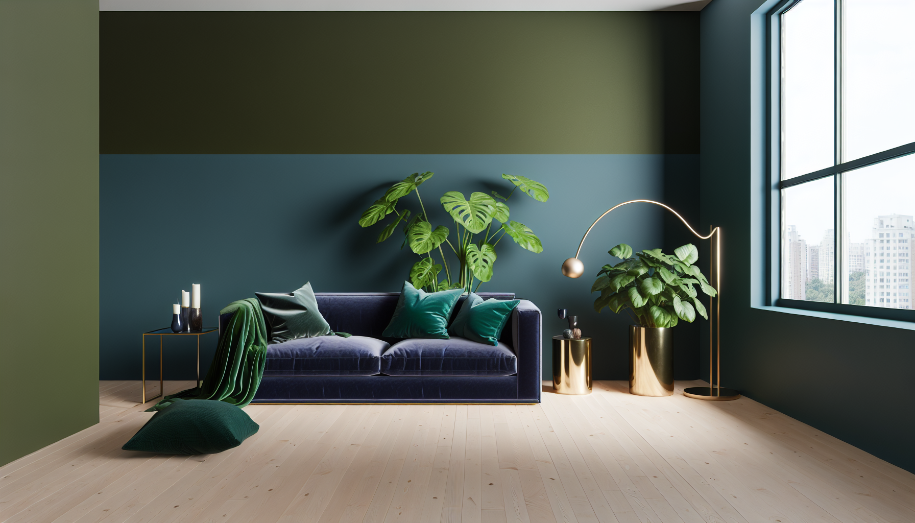
Choosing the right color scheme is fundamental to successful interior design. Cool colors can make a room feel larger, calmer, and more refined. Here are some of the most effective ways to combine cool colors in your home.
A monochromatic scheme uses different tints, tones, and shades of a single cool color. This approach is sophisticated and creates a cohesive, calming atmosphere.
Analogous schemes use colors that are next to each other on the color wheel, creating a harmonious and low-contrast look.
For a more dynamic and energetic space, pair a dominant cool color with a small amount of its complementary warm color. The contrast adds a powerful visual pop.
Here's a table summarizing popular combinations and their effects:
| Color Combination | Primary Cool Color | Accent Color(s) | Mood / Vibe |
|---|---|---|---|
| Coastal Serenity | Light Blue / Teal | Sandy Beige, White | Calm, Airy, Beachy |
| Modern Sophistication | Charcoal Gray / Navy | Silver, White, Emerald Green | Sleek, Elegant, Formal |
| Earthy Tranquility | Sage Green / Olive | Cream, Wood Tones, Slate Blue | Natural, Grounding, Peaceful |
| Bold & Dynamic | Royal Blue | Mustard Yellow / Coral | Energetic, Confident, Stylish |
| Regal Luxury | Deep Purple / Plum | Gold, Cream, Charcoal Gray | Opulent, Creative, Mysterious |
Monochromatic schemes use different shades of a single color. Complementary schemes use colors from opposite sides of the color wheel to create high contrast.
Pairing a dominant cool color with a small amount of its complementary warm color adds a powerful visual pop, creating a balanced and dynamic space.
Ready to add some sizzle to your serene, cool-toned designs? The secret lies in strategic pops of warmth. Discover how contrasting colors can create a dynamic, balanced, and visually stunning composition that captures attention and tells a compelling story.
The best warm colors to complement a cool color palette are their direct opposites on the color wheel. For instance, vibrant oranges and yellows beautifully contrast with blues, while rich reds and magentas pop against greens. These complementary pairings create high-impact visual interest and a sense of energy.
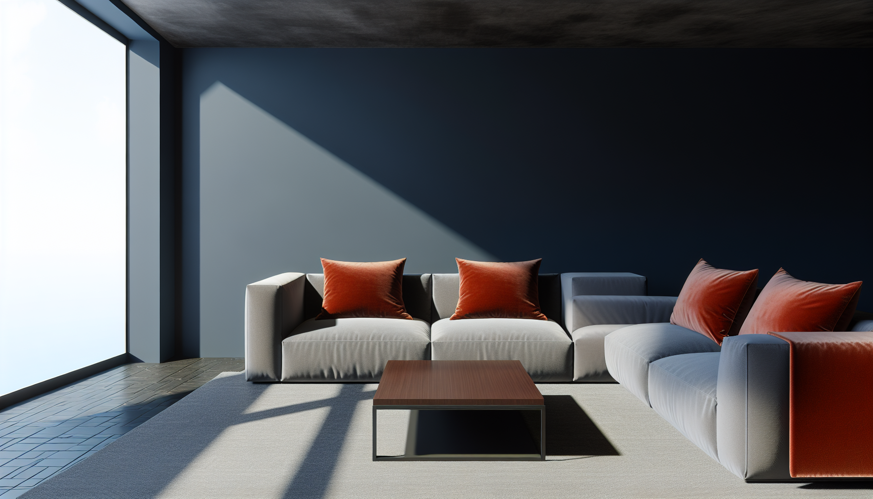
Pairing warm and cool colors is all about creating a deliberate, harmonious contrast. While it might seem counterintuitive, this opposition is what brings a design to life, preventing it from feeling monotonous.
The most impactful way to pair warm and cool tones is by using complementary colors—hues that sit directly opposite each other on the color wheel. This creates the strongest possible contrast, making both colors appear more vibrant and intense.
If direct complementary pairings feel too bold, you can create a more subtle and sophisticated look using other color relationships. A split-complementary scheme, for instance, uses one base color and the two colors adjacent to its complement. This maintains strong visual contrast but with less tension.
For a blue base, instead of just orange, you could use red-orange and yellow-orange. This method provides more creative flexibility and is a favorite among designers for creating rich, dimensional palettes. You can learn more by exploring advanced color schemes7.
To ensure your warm accents don't overpower your cool base, apply the 60-30-10 rule. This interior design principle is a timeless guide for creating a well-proportioned color scheme.
Complementary colors are directly opposite each other on the color wheel. This opposition creates the strongest possible contrast and visual energy in a design.
To maintain balance, the 60-30-10 rule advises using the complementary warm color as the 10% accent to avoid overpowering the cool-toned base.
Now, armed with this knowledge, I hope you feel ready to confidently wield the calming power of blues, greens, and purples. Go on, start experimenting with these serene hues to create balance, depth, and tranquility in all your creative projects!
Learn how to use nature-inspired colors like green to create healthier, happier spaces: For instance, spaces with green and blue accents have been shown to increase problem-solving capabilities and calmness, which in turn leads to ... ↩
Discover how major brands use color psychology to influence consumer perceptions and choices: The psychology of color suggests general guidelines for the ways that various hues and shades influence consumer behavior. ↩
Learn detailed techniques for applying atmospheric perspective in your own artwork: Learn how to master aerial perspective with tips for mixing colors and creating depth in your landscape paintings! ↩
Explore practical tutorials on manipulating value and saturation for a 3D effect: The canvas is flat so we need to create that feeling of 3-dimension by using value, color temperature, and muted & saturated color. ↩
Learn how to visually plan your color scheme before you start painting: Design your own amazing custom mood board for free with Canva's impressively easy to use online mood board maker. ↩
Discover expert techniques for achieving perfect color harmony in your space: In this post, we're sharing more about our approach to mixing warm and cool tones and a few tips on simplifying the process. ↩
Learn how to create sophisticated and balanced color palettes for your projects: Follow the 60-30-10 rule. Use 60% base color, plus 30% and 10% of each supporting color to achieve a cohesive design. · Control color temperature. · Make your ... ↩
Recommended reading: the latest three posts in this language.

Ever find yourself scrolling, searching for that perfect little mental escape? I know I do! When it comes to online tile puzzles, the options can feel endless. But don't worry, I've sifted through the colorful chaos to find the absolute best, including the beloved original Google game and some fantastic alternatives, just for you.
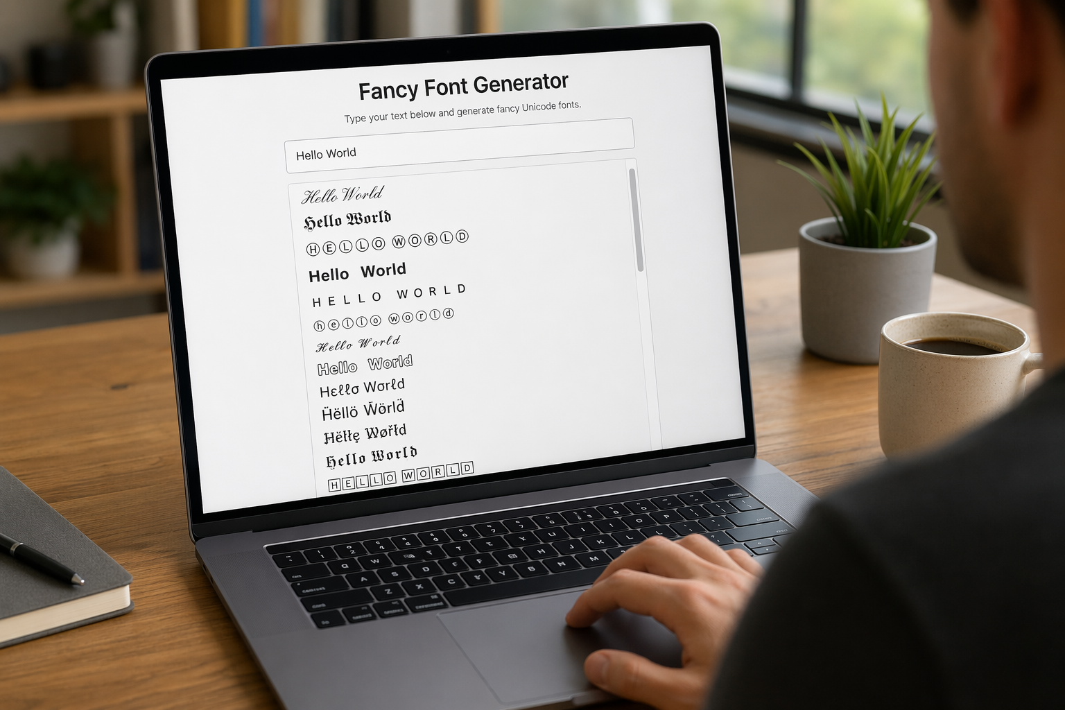
Remember that feeling when your social media posts just... vanished into the feed? I certainly do! For ages, I struggled to make my words pop. Then, I stumbled upon fancy font generators, and honestly, they've been a game-changer. They're my little secret for crafting text that truly stands out, making my content memorable without needing any fancy design degrees.

Have you ever just stopped to stare at the vast, endless blue of the sky or the deep, mysterious ocean? It feels like blue is everywhere, right? But then I started noticing something peculiar: when it comes to living things—plants, animals, us—true blue is incredibly hard to find. It got me wondering: why is such a common color in our world so shockingly rare in the vibrant tapestry of life? Let's explore this beautiful mystery together.
