
Did you know that up to 8% of men have some form of color vision deficiency? I remember the shock when I first heard that statistic. Suddenly, my carefully chosen color scheme might be unreadable to a significant portion of my audience. It's time we design with everyone in mind.
To design a color blind friendly palette, focus on high contrast in brightness and saturation, not just hue. Use online simulators to test your choices against different types of color blindness. Most importantly, always supplement color with other visual cues like patterns, icons, or text labels to convey information.
While these rules provide a solid foundation, truly effective accessible design goes deeper than just a quick fix. I've personally gathered specific, tested color combinations and a curated list of the best tools that will help you move from theory to practice, ensuring your work is clear and effective for all users. Trust me, it's a game-changer.
This common genetic condition makes it crucial for designers to create accessible color palettes for a significant portion of the male population.
Contrary to its name, 'color blindness' rarely means seeing in black and white. It's typically a deficiency in perceiving specific colors, a nuance crucial for designers to grasp. Understanding these variations is the first step toward creating truly accessible designs for a wider audience.
The most prevalent type is red-green color blindness, which includes Deuteranopia (difficulty with greens) and Protanopia (difficulty with reds). A less common form is blue-yellow color blindness (Tritanopia). The rarest condition is Monochromacy, or complete color blindness, where individuals see no color at all.
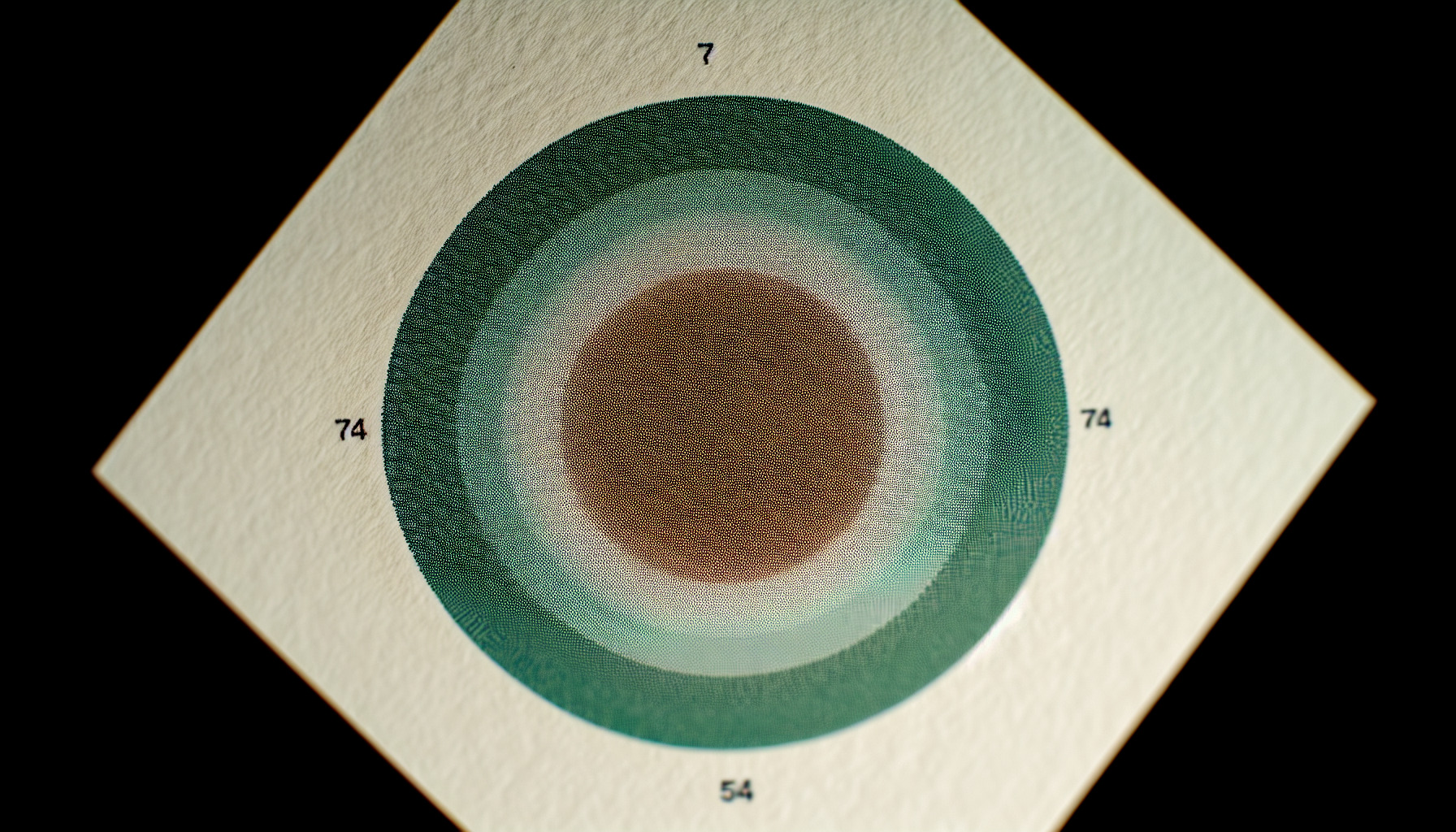
While the term 'color blindness' is widely used, Color Vision Deficiency (CVD) is more accurate. Most people with CVD can see colors, but they perceive a narrower range of hues than someone with typical vision. These conditions are usually genetic and result from issues with the cone cells in the eye's retina that are responsible for color perception.
This is by far the most common group of color vision deficiencies, affecting up to 8% of men and 0.5% of women with Northern European ancestry. It stems from an anomaly in the red (L-cones) or green (M-cones) photoreceptors.
This type, known as Tritan-deficiency, is much rarer. It affects the blue cone cells (S-cones) and makes it difficult to differentiate between blue and green, as well as yellow and red/pink.
The rarest of all conditions, Monochromacy affects an estimated 1 in 33,000 people. Individuals with this condition, also called Achromatopsia, see the world in shades of gray, black, and white. Their vision relies on rod cells instead of cone cells, often resulting in sensitivity to bright light. While you are unlikely to encounter many users with this condition, designing with high luminance contrast is essential for their experience and is a cornerstone of accessible web design2.
The text states this is the most prevalent form, affecting up to 8% of men and 0.5% of women with Northern European ancestry.
This condition, Monochromacy, is the rarest form. Most people with CVD perceive a narrower range of hues, not a complete absence of color.
Ever squinted at a chart, unable to tell the lines apart? For millions with color vision deficiencies, this is a daily digital reality. Certain color pairings create invisible walls, making your content confusing or outright unreadable. Let's dismantle them.
To ensure readability for users with color vision deficiency, always avoid color combinations with low value contrast, especially red and green. Other problematic pairings include green and brown, blue and purple, and green and blue. These colors can appear nearly identical, rendering information indistinguishable.
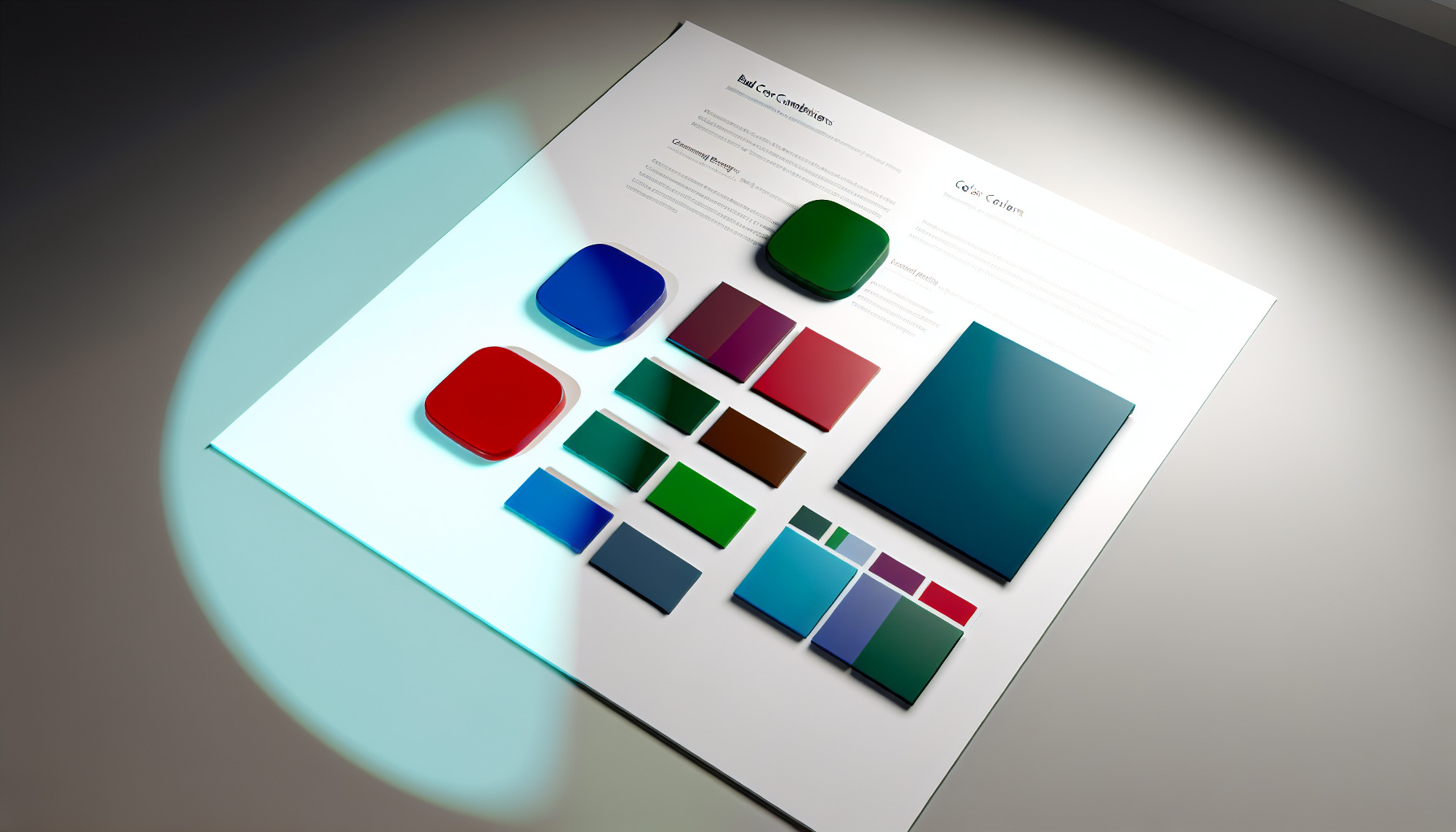
The core issue with poor color combinations is their reliance on hue differences that are imperceptible to people with certain types of CVD. When colors have similar brightness or saturation, they can blend together.
This is the most well-known problematic pairing because it directly affects individuals with Deuteranopia (green-blind) and Protanopia (red-blind), the most common forms of CVD. Using red and green to signify opposing states, like 'stop' vs. 'go' or 'error' vs. 'success' without accompanying icons or text, is a classic accessibility mistake. A person with red-green CVD might see both colors as a muddy brownish-yellow.
Beyond red and green, several other combinations can cause confusion:
Here is a quick reference table of combinations to handle with care:
| Problematic Pair | Why It's a Problem | A Better Approach |
|---|---|---|
| Red & Green | Indistinguishable for the most common forms of CVD. | Use high-contrast pairs like blue and orange; add icons. |
| Green & Brown | Appear very similar, especially in charts and maps. | Increase the brightness difference; use different textures. |
| Blue & Purple | Can both appear as shades of blue. | Pair blue with a much lighter color like white or yellow. |
| Gray & Pink | A light gray and a pale pink can look identical. | Drastically change the brightness or use a bold, saturated pink. |
Seeing visual examples of these problematic pairs3 can be incredibly helpful for understanding how they appear to users with CVD. The key takeaway is to never rely on color alone to convey critical information.
The text also lists other problematic pairings like green and brown, blue and purple, and green and blue, which can cause confusion for users with CVD.
The text recommends adding icons as a better approach to ensure critical information is not conveyed by color alone, especially when using pairs like red and green.
Guesswork isn't a strategy for accessible design. Thankfully, numerous digital tools let you see your palette through different eyes, ensuring your choices work for everyone. These tools remove ambiguity and empower confident, inclusive design decisions.
Use online simulators, browser extensions, and design plugins to test your palette. Tools like Coblis and Stark allow you to view your designs as someone with color blindness would, while contrast checkers ensure you meet WCAG standards for text readability. This proactive testing is key to accessible design.
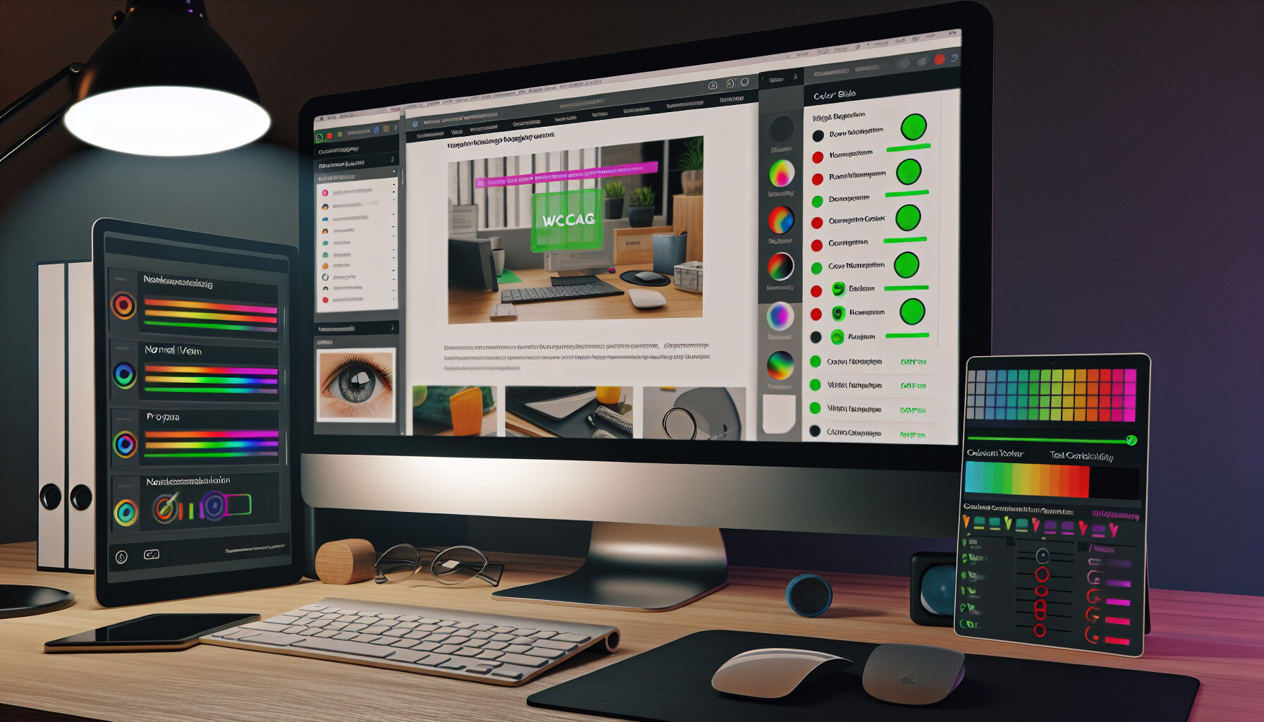
Relying on your own vision is not enough to create a universally accessible design. You must actively test your palette using specialized tools that simulate color vision deficiencies. Here’s how you can leverage them effectively.
Online simulators are one of the quickest ways to check a static design. You can simply upload an image of your website, app interface, or graphic, and the tool will generate versions showing how it appears to people with different types of color blindness. They provide a quick, visual check that can instantly reveal problem areas, such as buttons that disappear or text that becomes unreadable. Many of these color accessibility tools4 are free and web-based, making them highly accessible for any project.
For testing live websites and web applications, browser-based tools are invaluable. Most modern browsers, like Chrome and Firefox, have built-in developer tools that can simulate various vision deficiencies directly on the page. Additionally, browser extensions can provide on-the-fly analysis of contrast and color issues without ever leaving your current tab. This allows you to inspect interactive elements like hover states and form fields in real-time.
To catch issues early in the design process, use plugins directly within your design software (like Figma, Sketch, or Adobe XD). These integrated design plugins5 allow you to simulate color blindness and check contrast ratios without exporting images or switching applications. By integrating accessibility checks into your daily workflow, you can make more informed color choices from the very beginning, saving significant time and effort later in development.
Beyond simulating color blindness, it's crucial to ensure your text is legible. Contrast checkers measure the contrast ratio between your text color and its background color to see if it meets the official WCAG contrast standards6. These standards define minimum levels for readability.
| WCAG Level | Text Size | Minimum Contrast Ratio |
|---|---|---|
| AA | Normal Text (<18pt) | 4.5:1 |
| AA | Large Text (18pt+ or 14pt+ bold) | 3:1 |
| AAA | Normal Text (<18pt) | 7:1 |
| AAA | Large Text (18pt+ or 14pt+ bold) | 4.5:1 |
Using a combination of these tools will give you a comprehensive view of your palette's accessibility and empower you to fix issues before they reach your users.
The WCAG AA standard requires a 4.5:1 ratio for normal text and a 3:1 ratio for large text, not all text.
The context states that integrated design plugins allow you to simulate color blindness directly within your design software, such as Figma, Sketch, or Adobe XD.
Absolutely. Relying only on color to convey information can exclude a significant portion of your audience. Patterns and textures offer a powerful, universal alternative to create designs that are both beautiful and accessible to everyone, regardless of their color vision.
Yes, patterns and textures are a primary method for creating color-blind friendly designs. By assigning distinct patterns or textures to different elements—such as using stripes for one data series in a graph and dots for another—you ensure that the information is clearly distinguishable without any reliance on hue.

When color is removed from the equation, we must rely on other visual differentiators to communicate meaning. Patterns and textures step in as a robust solution, creating a visual language that is independent of a user's ability to perceive color.
Patterns add a layer of information that is discernible through shape and repetition. This is especially critical in data visualizations like charts and graphs, where color is often the default method for distinguishing between datasets. For a user with color vision deficiency, a multi-colored pie chart might look like a uniform collection of similar shades. However, if each slice has a unique pattern, the data becomes instantly clear.
Implementing patterns doesn't have to be complex. The goal is to choose textures that are distinct enough to be easily told apart, even at a small scale. Consider their application in common UI elements:
| Element Type | Standard Approach (Color) | Accessible Approach (Pattern) |
|---|---|---|
| Line Graph | Red line vs. Green line | Solid line vs. Dashed line vs. Dotted line |
| Bar Chart | Blue bars vs. Orange bars | Solid bars vs. Striped bars vs. Checkered bars |
| System Status | Green dot for 'Online' | Solid circle for 'Online', empty circle for 'Offline' |
| Form Fields | Red border for error | Red border with a warning icon and striped background |
These additions provide redundant cues, a core principle of accessible design. For more ideas, you can explore various accessible data visualization techniques7.
When incorporating patterns, it's important to keep a few guidelines in mind to ensure they are effective:
By following these principles, you can create more inclusive and effective UI accessibility patterns8 that serve all users.
Relying only on color can exclude users with color vision deficiencies. Patterns and textures offer a universal alternative for accessible designs.
Simple patterns like stripes and dots prevent visual clutter and scale better on different screen sizes, ensuring the design remains clear and effective.
For me, embracing color-blind-friendly design isn't a limitation; it's a gateway to creating clearer, more robust, and universally accessible visuals. Let's make our work resonate with everyone!
Get practical tips and visual examples for designing for different types of CVD: Use more than one technique at a time · Keep it simple · Pattern is your friend · Avoid certain color combinations · Use contrast · Labels can help. ↩
Learn the official accessibility standards for color contrast on the web: The intent of this success criterion is to provide enough contrast between text and its background, so that it can be read by people with moderately low vision ... ↩
See visual examples of how these combinations appear to people with different CVDs: Why Red/Black Can Be Bad. Some color blind users are lacking the capability to detect the lower color wave frequencies associated with red. For these users ... ↩
Discover a list of free online tools for simulating color blindness: Simulates colorblindness in your web browser. Colorblindly is an extension that helps developers create websites for the people with colorblindness by allowing ... ↩
Find plugins to integrate accessibility checks directly into your design workflow: Create more inclusive designs with color accessibility plugins from the Figma Community. These essential tools help ensure your work reaches everyone. Check ... ↩
Understand the official accessibility standards for color and contrast on the web: WCAG conformance should be evaluated for color pairs specified in the content that an author would expect to appear adjacent in typical presentation. ↩
See practical examples of using patterns in charts and graphs for accessibility: Instead of relying on color alone to explain the data, add an additional visual indicator, such as a pattern, shape, or text label so that even if someone is ... ↩
Discover proven UI component designs that do not rely solely on color: 7 Ways you can improve color accessibility for color blind users · #1: Use patterns and textures · #2: Utilize colors and symbols · #3: Use text labels · #4: ... ↩
Recommended reading: the latest three posts in this language.

Ever find yourself scrolling, searching for that perfect little mental escape? I know I do! When it comes to online tile puzzles, the options can feel endless. But don't worry, I've sifted through the colorful chaos to find the absolute best, including the beloved original Google game and some fantastic alternatives, just for you.
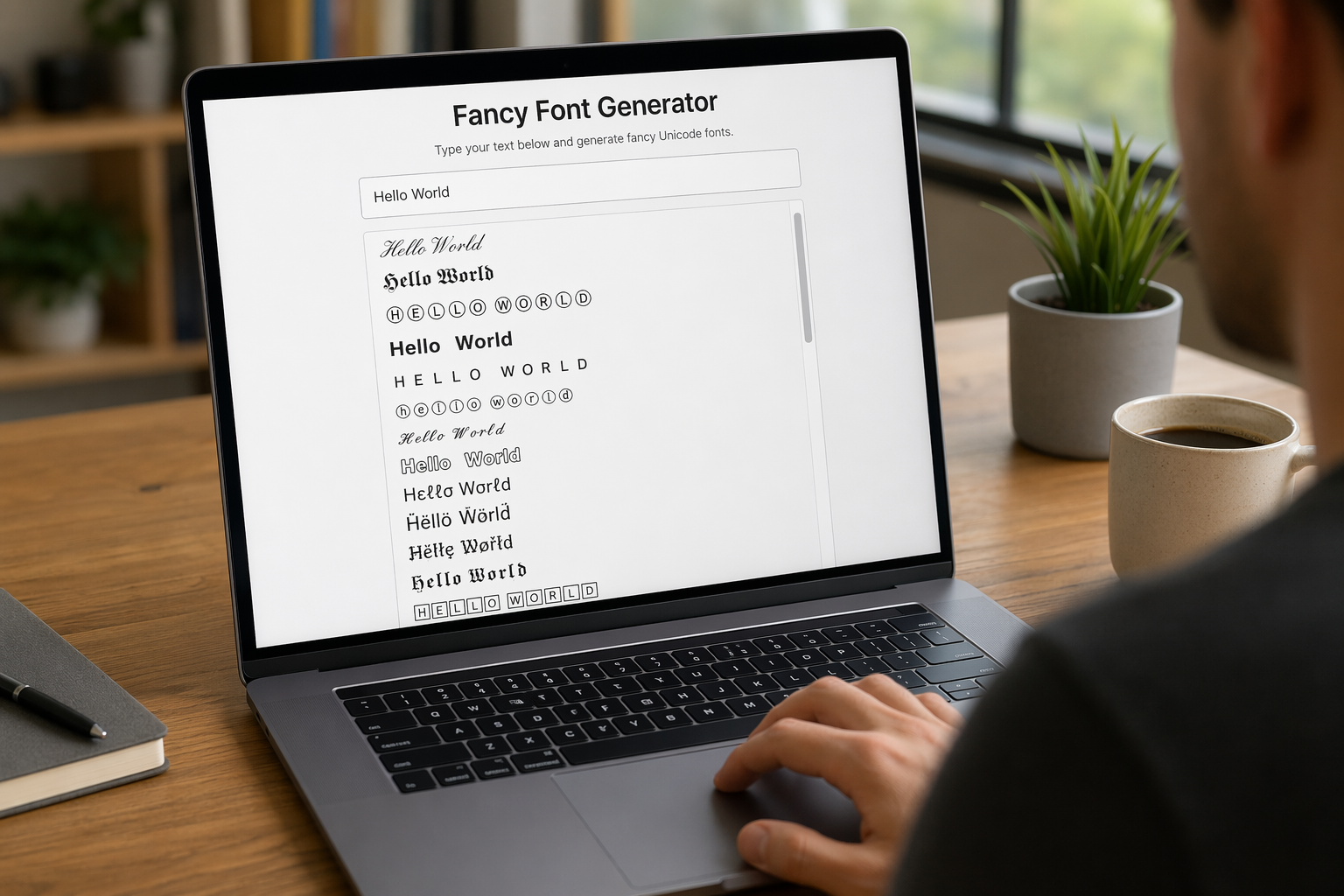
Remember that feeling when your social media posts just... vanished into the feed? I certainly do! For ages, I struggled to make my words pop. Then, I stumbled upon fancy font generators, and honestly, they've been a game-changer. They're my little secret for crafting text that truly stands out, making my content memorable without needing any fancy design degrees.

Have you ever just stopped to stare at the vast, endless blue of the sky or the deep, mysterious ocean? It feels like blue is everywhere, right? But then I started noticing something peculiar: when it comes to living things—plants, animals, us—true blue is incredibly hard to find. It got me wondering: why is such a common color in our world so shockingly rare in the vibrant tapestry of life? Let's explore this beautiful mystery together.
