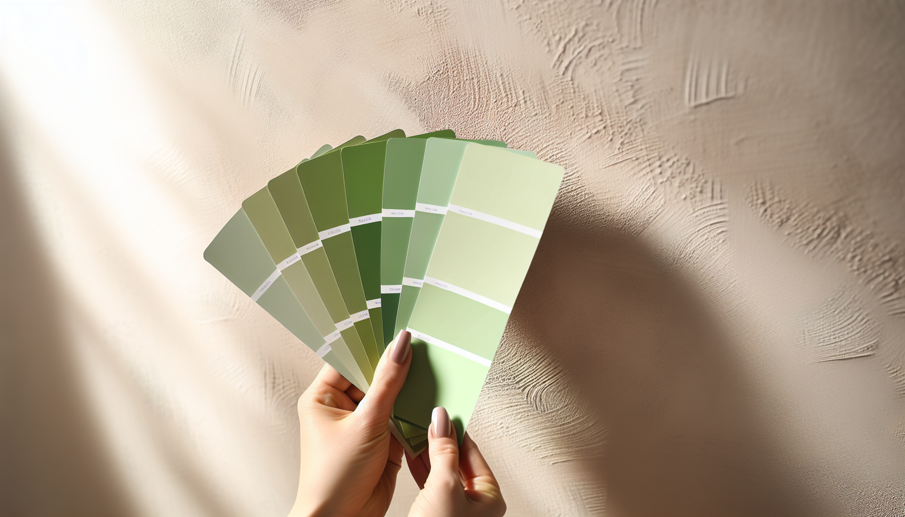
Oh, green! It's one of those colors that just gets you, isn't it? From the calm whisper of a forest to the bold shout of a fresh lime, green has so many personalities. But when I'm staring at a hundred shades, trying to pick 'the one' for a client's living room or my own brand's new look, I often wonder, 'How on earth do I narrow this down?'
To choose the right green color palette, first determine the mood you want to create (e.g., calming, energetic). Next, identify the undertones of the greens—cool (blue-based) or warm (yellow-based)—and select complementary colors that create a harmonious scheme for your specific context.
That little snippet gives you the quick fix, but trust me, there's a whole world of nuance beneath the surface. I've been down this road countless times, and I've learned that truly mastering green means going a bit deeper. Stick with me, and I'll share the secrets I've picked up—the ones that turn a 'pretty good' palette into something you'll absolutely adore for years.
Lime green is a vibrant shade linked to energy and excitement. Muted greens like sage are associated with calmness.
Ever wondered why sage green feels calming while lime green feels energetic? The psychology of color is fascinating. Different shades of green trigger distinct emotional and psychological responses, rooted in our deep-seated connections to nature and culture.
The psychology behind different shades of green is tied to their natural associations. Light greens like mint suggest freshness and tranquility, vibrant greens like lime evoke energy and excitement, while dark greens such as forest green convey stability, wealth, and sophistication.
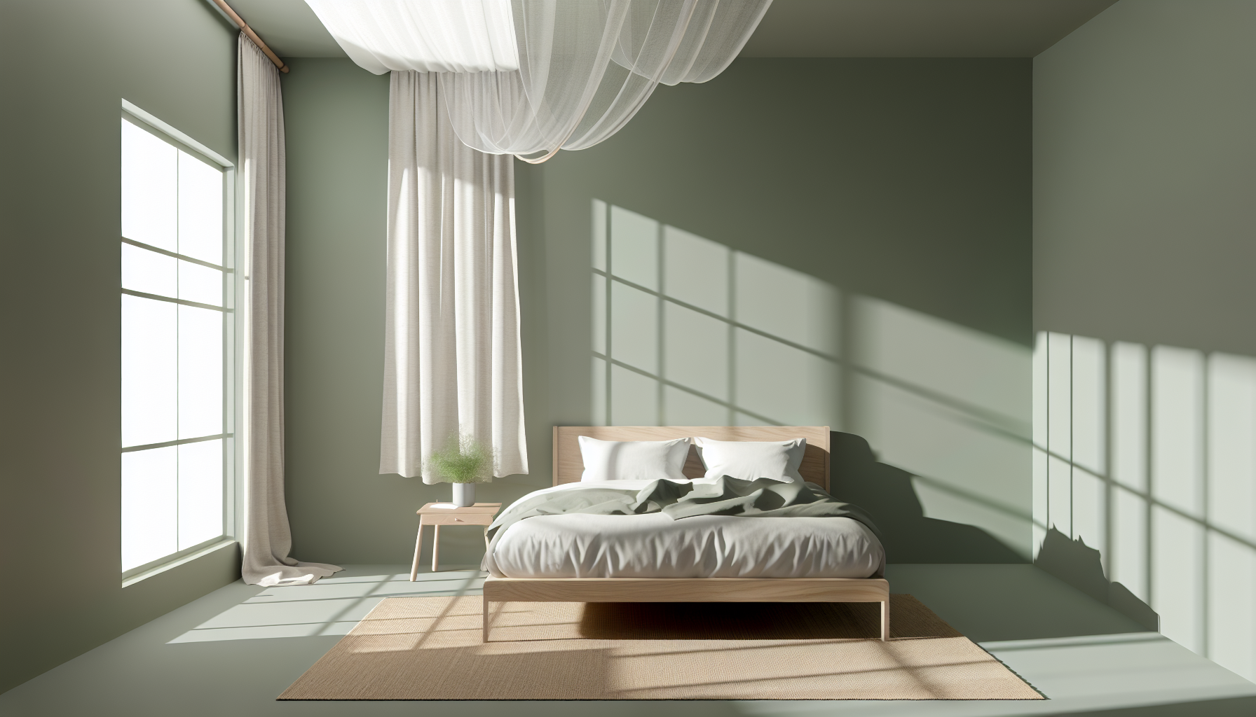
Green is often called nature's neutral, but its psychological impact is anything but. The specific shade you choose can dramatically alter the mood of a room or the perception of a brand. Understanding these nuances is key to harnessing the color's full potential.
Shades like sage, mint, and seafoam green are soft and gentle on the eyes. They are strongly associated with new beginnings, health, and tranquility. Because of their calming properties, these hues are often used in environments designed for rest and healing, such as bedrooms, bathrooms, and healthcare facilities. Their understated elegance makes them a popular choice in modern color psychology in interior design1.
Lime, emerald, and chartreuse are high-energy colors that command attention. These vibrant shades are associated with liveliness, creativity, and a sense of excitement. They can stimulate feelings of refreshment and enthusiasm, making them excellent for accent walls in creative spaces or for brands that want to project a fresh, energetic image. However, they should be used thoughtfully, as too much can be overwhelming. Many tech companies and health food brands are using vibrant colors in branding2 to convey innovation and vitality.
Deep shades like forest, olive, and hunter green evoke a sense of stability, tradition, and security. They are reminiscent of dense forests and the natural world, which can feel grounding and reassuring. These colors are also historically linked to wealth and ambition. Consequently, they are often found in libraries, offices, and financial institutions to create an atmosphere of dependability and quiet confidence.
Here is a quick summary of green's psychological associations:
| Shade Category | Psychological Association | Common Use Cases |
|---|---|---|
| Light & Muted Greens | Calm, Freshness, Health, Renewal | Bedrooms, Spas, Healthcare Branding |
| Bright & Vibrant Greens | Energy, Vitality, Creativity, Excitement | Accent Walls, Tech Logos, Activewear |
| Dark & Earthy Greens | Stability, Wealth, Nature, Sophistication | Libraries, Financial Institutions, Dens |
Different shades of green trigger distinct emotional responses. Light greens are calming, bright greens are energetic, and dark greens convey stability.
Deep, earthy greens are reminiscent of nature's grounding presence and are historically linked to wealth, often used in financial institutions and libraries.
Want a sophisticated, cohesive look? A monochromatic green scheme offers depth and harmony by exploring the full range of a single hue. It's a simple yet powerful design strategy that creates an instantly calming and unified atmosphere.
To create a monochromatic green color scheme, select a single base green hue and then expand upon it by using its different tints (adding white), tones (adding gray), and shades (adding black). This creates variation in lightness and saturation while maintaining a cohesive, unified look.
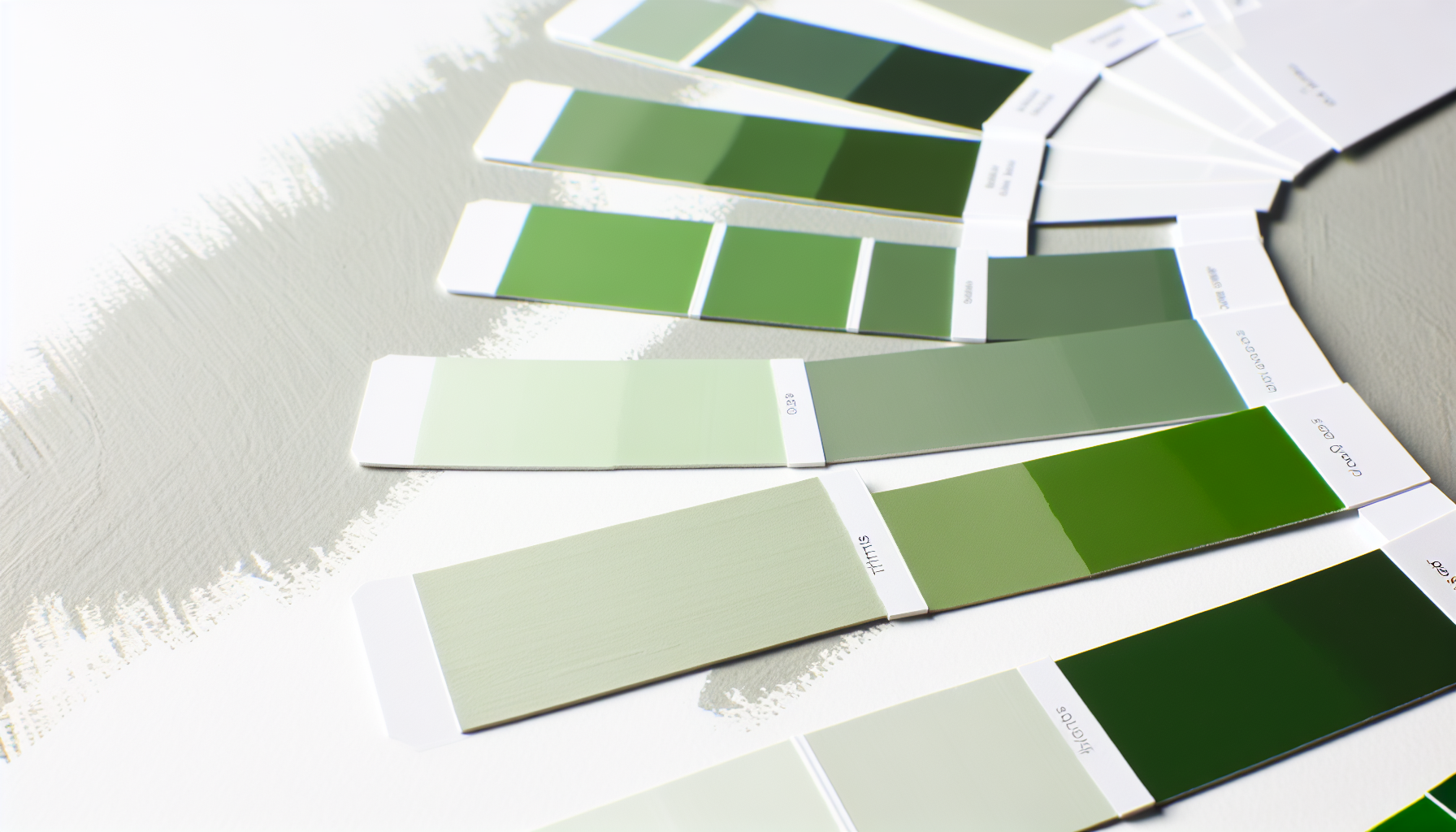
A monochromatic scheme is one of the easiest to execute yet looks incredibly chic and intentional. Instead of juggling different colors, you focus on the nuances within one. For green, this means exploring everything from a pale mint to a deep forest green, all derived from the same base hue.
Your first step is to choose your foundational green. This will set the overall mood. Do you want the vibrant energy of a lime green, the calming feel of a sage green, or the regal elegance of an emerald green? This base color will be the star of your palette.
Once you have your base hue, you can create variations to add depth and prevent the scheme from feeling flat. This is where monochromatic color theory3 comes into play. You create variations by adjusting the base hue's value and saturation:
Here’s a simple breakdown using a hypothetical "Leaf Green" as the base:
| Variation | How to Create | Resulting Color Example |
|---|---|---|
| Tint | Leaf Green + White | Pale Sage |
| Tone | Leaf Green + Gray | Muted Olive |
| Shade | Leaf Green + Black | Deep Hunter Green |
To apply your new palette effectively, use the classic 60-30-10 design rule.
A monochromatic scheme is based on a single hue, using its various tints, tones, and shades to create a cohesive look.
Shades are created by adding black to a base color, making it darker and richer. Adding white creates a lighter tint.
From serene sage to dramatic emerald, green is making a major statement in interior design. Let's explore the trending palettes that are transforming modern homes and discover how you can incorporate these popular hues into your own space.
Currently, trending green palettes in interior design lean towards nature-inspired tones. Popular choices include earthy sage green paired with warm neutrals, rich olive green with natural wood finishes, and luxurious deep emerald green accented with brass or gold metallics for a sophisticated touch.
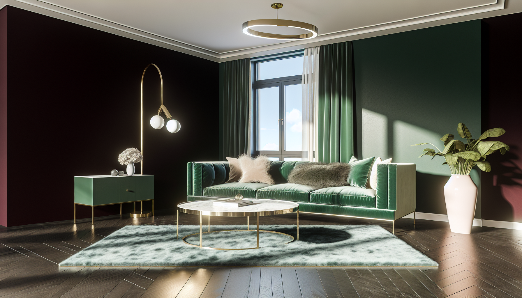
Green's versatility allows it to fit seamlessly into various aesthetics, from minimalist to maximalist. The current trends emphasize bringing the outdoors in, creating spaces that feel both restorative and stylish.
These understated greens are celebrated for their calming and grounding properties. They connect interiors to the natural world, creating a serene sanctuary.
For those looking to make a bold statement, deep greens offer unparalleled richness and elegance. These shades are often associated with luxury and drama.
| Palette | Mood | Best Paired With | Ideal For |
|---|---|---|---|
| Sage Green | Calming, Airy, Natural | Cream, light wood, linen | Bedrooms, bathrooms, minimalist spaces |
| Olive Green | Warm, Sophisticated, Earthy | Terracotta, leather, dark wood | Living rooms, kitchens, rustic decor |
| Emerald Green | Luxurious, Bold, Dramatic | Brass, marble, velvet | Accent walls, cabinetry, formal areas |
| Forest Green | Cozy, Moody, Enveloping | Charcoal, walnut, rich textiles | Studies, libraries, intimate spaces |
The context explains that sage green, a new neutral, pairs best with creamy whites and light woods to create a relaxed, airy atmosphere.
The text highlights that accenting deep emerald green with brass or gold metallics is a popular way to create a sophisticated and opulent touch.
Ever painted a wall a beautiful sage green, only for it to look dull and gray? The culprit is often natural light. Let's explore how the sun's changing rays can dramatically alter your chosen green hues, ensuring you make the perfect choice for your space.
Natural light significantly impacts green color choices because its color temperature and intensity shift throughout the day. North-facing rooms receive cool, indirect light that can wash out warm greens, while south-facing rooms get bright, warm light that intensifies colors, potentially making vibrant greens feel overwhelming.
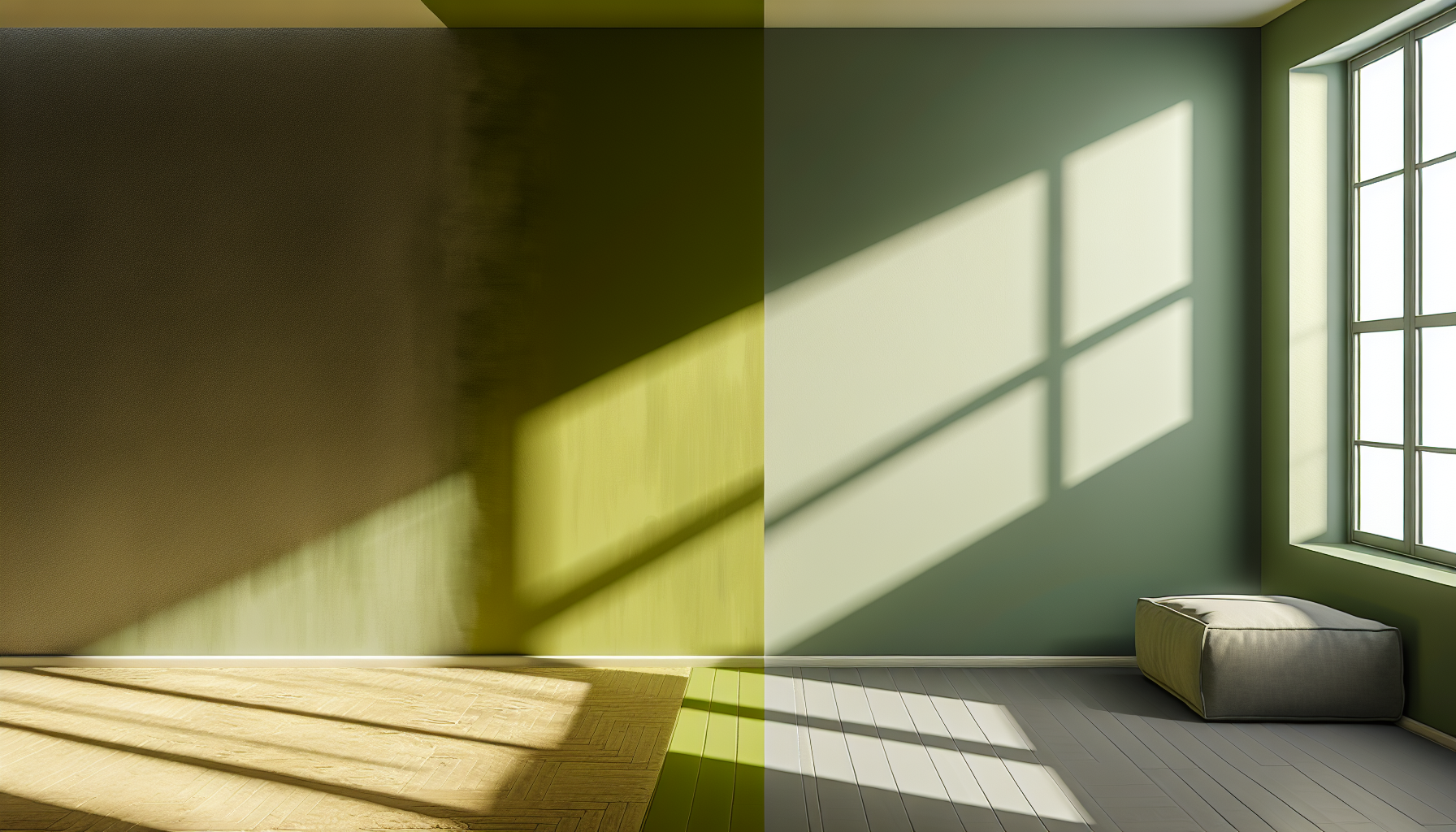
The interaction between color and light is a fundamental principle of interior design. A green that looks perfect on a paint chip can transform entirely once on your walls, primarily due to the direction and quality of natural light your room receives.
Your room's orientation is the single most important factor. The light it gets will either enhance or subdue the undertones in your chosen green.
Understanding the undertone of your green is key to predicting how it will behave.
| Light Exposure | Effect on Cool Greens (e.g., Mint, Sage) | Effect on Warm Greens (e.g., Olive, Lime) |
|---|---|---|
| North | Can appear muted, gray, or overly cool. | Feel balanced and earthy; less likely to look too yellow. |
| South | Look crisp, bright, and true to color. | Can become very intense and vibrant, sometimes overwhelmingly so. |
| East | Appear bright and clear in the morning, more subdued later. | Look lively in the AM; more muted and earthy in the PM. |
| West | May look dull in the morning; warm and glowing in the evening. | Can look muted in the AM; become rich and golden in the PM. |
The best advice is to always test a sample. Paint a large swatch on your wall and observe it throughout the day to see how it truly lives in your space before you commit.
The cool light in north-facing rooms balances the yellow undertones of warm greens like olive, making the space feel earthy and balanced rather than sterile.
While most greens work well, intense southern light can make highly saturated greens feel overwhelming and overly vibrant, so caution is advised with bold shades.
By understanding green's psychology and applying color theory, you can confidently select a palette that perfectly suits your vision. Go ahead and experiment to find the ideal green combination that brings your project to life.
Learn how to use color science to create a truly calming home environment: “Colors that calm the nervous system are cool and neutral tones, like blue, green, white, gray, and beige," says Amber Guyton, founder of ... ↩
Discover expert tips on making your brand stand out with energetic color palettes: Brand colors play a big role in brand perception. Here's how to choose the right brand colors and optimize them for your branding. ↩
Learn how to apply color theory to create a balanced and professional design: “When using monochromatic colors, it is important to vary the shades, tints, and tones to create interest and depth.” To employ your own ... ↩
Learn how to connect your space with nature using green palettes: This paper moves from research on biophilic responses to design application as a way to effectively enhance health and well-being for individuals and society. ↩
See how different design styles incorporate trending green palettes for inspiration: If you want something a bit more cottagecore, try a pale green and ivory color scheme. And for something more midcentury, an olive tone with ... ↩
Learn expert tips for matching paint colors with your room's specific lighting: Learn about how a room's direction – and the amount of natural light it gets – affects how the paint color you choose will look throughout the day. ↩
Recommended reading: the latest three posts in this language.

Ever find yourself scrolling, searching for that perfect little mental escape? I know I do! When it comes to online tile puzzles, the options can feel endless. But don't worry, I've sifted through the colorful chaos to find the absolute best, including the beloved original Google game and some fantastic alternatives, just for you.
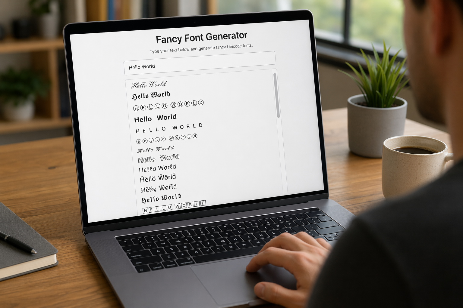
Remember that feeling when your social media posts just... vanished into the feed? I certainly do! For ages, I struggled to make my words pop. Then, I stumbled upon fancy font generators, and honestly, they've been a game-changer. They're my little secret for crafting text that truly stands out, making my content memorable without needing any fancy design degrees.

Have you ever just stopped to stare at the vast, endless blue of the sky or the deep, mysterious ocean? It feels like blue is everywhere, right? But then I started noticing something peculiar: when it comes to living things—plants, animals, us—true blue is incredibly hard to find. It got me wondering: why is such a common color in our world so shockingly rare in the vibrant tapestry of life? Let's explore this beautiful mystery together.
